The Perpetua Forma editorial — long-form writing on interior. Use the filters below to narrow by studio, photographer, material or year.
Filter by , , , or .
Cherry Orchard
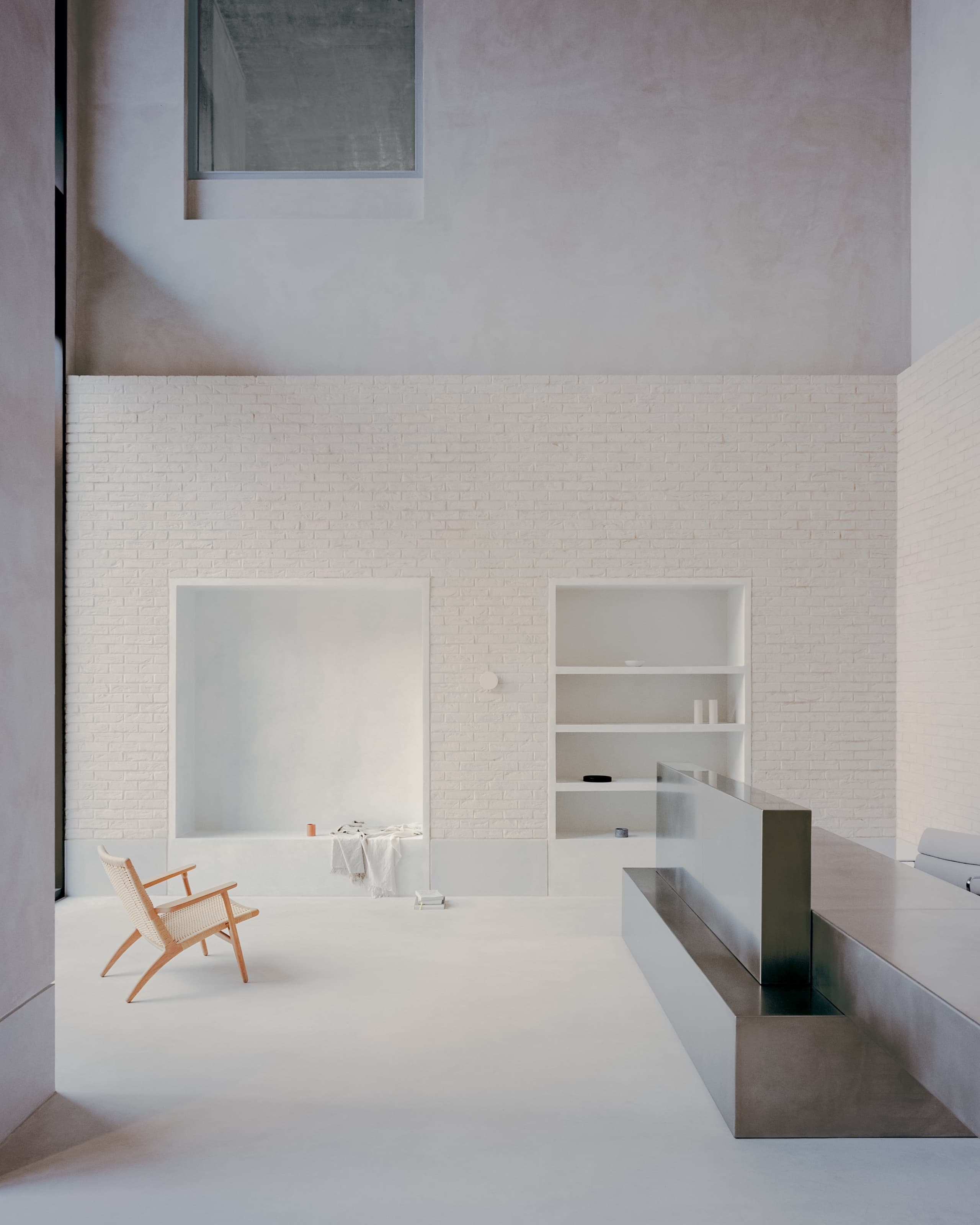
Actual Office has completed the fit-out of a series of shared living spaces in South London, defined by a simple but strong design idea and curated material palette that balances warmth, durability, and spatial clarity. Collaborating with a dynamic client, Actual Office established a unified design vision and applied it to a series of interconnected shell spaces, transforming them into a refined residential environment. At the heart of the scheme, a triple-height entrance hall is flanked by domestic-scaled spaces above. These are linked via three large apertures to establish visual connections between floors, contributing to a sense of openness and spatial continuity. Meanwhile, a solitary column at entry level frames the opening to a deep clay-coloured mailbox chamber. The upper-floor spaces are accessed through white-oiled oak joinery integrating kitchens, seating, and storage. This approach allowed for a largely free and open plan, with functional zones subtly defined through reveals within the timber. Floor to ceiling voiles wrap the perimeter, softening the relationship with the surrounding urban environment, creating a calm and introspective atmosphere. Working closely with local makers and artisans, Actual Office also designed a series of bespoke furniture pieces that reflect the restrained material palette and language of the interiors. A monolithic concierge desk fabricated entirely from hand worked stainless steel creates a sculptural focal point and anchors the entrance hall. On the first floor, two large custom timber tables act as focal points, promoting spontaneous interaction whilst reinforcing the project’s emphasis on material continuity and craftsmanship.
Swop South Melbourne
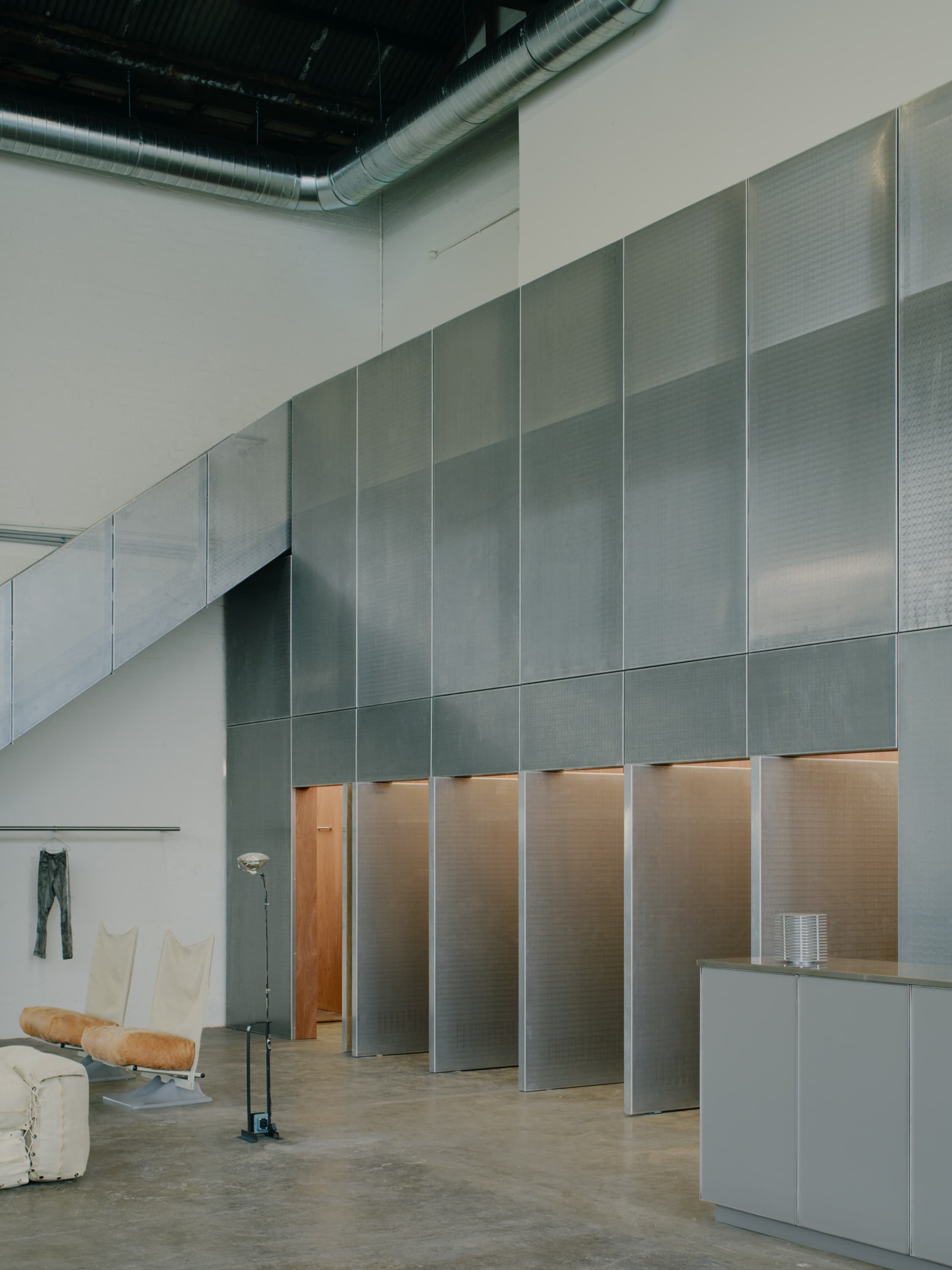
Swop South Melbourne takes the secondhand store — a typology built on volume and turnover — and slows it down. The largest outpost yet for the national resale chain, it occupies a 1938 warehouse on Clarke Street that had passed through a long sequence of uses: one of Australia's first Coca-Cola factories early on, and more recently an axe-throwing venue and a Crossfit gym. None of those left a usable retail plan behind, and that absence became the opening. With no conventional shopfront logic to inherit, William McRoberts and Joseph Gardner of Studio Gardner could treat the building as a found volume and ask what resale looks like when it is given room to be approached slowly. The shell does most of the arguing. Nine-metre ceilings and steel-framed windows on every side give the 500-square-metre floor its character, and decades of alteration had left the structure confused rather than legible. The design resets it rather than re-narrating it, treating the height and the raking daylight as the project's primary material. Into that volume comes a single decisive element: a perforated aluminium mesh wall dividing front of house from back. It is a restrained move that does a great deal — light passes through the fine surface, throwing shifting shadows across the floor and catching reflections of the original steel windows, so a static partition reads as something closer to weather. Fixings are concealed within the mesh and services threaded through without breaking the openness, so the intervention never competes with the room it sits inside. That restraint sets up the plan. With the mesh wall doing the dividing, the floor is left largely open, the long warehouse section legible end to end, and the clothing given the space to be read as display rather than stock. The brief, as the client framed it, was for the store to feel less like a shop than a gallery — a Parisian or New York gallery, elevated but still accessible — somewhere a visitor lingers rather than transacts. The loose, unpartitioned arrangement is what makes that pace possible, and it scales: a larger floor lets the curation breathe where the chain's earlier rooms could feel crowded at the weekend. Gardner softens the industrial frame through curation rather than construction. Vintage and contemporary pieces, drawn from local and international designers, are arranged into zones that sit between a design gallery and a room you might settle into — a vintage inflatable sofa by Günter Sulz alongside a custom steel coffee table by Sydney's Galerie Terminus, the brutalist Stos lamp by Melbourne's Brud Studia, and a four-metre tree set in an Australian-made planter. The fit-out leans on local makers for its working pieces, with the clothing racks built by Brunswick East's Weston Fab and joinery by Cessa Furniture. The effect dissolves the usual line between display and use: furniture is both exhibit and invitation, and the secondhand clothing inherits some of that same considered attention. What the project finally proposes is that resale need not be transactional in its spaces any more than in its ethics. By resetting a heavily altered warehouse, holding its volume open and ordering it with a single luminous screen, Swop South Melbourne gives ordinary pre-loved clothing an unusual measure of reverence — and argues that the slower, more deliberate way of looking usually reserved for objects behind glass can be extended to a rack of used coats.
Apartment no.201
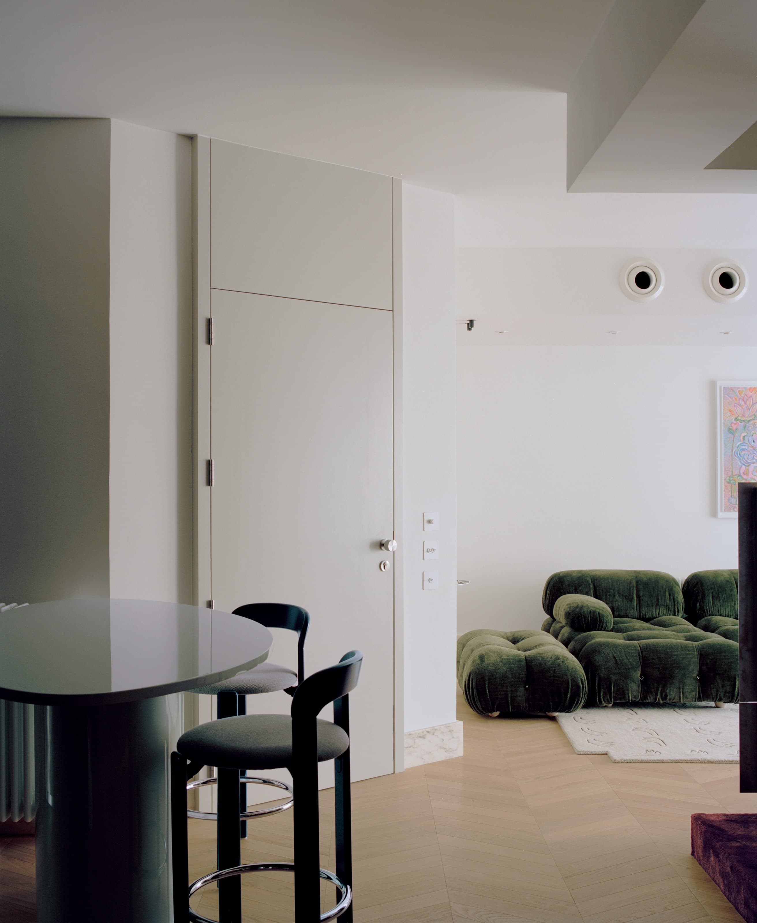
Anastasiou Misseri reworks an enclosed three-bedroom apartment into a luminous two-bedroom residence, where built-in architecture and a restrained material palette carry a single, continuous narrative. Inside an early-2000s apartment block, Anastasiou Misseri took on a dark, enclosed three-bedroom apartment whose common areas had been left fragmented. The renovation focused on reorganising those areas into a cohesive living environment, improving both visual and functional flow. Conceived in close collaboration with the clients as a curated pied-à-terre, the project trades a third bedroom for spatial clarity and refined detailing. The decisive move is architectural rather than cosmetic. By relocating the kitchen, the designers were able to introduce a continuous built-in element that begins as kitchen cabinetry and resolves, without interruption, into a display shelving system in the living space. It is a single gesture that ties cooking, gathering, and the showing of objects into one legible run — fitting for a home shaped around the appreciation of art. Beside it, a raised carpeted platform lifts a reading nook slightly out of the flow of the room, defining an intimate corner without the need for walls. Removing one bedroom did more than open up the plan. It freed the space for a generous walk-in wardrobe folded into the master bedroom, allowing the private rooms to share the same uninterrupted spatial logic as the living areas. Throughout, custom joinery in wood veneer and coloured lacquer sets the interior temperature, warm and precise in equal measure. Bespoke pieces — the kitchen table, the TV unit, the dresser — are treated not as furniture placed within the architecture but as extensions of it, drawn from the same language. Holding the composition together is a disciplined use of marble. It appears as a continuous skirting that wraps around each room, as the kitchen worktop, and again in the bathrooms as sinks and as the lining of walls and floors. Recurring with deliberate consistency, the stone becomes a connective thread, carrying the eye from one space to the next. Every element has been considered and designed to serve a coherent whole — a residence where spatial clarity, refined detailing, and a carefully chosen palette read as a single, unbroken narrative.
Kifisia Apartment
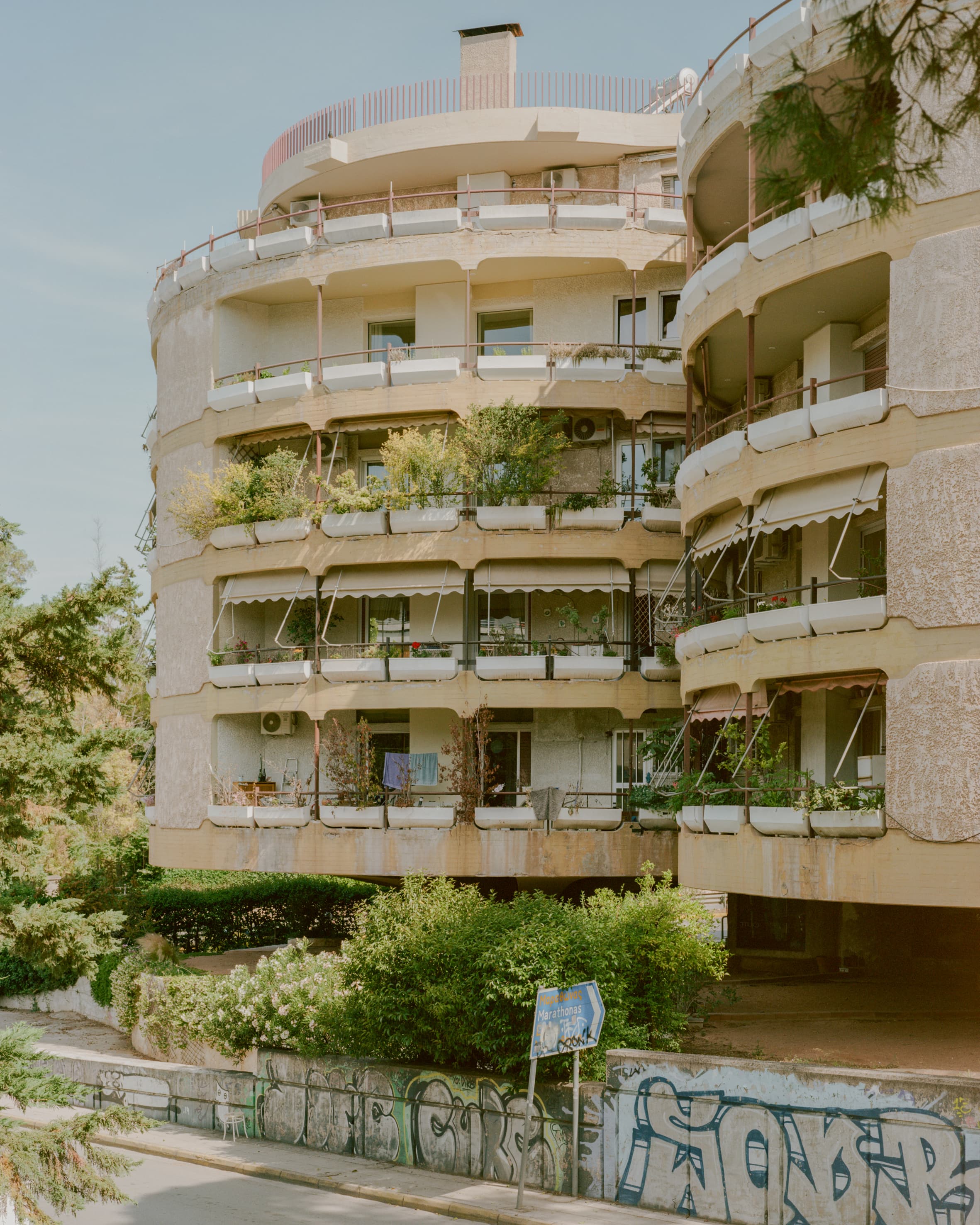
At the entrance to Kifisia, where the avenue comes in from Athens, a pair of round volumes stands clear of the ground on cylindrical supports. This is the Stroggyli Polykatoikia — the round apartment building — designed by Nikos Despotidis and built in 1973–1974. The concrete is left exposed and the balconies run continuously around the circumference, so the elevation reads as a stack of horizontal bands with neither a front nor a back. Contemporaries treated the structure as a technical accomplishment, and accounts from the period describe architects travelling from abroad to see how it had been done. It has been a fixed point in the northern suburbs ever since, known by its shape rather than by its address, though remarkably little about it has been written down: the building appears in no published survey of significant Athenian apartment buildings, and Despotidis himself leaves almost no published trace. The geometry sets the terms for everything inside it. The perimeter curves away continuously, so partitions meet the façade at an angle that changes along its length, and the corners a rectangular plan would rely on are not available. The 80 m² apartment that Georgios Apostolopoulos Architects has now reworked was organised as a sequence of enclosed rooms: two narrow corridors, the bathroom occupying the centre, and the principal living areas compressed into a narrow zone with limited access to daylight. The renovation began by taking things away. Every internal partition was removed, leaving the existing structure exposed and the floor plate readable in one view. What followed did not put the walls back. Georgios Apostolopoulos Architects treats the apartment as a continuous interior and hands the work of division to a set of joinery elements, which define how each part of the plan is used without closing it off. The question the project puts is whether a home needs rooms at all, or only the things that rooms were supposed to provide. The kitchen answers first. Placed at the centre of the plan, it is built as a solid volume and handled less as a room than as an object to be inhabited — cooking, working and meeting all collect around it. The island can be approached and used from every side, which is what makes it the social instrument of the apartment rather than a service counter: it supports the routines of a day without setting an order for them. Living and dining open out from it through gentle transitions rather than doorways. That continuity carries into the main bedroom, which reads as an extension of the living area instead of a sealed room. The vanity runs past the bathroom enclosure, and the wardrobes work as layered filters rather than partitions. Privacy here is not fixed in the plan but adjusted in use — a matter of where someone stands and what is drawn across, negotiated through occupation. At the far end of the apartment the second bedroom is not built. In its place sits a flexible joinery system: a fold-down bed, an integrated desk and sliding panels that let the same square metres move between sleeping, working and storage. It behaves less like a room than like a piece of domestic equipment, and it is the clearest statement of the project's argument — that use can be held by furniture as competently as by walls. The material handling keeps out of the way of all this. A monochromatic palette holds the interior quiet and lets the original structure stay present in the room, while slim-frame windows admit as much light as the openings allow, so the continuity between one part of the plan and the next is carried by daylight as much as by geometry. What results is a domestic interior organised as a system of spatial relationships rather than a collection of rooms: boundaries that stay fluid, privacy that can be dialled up or down, and a plan whose order emerges from how it is lived in.