Perpetua Forma — furniture label & editorial platform for architecture, furniture and photography
PF, short for Perpetua Forma, is a double-sided entity — both a furniture label and an editorial platform featuring architecture, furniture and photography.
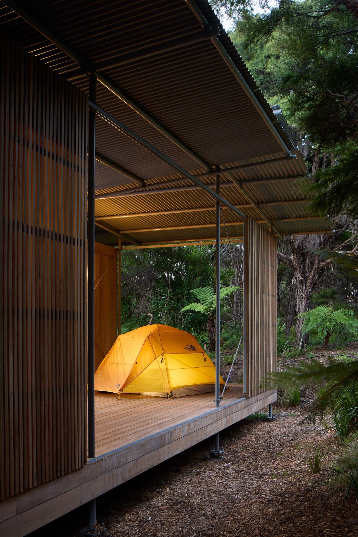
House for Camping
House for Camping sits on the boundary of Abel Tasman National Park, within a regenerating beech-podocarp forest of mature kānuka. Rather than clear new ground, Patchwork Architecture set the building inside an existing clearing and organised it as a courtyard type — pushing the structure to the forest edge and leaving the centre as a sun-filled outdoor room. The house is conceived as a series of rooms gathered beneath a single expansive roof. A single corrugated-steel roof spans the plan as one continuous plane, carried on a raked grid of slender steel posts and diagonal steel bracing that lift it clear of the timber volumes beneath. The rooms are wrapped in vertical timber board cladding, with narrower battened timber screens marking entries and enclosing the more private edges — a soft, weathering skin held apart from the steel frame that carries the roof above it. Deep verandas run beneath the overhanging roof around the courtyard's perimeter, linked by open timber decking. This is not a house that behaves like an ordinary one. Covered outdoor spaces frame apertures onto the surrounding bush and double as sleeping areas for extended family, with tents pitched beneath the eaves — sheltered, but still open to the outside. Bedrooms, living spaces and an outdoor shower are arranged along the covered edges of the courtyard, reached along the timber-decked breezeways that thread through its planting of native grasses and loose rock. Inside, walls and ceilings are lined in dark-stained timber, and a freestanding stainless-steel island anchors the kitchen at the centre of the living space. The plan stays tight and considered — generous enough for the rhythms of a big family without tipping into excess, its footprint small enough to read, from above, as little more than a clearing in the forest canopy. The site lies a short distance from one of New Zealand's most celebrated coastlines, set deep inside the forest the house was built to preserve. It asks something of the people who live there — an attentiveness to weather, to the bush, to what lies just beyond the building's edge. The house runs fully off-grid, generating its own power and collecting its own water, independent of the surrounding infrastructure; that self-sufficiency is what lets it sit this far into the forest without asking for more of it than the original clearing already gave up. Rory Wilson-Cartwright (SUPER OFFICE), the project architect, lived on site for close to a year during construction — off-grid, in a small temporary dwelling alongside builder George and his apprentice Marty, sharing a kitchen and working the tools alongside them. It was, by his account, an education in how buildings are actually made, and in how a place changes as it comes together.
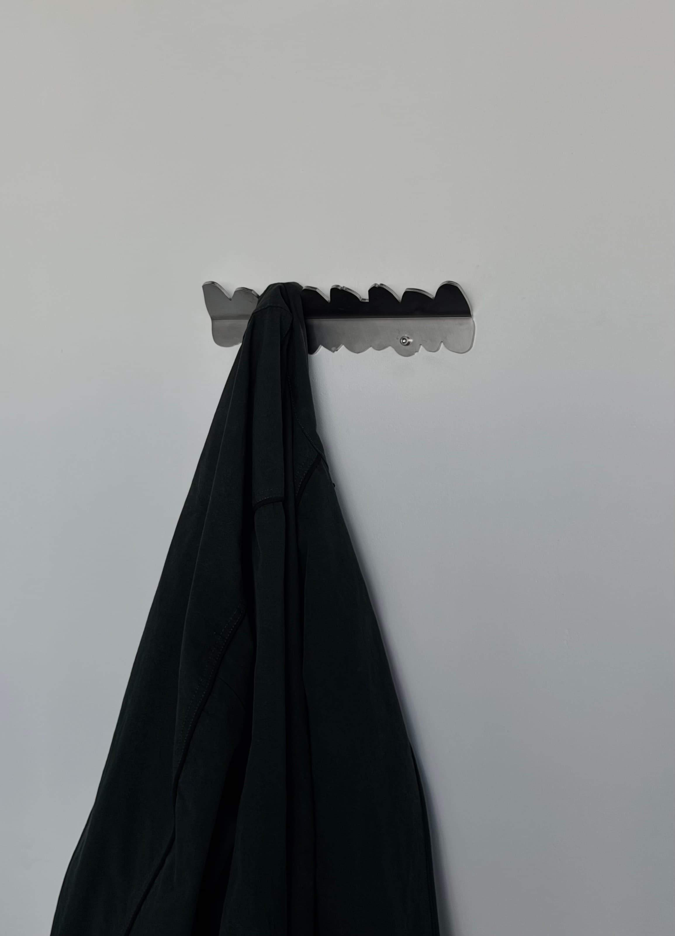
Coat Hook (Small)
A contemporary take on the traditional wall hook. The design started as hand-sketched shapes on paper, exploring abstract forms that could work as a coat hook. The sketches are scanned, scaled and edited digitally, then laser cut from a single sheet of solid 4mm stainless steel and bent at a 45° angle to offer a versatile resting place for coats, scarves, bags and hats, with every edge deburred to protect fabrics. It ships with custom screws that tighten with an Allen key; wall plugs aren't included, since these vary by wall type.
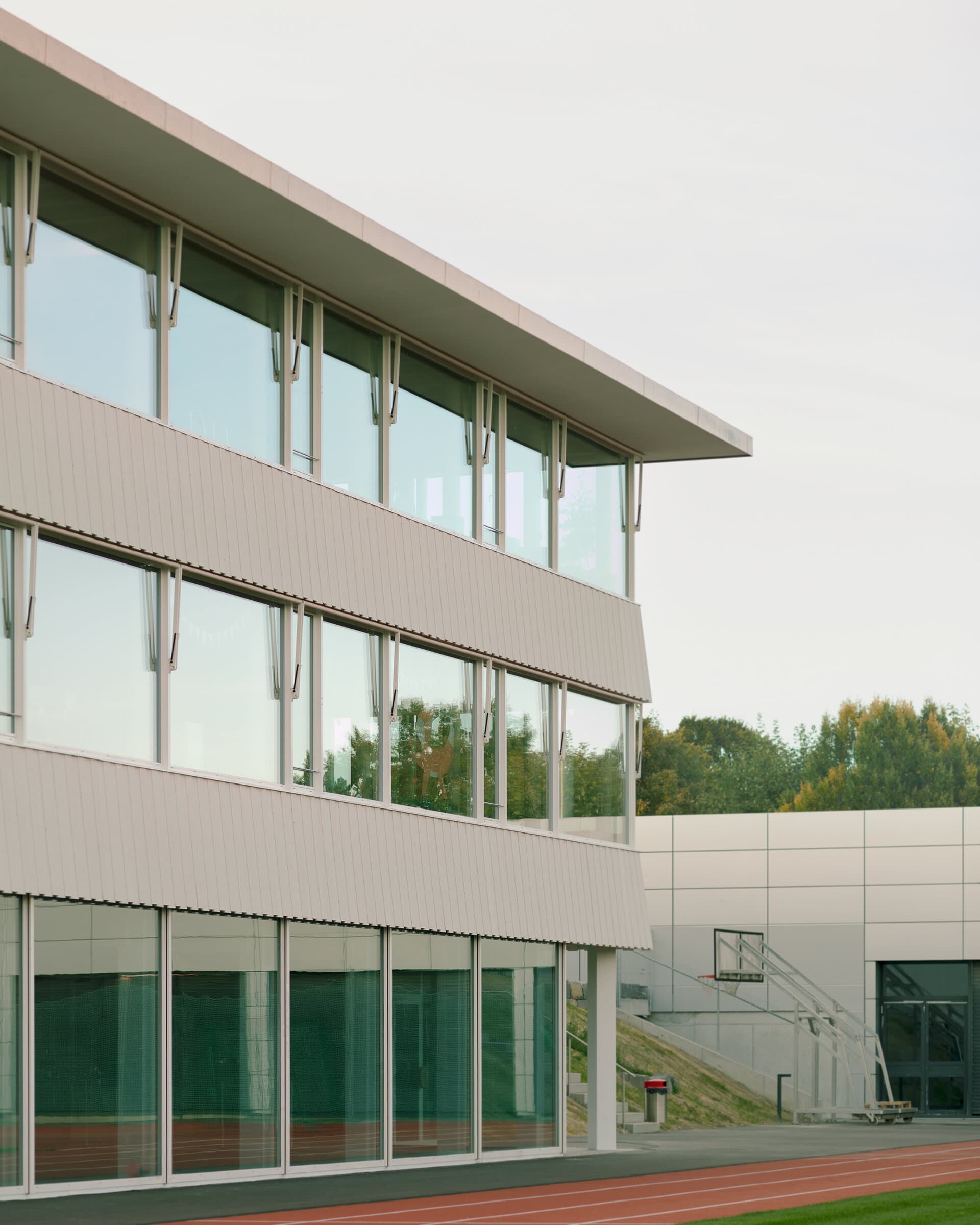
Stöckliacker School Complex
The Stöckliacker school complex in Lohn-Ammannsegg is defined by two fixed conditions: a large open space at its centre, and a site that slopes gently across it. Haller Gut Architekten's new building closes a gap in the complex, set between the existing double kindergarten and a multipurpose hall along Friedhofstrasse. Generous distances to the neighbouring school and residential buildings, together with sightlines kept open across the plot, preserve the site's spatial expanse despite the considerable densification the new building represents. The addition is a three-storey timber structure, filigree enough, in the architects' own description, to give the school an identity without adding visual weight to an already crowded site. It is oriented outward on every side rather than toward a single front: a generous canopy and three covered entrance loggias mark the points of arrival, sheltering the thresholds between inside and outside. The timber structure is left exposed throughout, standing as both frame and finish; in selected interior spaces raw brick is left similarly unfinished, extending the same restraint to the building's second material. In plan, the school and the sports hall are kept spatially separate so the two can be run independently. Rooms for sport sit in the gallery and basement levels; the ground floor gathers the kindergartens, the day school and a cultural room with direct access outside. Above, the school rooms are grouped into a cluster reached through a central, multi-purpose hall, with cloakrooms and study niches set along both sides of its façade — used for independent work as well as an informal break space. The slope that defines the site is treated as a working device rather than a condition to be levelled: because the ground falls toward the building, both the school's ground floor and the sports hall's gallery level can be entered directly at grade, without ramps, stairs or additional excavation. Outside, a green belt of trees runs along the street-facing edges of the plots and frames the shared open space at the centre of the complex; the playgrounds, sports fields and open areas surrounding the building are loosely rather than prescriptively arranged, offering different play and adventure zones to children of different ages, a range of activity further extended by a small natural forest at the site's edge. The project, designed and built between 2023 and 2025 for the Einwohnergemeinde Lohn-Ammannsegg, extends an existing school campus rather than replacing it — closing out the Stöckliacker complex's edge while leaving the ground it was built around, and the buildings either side of it, undisturbed.
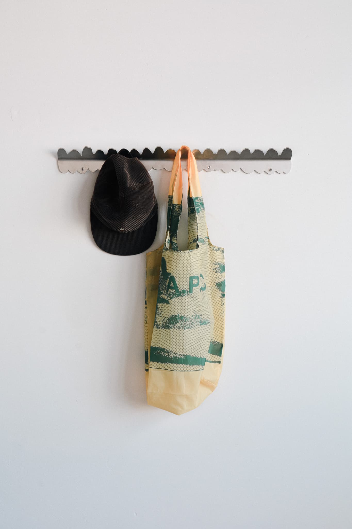
Coat Hook (Large)
A contemporary take on the traditional wall hook, in a longer format. The design started as hand-sketched shapes on paper, exploring abstract forms that could work as a coat hook. The sketches are scanned, scaled and edited digitally, then laser cut from a single sheet of solid 4mm stainless steel and bent at a 45° angle to offer a versatile resting place for coats, scarves, bags and hats, with every edge deburred to protect fabrics. It ships with custom screws that tighten with an Allen key; wall plugs aren't included, since these vary by wall type.
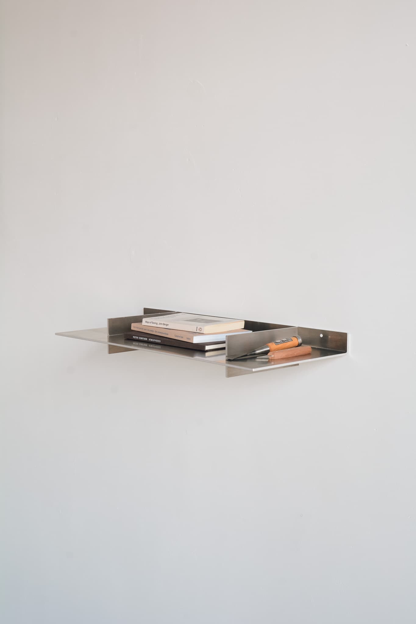
Wall Shelf S_600
The S-600 is a single shelf, folded from a single sheet of 4mm raw aluminium. Its strength comes from the construction. The shelf slides onto a vertical flange through precision-cut openings, locking the two parts together and carrying the load straight into the wall. Mounting is simple. A central keyhole slot takes the first screw: hang the shelf, level it, then mark and fix the remaining points. Stainless steel Phillips screws are included.
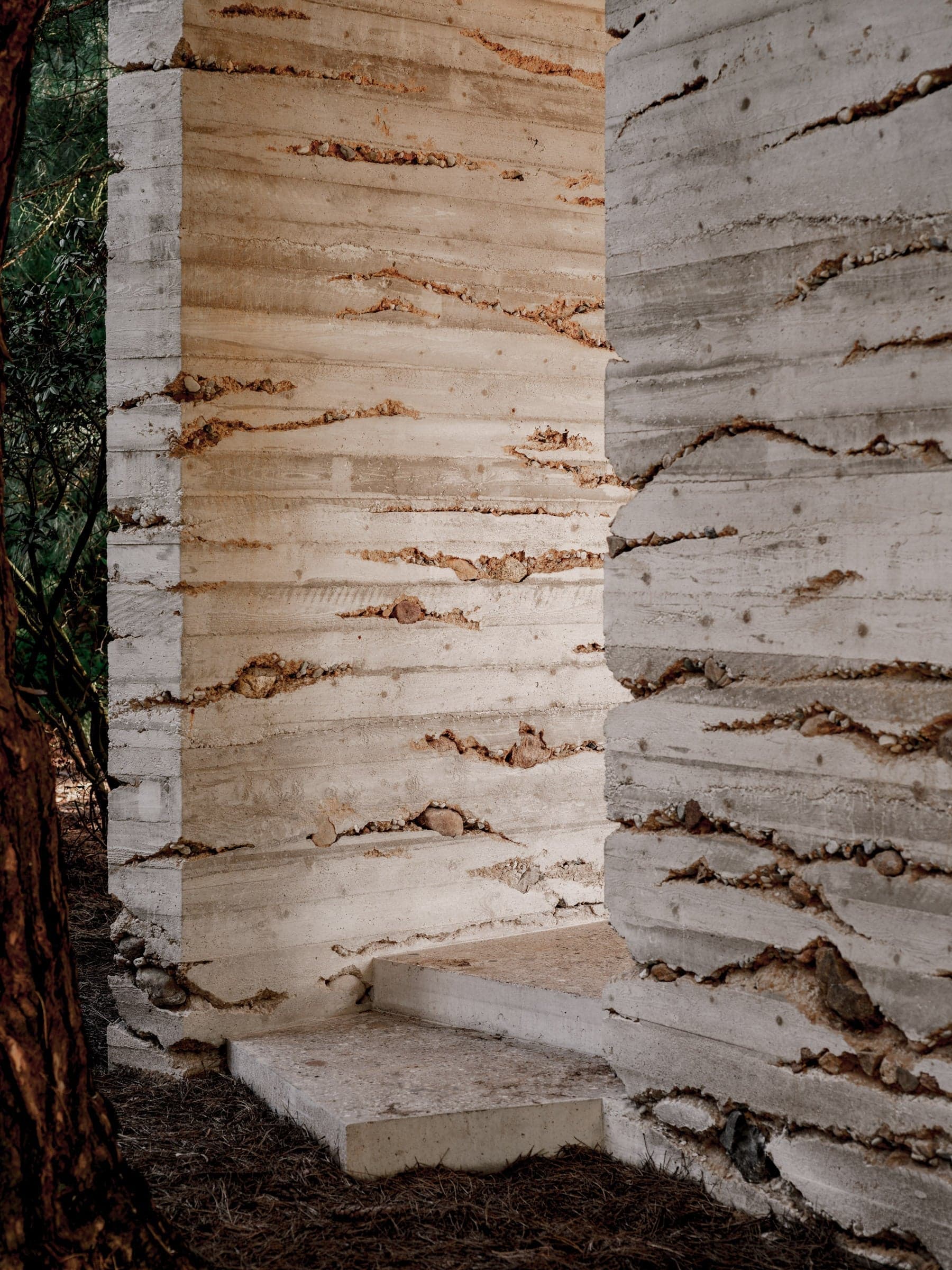
Pinetum
In 2018, a competition was held for a new pavilion in the Pinetum Blijdenstein botanical garden in Hilversum, attracting 135 architectural firms, including several prominent international names. Following a rigorous selection process, which narrowed the field to eight, then four, proposals, Enzo Valerio's design was selected as the winning entry. Over the next few years, the design evolved through close collaboration with Pinetum Blijdenstein, alongside efforts to secure funding for construction. After obtaining a building permit in 2022, numerous tests, material samples, and design iterations were conducted, culminating in the pavilion’s initial staking out in March 2023. Enzo Valerio’s studio is distinct in its hands-on approach, allowing continual refinement and adaptation throughout the construction phase. The pavilion’s architectural form comprises three robust, monolithic walls that appear to emerge naturally from the forest floor, seamlessly blending with their surroundings. A fluidly connected floor flows between the walls in three distinct directions, each creating a unique atmosphere and function. Above, a cantilevered roof appears to fold organically around the surrounding trees. The entire structure was crafted from a custom concrete mixture, incorporating sand excavated from the pavilion’s foundation and stones gathered on-site. This blend, featuring Hilversum’s characteristic yellow sand, lends a warm tone to the concrete. Hilversum’s soil plays a significant role in the pavilion’s design. This region is notable for its sandy subsoil, which has formed over centuries due to glacial and fluvial processes. The sand is not just a structural component but is integral to the design, embodying a connection to place. During the pouring of the pavilion walls, sand and stones from the garden were added to create horizontal striations, evoking the stratified layers seen in the area’s natural terrain. These bands highlight the weight and solidity of the structure, providing a visual narrative of the land’s geological history. In contrast, the pavilion’s floor features a polished finish that reveals embedded stones, showcasing a spectrum of colors and textures found in the garden’s soil. The roof was poured in seamless formwork, creating a smooth, reflective ceiling that brings the lush greenery of the garden into the pavilion’s interior. The process of creating this pavilion, blending thoughtful design with meticulous craftsmanship, is documented in the film At a Garden’s Pace by Juan Benavides, which premiered at the Architecture Film Festival Rotterdam (AFFR). The film offers an immersive look into the pavilion’s construction, where Enzo Valerio and a team of young architects, employed simple yet inventive techniques to explore and emphasize the “nature of concrete.” Under the attentive eyes of the gardener and garden visitors, their dedication illustrates that construction is as much a creative and integral part of the design process as any other stage. This meditative documentary highlights how exceptional design, coupled with skilled craftsmanship, can transform even a modest commission into a living work of art.
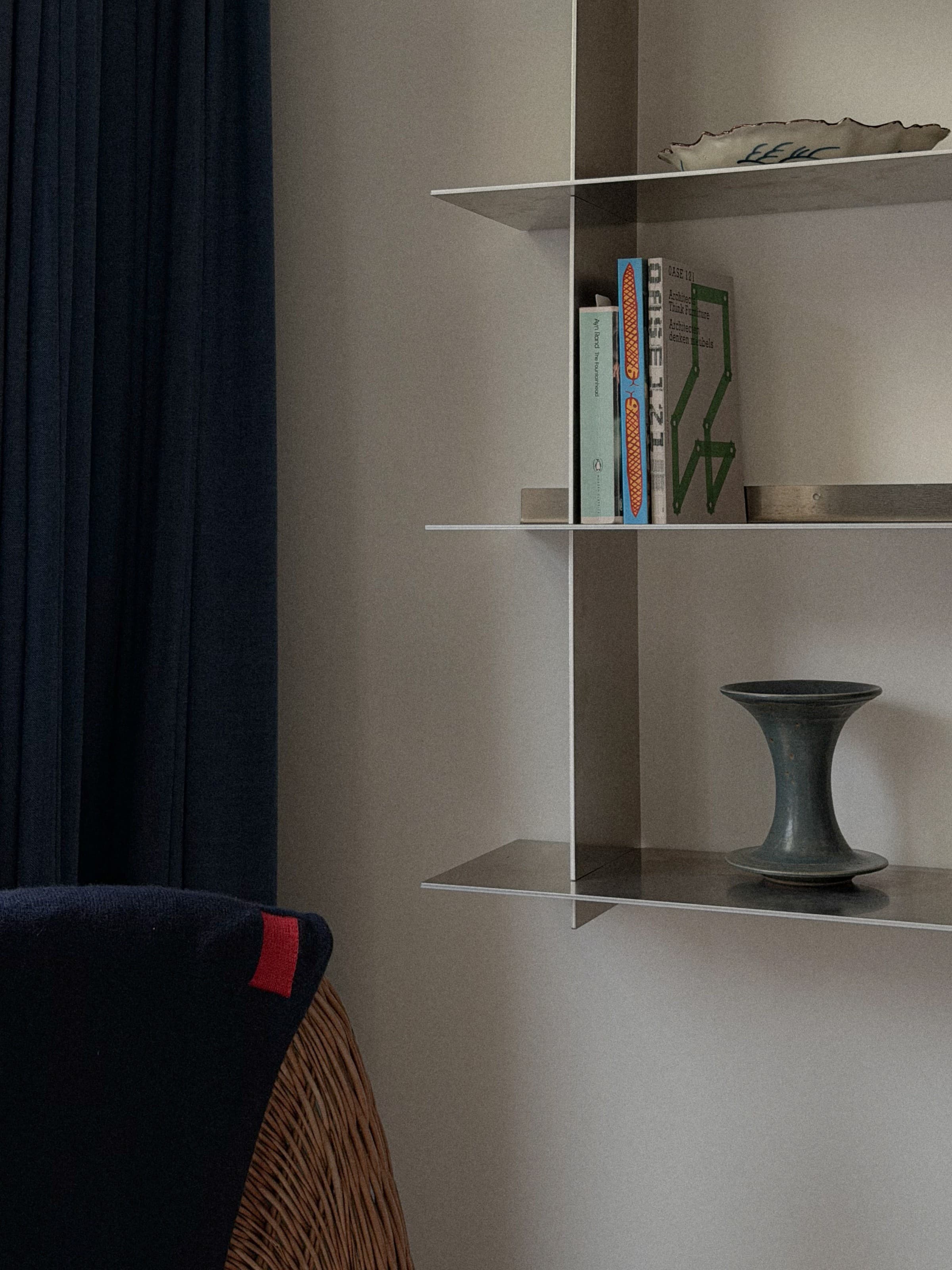
Wall Shelf Q_600
The Q-600 is a four-tier shelf, each tier folded from a single sheet of 4mm raw aluminium. Its strength comes from the construction. Each shelf slides onto a vertical flange through precision-cut openings, locking the two parts together and carrying the load straight into the wall. Mounting is simple. A central keyhole slot takes the first screw: hang each shelf, level it, then mark and fix the remaining points. Stainless steel Phillips screws are included.
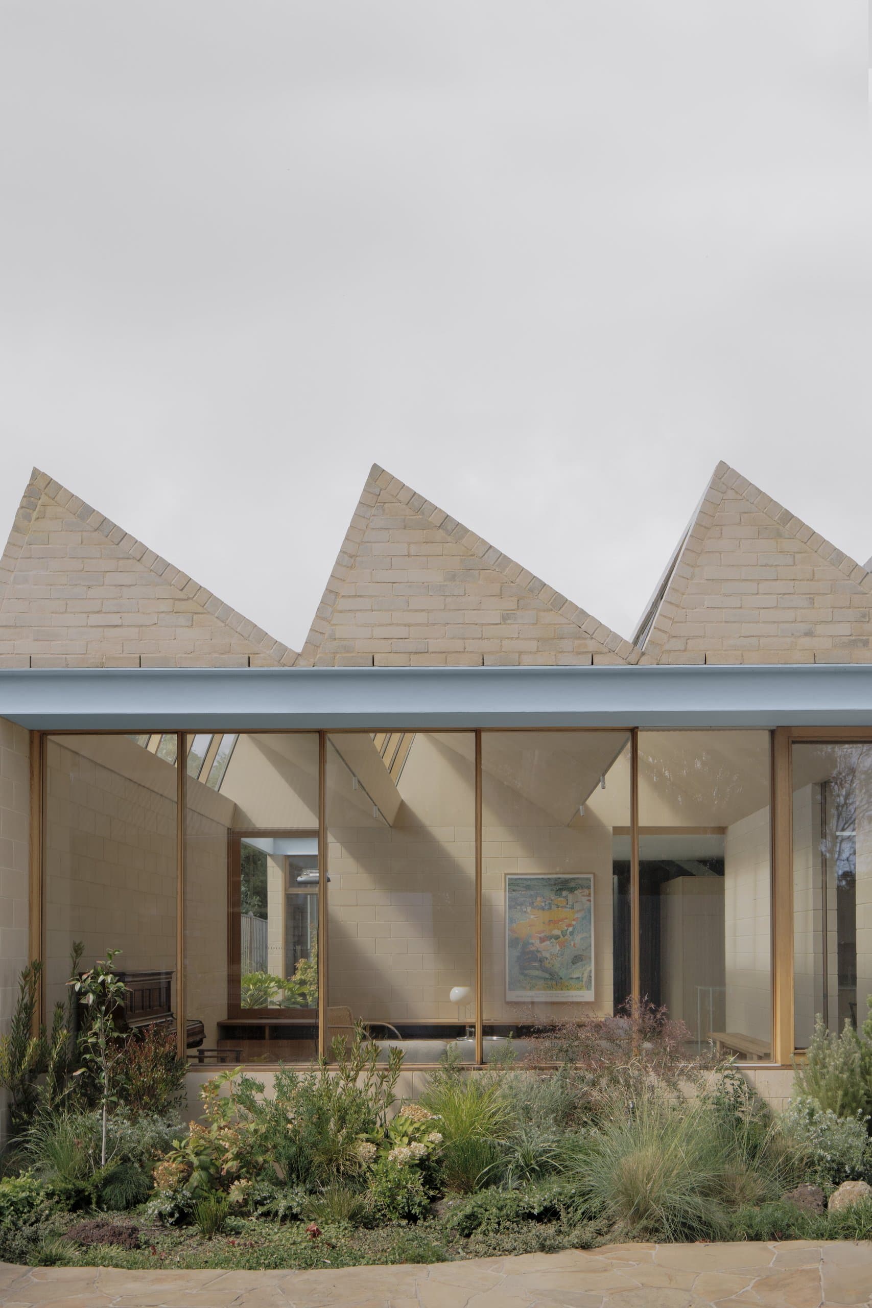
A Courtyard House
A Courtyard House sets out to bring the garden inside, and takes its brief almost literally: a house and garden its owners intend to be able to live in their whole life. That single condition — long-term accessibility held in view from the start — reorganises the plan around difference rather than a single shared centre of gravity. The two main occupants, one an artist and one in business, and both grandparents to a family that gathers here when it is in town, keep distinct interests and routines, so the house is arranged to let those lives run in parallel and only converge when they need to. The organising device is a loose nine-square grid that breaks the ground into four quadrants of occupation. Each quadrant is left free to answer its own programmatic and climatic brief through its openings, outlooks and roof profile, so no two parts of the house read quite the same. What holds them together is the centre: the kitchen sits at the heart of the plan as the collective space for everyone, with gardens set around it and each interior paired with an equivalent piece of outdoor room. Above, a second level carries separate sleeping and entertainment quarters, so the extended family can be housed without folding back into the primary living areas. Structure and material follow a constraint written into the site — a 1918 covenant requiring all visible walls and roofs to be tile, brick or concrete. The house takes this at face value: double concrete block walls on the ground level, rendered brick to level 01 and the visible roofs. Between the two palettes runs a band of pale blue steel, a parallel flange channel that reappears across the project as lintel, rainhead, awning and soft boundary in turn. It is a single continuous detail asked to do many things, and in that economy it carries a recurring MI—JI ambition — to make a lot from little. The building's form is also its environmental strategy. All available roof space is given over to photovoltaic panels tied to a multi-battery store and car charging, gas is disconnected from the site entirely, and heating and cooling run on a heat pump drawing from the same array. The massing is tuned to suit: the double-storey portion is placed to the south to limit overshadowing of the panels, which also keeps the most-used northern rooms low and at a human scale. The landscape, by SL.ug, was worked as a major element rather than a surround, and the whole site — paths inside and out, thresholds set flush — is detailed for wheelchair access, making good on the brief's long horizon. The contractor, DIMPAT, carried the joinery and carpentry that the scheme's precision depends on. What the house finally proposes is a way of holding difference together without flattening it. By dividing the ground into quadrants and pairing each room with a garden, A Courtyard House lets separate lives keep their own light, outlook and roof, then draws them back to a shared kitchen at the centre — architecture that orders variety rather than resolving it away.
Newsletter