The Perpetua Forma editorial — long-form writing on architecture, furniture and photography. Use the filters below to narrow by studio, photographer, material or year.
Filter by , , , or .
House for Camping
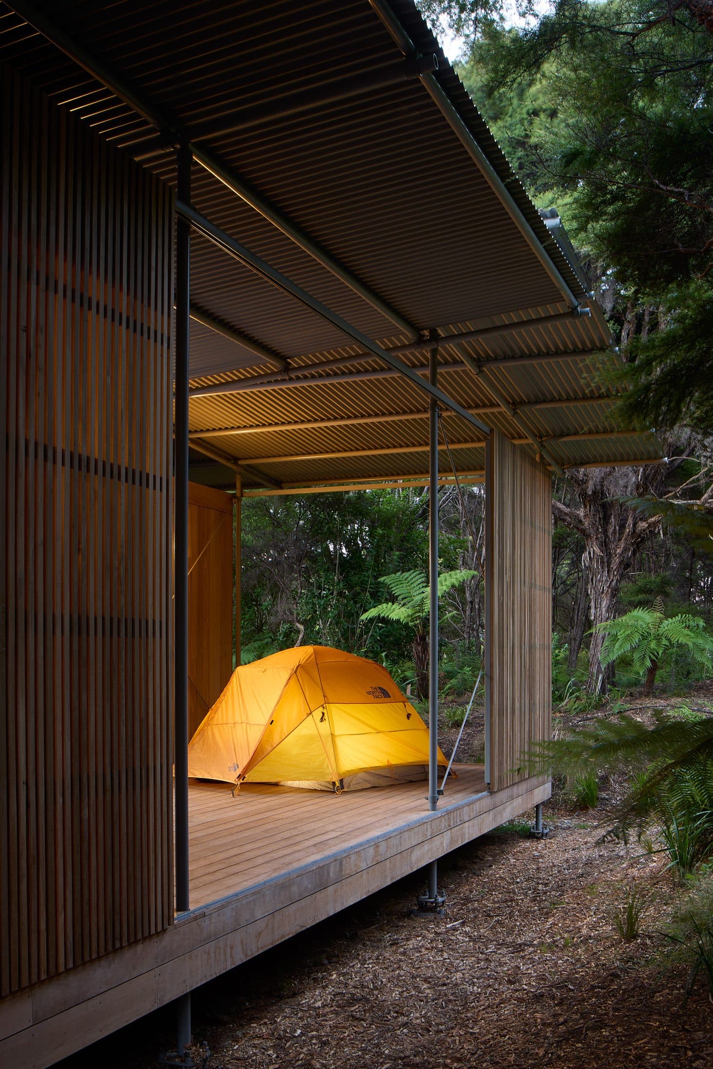
House for Camping sits on the boundary of Abel Tasman National Park, within a regenerating beech-podocarp forest of mature kānuka. Rather than clear new ground, Patchwork Architecture set the building inside an existing clearing and organised it as a courtyard type — pushing the structure to the forest edge and leaving the centre as a sun-filled outdoor room. The house is conceived as a series of rooms gathered beneath a single expansive roof. A single corrugated-steel roof spans the plan as one continuous plane, carried on a raked grid of slender steel posts and diagonal steel bracing that lift it clear of the timber volumes beneath. The rooms are wrapped in vertical timber board cladding, with narrower battened timber screens marking entries and enclosing the more private edges — a soft, weathering skin held apart from the steel frame that carries the roof above it. Deep verandas run beneath the overhanging roof around the courtyard's perimeter, linked by open timber decking. This is not a house that behaves like an ordinary one. Covered outdoor spaces frame apertures onto the surrounding bush and double as sleeping areas for extended family, with tents pitched beneath the eaves — sheltered, but still open to the outside. Bedrooms, living spaces and an outdoor shower are arranged along the covered edges of the courtyard, reached along the timber-decked breezeways that thread through its planting of native grasses and loose rock. Inside, walls and ceilings are lined in dark-stained timber, and a freestanding stainless-steel island anchors the kitchen at the centre of the living space. The plan stays tight and considered — generous enough for the rhythms of a big family without tipping into excess, its footprint small enough to read, from above, as little more than a clearing in the forest canopy. The site lies a short distance from one of New Zealand's most celebrated coastlines, set deep inside the forest the house was built to preserve. It asks something of the people who live there — an attentiveness to weather, to the bush, to what lies just beyond the building's edge. The house runs fully off-grid, generating its own power and collecting its own water, independent of the surrounding infrastructure; that self-sufficiency is what lets it sit this far into the forest without asking for more of it than the original clearing already gave up. Rory Wilson-Cartwright (SUPER OFFICE), the project architect, lived on site for close to a year during construction — off-grid, in a small temporary dwelling alongside builder George and his apprentice Marty, sharing a kitchen and working the tools alongside them. It was, by his account, an education in how buildings are actually made, and in how a place changes as it comes together.
Stöckliacker School Complex
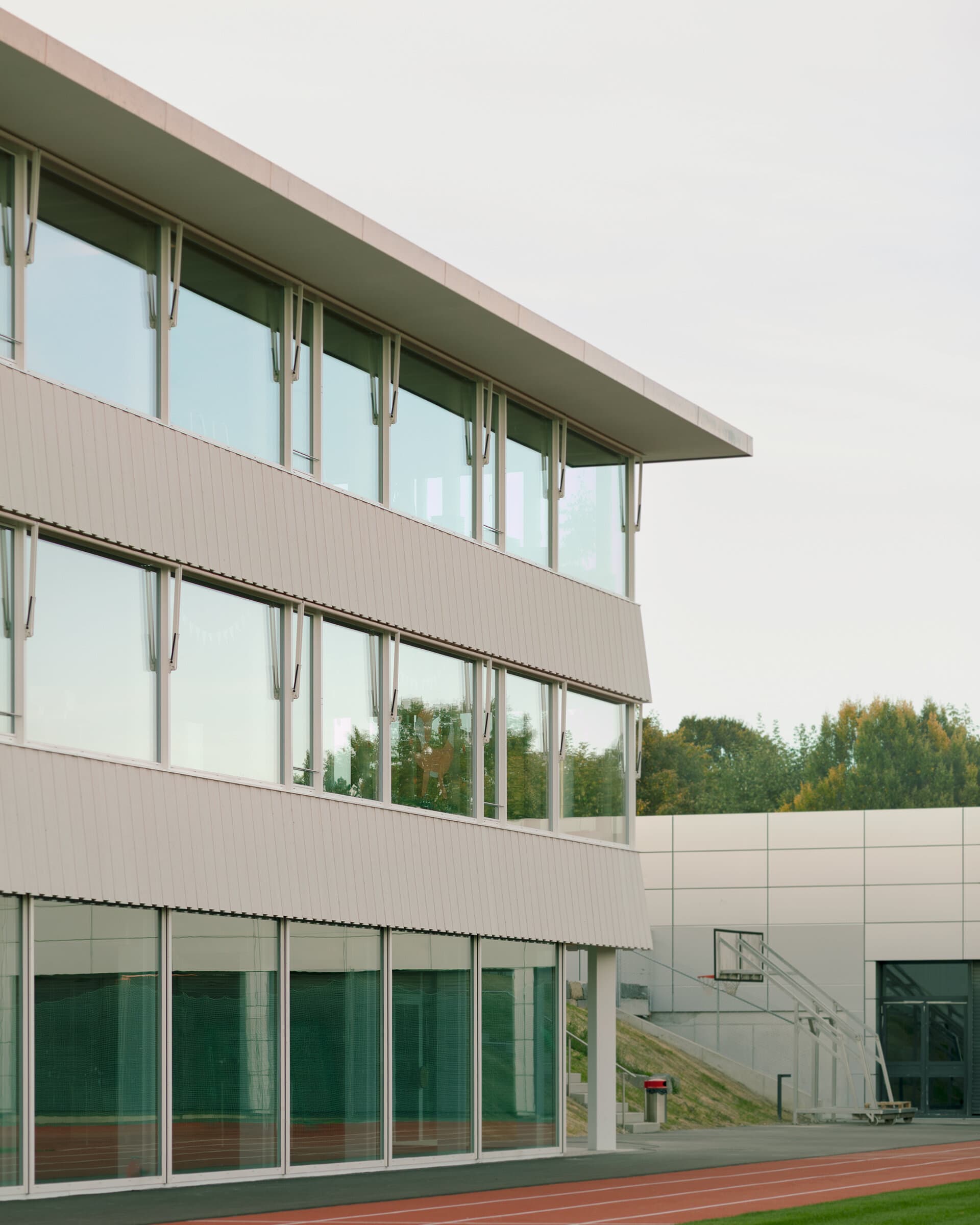
The Stöckliacker school complex in Lohn-Ammannsegg is defined by two fixed conditions: a large open space at its centre, and a site that slopes gently across it. Haller Gut Architekten's new building closes a gap in the complex, set between the existing double kindergarten and a multipurpose hall along Friedhofstrasse. Generous distances to the neighbouring school and residential buildings, together with sightlines kept open across the plot, preserve the site's spatial expanse despite the considerable densification the new building represents. The addition is a three-storey timber structure, filigree enough, in the architects' own description, to give the school an identity without adding visual weight to an already crowded site. It is oriented outward on every side rather than toward a single front: a generous canopy and three covered entrance loggias mark the points of arrival, sheltering the thresholds between inside and outside. The timber structure is left exposed throughout, standing as both frame and finish; in selected interior spaces raw brick is left similarly unfinished, extending the same restraint to the building's second material. In plan, the school and the sports hall are kept spatially separate so the two can be run independently. Rooms for sport sit in the gallery and basement levels; the ground floor gathers the kindergartens, the day school and a cultural room with direct access outside. Above, the school rooms are grouped into a cluster reached through a central, multi-purpose hall, with cloakrooms and study niches set along both sides of its façade — used for independent work as well as an informal break space. The slope that defines the site is treated as a working device rather than a condition to be levelled: because the ground falls toward the building, both the school's ground floor and the sports hall's gallery level can be entered directly at grade, without ramps, stairs or additional excavation. Outside, a green belt of trees runs along the street-facing edges of the plots and frames the shared open space at the centre of the complex; the playgrounds, sports fields and open areas surrounding the building are loosely rather than prescriptively arranged, offering different play and adventure zones to children of different ages, a range of activity further extended by a small natural forest at the site's edge. The project, designed and built between 2023 and 2025 for the Einwohnergemeinde Lohn-Ammannsegg, extends an existing school campus rather than replacing it — closing out the Stöckliacker complex's edge while leaving the ground it was built around, and the buildings either side of it, undisturbed.
A Courtyard House
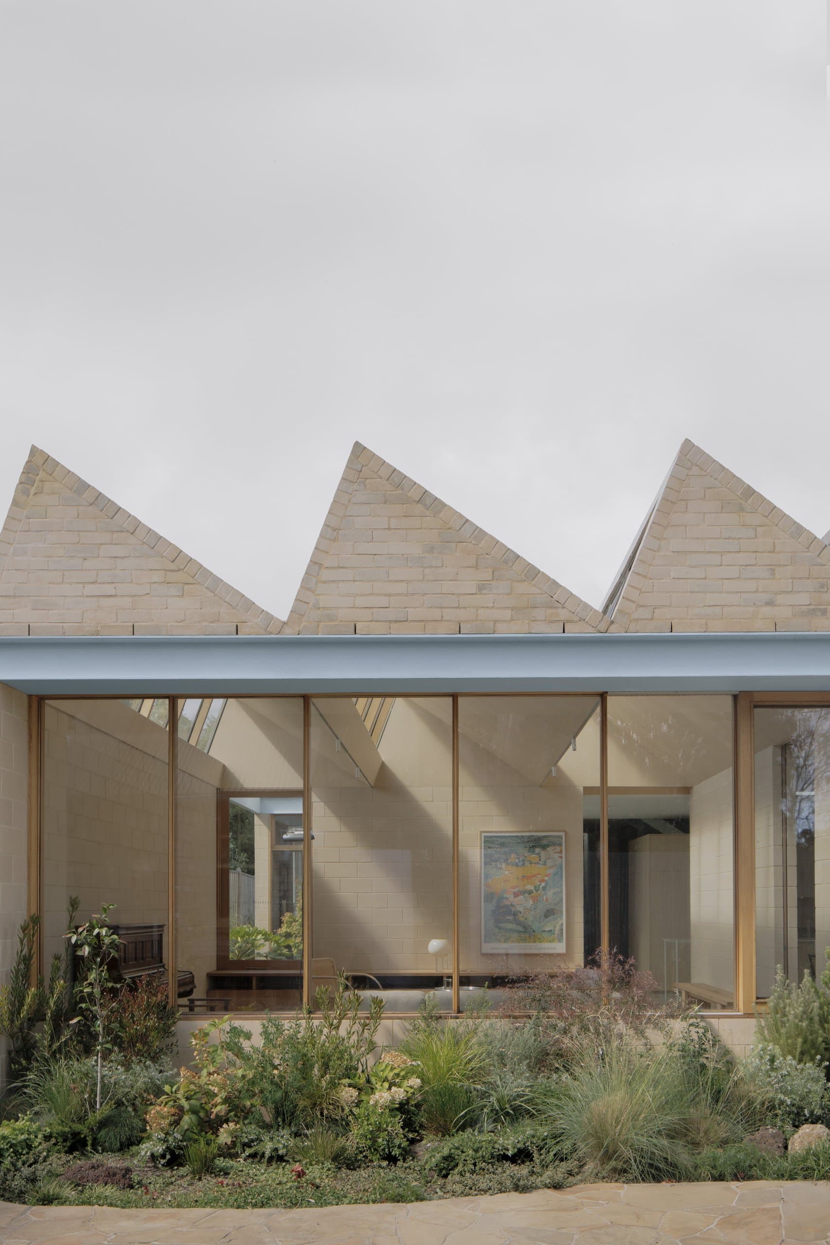
A Courtyard House sets out to bring the garden inside, and takes its brief almost literally: a house and garden its owners intend to be able to live in their whole life. That single condition — long-term accessibility held in view from the start — reorganises the plan around difference rather than a single shared centre of gravity. The two main occupants, one an artist and one in business, and both grandparents to a family that gathers here when it is in town, keep distinct interests and routines, so the house is arranged to let those lives run in parallel and only converge when they need to. The organising device is a loose nine-square grid that breaks the ground into four quadrants of occupation. Each quadrant is left free to answer its own programmatic and climatic brief through its openings, outlooks and roof profile, so no two parts of the house read quite the same. What holds them together is the centre: the kitchen sits at the heart of the plan as the collective space for everyone, with gardens set around it and each interior paired with an equivalent piece of outdoor room. Above, a second level carries separate sleeping and entertainment quarters, so the extended family can be housed without folding back into the primary living areas. Structure and material follow a constraint written into the site — a 1918 covenant requiring all visible walls and roofs to be tile, brick or concrete. The house takes this at face value: double concrete block walls on the ground level, rendered brick to level 01 and the visible roofs. Between the two palettes runs a band of pale blue steel, a parallel flange channel that reappears across the project as lintel, rainhead, awning and soft boundary in turn. It is a single continuous detail asked to do many things, and in that economy it carries a recurring MI—JI ambition — to make a lot from little. The building's form is also its environmental strategy. All available roof space is given over to photovoltaic panels tied to a multi-battery store and car charging, gas is disconnected from the site entirely, and heating and cooling run on a heat pump drawing from the same array. The massing is tuned to suit: the double-storey portion is placed to the south to limit overshadowing of the panels, which also keeps the most-used northern rooms low and at a human scale. The landscape, by SL.ug, was worked as a major element rather than a surround, and the whole site — paths inside and out, thresholds set flush — is detailed for wheelchair access, making good on the brief's long horizon. The contractor, DIMPAT, carried the joinery and carpentry that the scheme's precision depends on. What the house finally proposes is a way of holding difference together without flattening it. By dividing the ground into quadrants and pairing each room with a garden, A Courtyard House lets separate lives keep their own light, outlook and roof, then draws them back to a shared kitchen at the centre — architecture that orders variety rather than resolving it away.
The Apple House
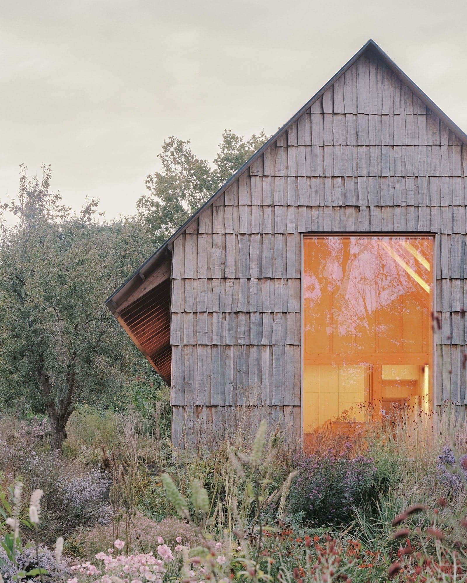
Located at Serge Hill in Hertfordshire, The Apple House by Okra Studio is a multifunctional community building dedicated to horticulture, education, and wellbeing. Commissioned by The Serge Hill Project for Gardening and Health, the project was developed in collaboration with landscape designer Tom Stuart-Smith and engineers Structure Workshop, and completed in 2024 after a six-year process. The project reflects a deep commitment to natural materials and local sourcing. Almost everything above ground level is made from natural components: hempcrete walls, cleft oak cladding, and a floor of unfired clay sourced and prepared within ten miles of the site. Together with a spruce glulam frame designed in collaboration with Structure Workshop, these materials create a robust yet inviting structure. Internally, the natural finishes remain visible and tactile: lime-plastered walls and the clay floor contribute to a calm, warm atmosphere, while the hempcrete provides both insulation and structural support. The architecture embodies the project’s environmental and social values, demonstrating that material sustainability can be expressed in both performance and experience. The building’s openings frame distinct views: a woodland to the south, a vegetable garden to the east, and an extensive plant library to the west. These connections reinforce the link between architecture and landscape, supporting a year-round programme of horticultural education and community activities for schools, youth groups, mental health charities, residents, and designers. With its accessible layout, adaptable spaces, and inclusive ethos, The Apple House provides essential infrastructure for a growing public programme that prioritises access to nature for those who have least opportunity to experience it. The project exemplifies how thoughtful, low-impact architecture can support environmental stewardship and wellbeing through design that is at once robust, welcoming, and deeply rooted in its setting.

Villa V
In Poblenou, a semi-detached house had been put together over the years an almost self-constructed manner. Its footprint is a single bay, 4.7 metres wide between party walls and 18 metres deep, so daylight could enter only at the two short ends of the plan. Above the original ground floor, three further volumes had been added one after another in low-quality systems and materials, and the result was a sequence of dark, fragmented rooms with few spatial qualities to speak of. Aramé Studio's transformation works from that condition rather than clearing it away. The decisive move is a subtraction. Working directly with the existing structure, the project removes the central volume of the upper floor and opens a large double-height void in its place. A large skylight above it lets light reach the whole interior, where before it stopped at either end — a single gesture that reverses the conditions the house was built with. The void is both where the project begins and where it is most intense: it holds the main staircase, organised around the skylight, and gives the rest of the dwelling its spatial structure. Below, the ground floor is treated as one continuous living space, closely tied to the rear patio. The centre of the plan is kept free, while the kitchen, bathrooms, storage and fixed furniture are pushed to the perimeter, so the living areas run into one another without division. In the middle of this open floor stands an island-table of concrete cast in situ — fixed, immovable, and intended as the domestic core of the house. The studio treats it as infrastructure for collective life rather than as furniture: the place for gathering, working, shared meals and everyday celebrations, around which domestic life unfolds. The void also introduces a scale rarely found in domestic interiors. Aramé Studio relates it to the historical palace and the bourgeois house, where the staircase held a central and representative position, and the reference carries into ordinary use: going up or down the stairs becomes a spatial event with an almost theatrical quality rather than a purely functional passage. That monumentality is deliberately held in check by the materials. The walls lit by the skylight expose the successive layers and materials from which the house was built over time, leaving the marks, scars and imperfections of the existing structure in view. The staircase draws on a vernacular and industrial imaginary and is assembled with traditional timber construction techniques, while the island-table stands as a monolithic piece of raw concrete — heavy, primitive, closer to infrastructure than to an object. The house keeps these terms in tension without resolving them — monumentality and austerity, bourgeois spatiality and vernacular construction, domesticity and theatre — and its ambiguity is precisely what it proposes.
Pilates Pavilion
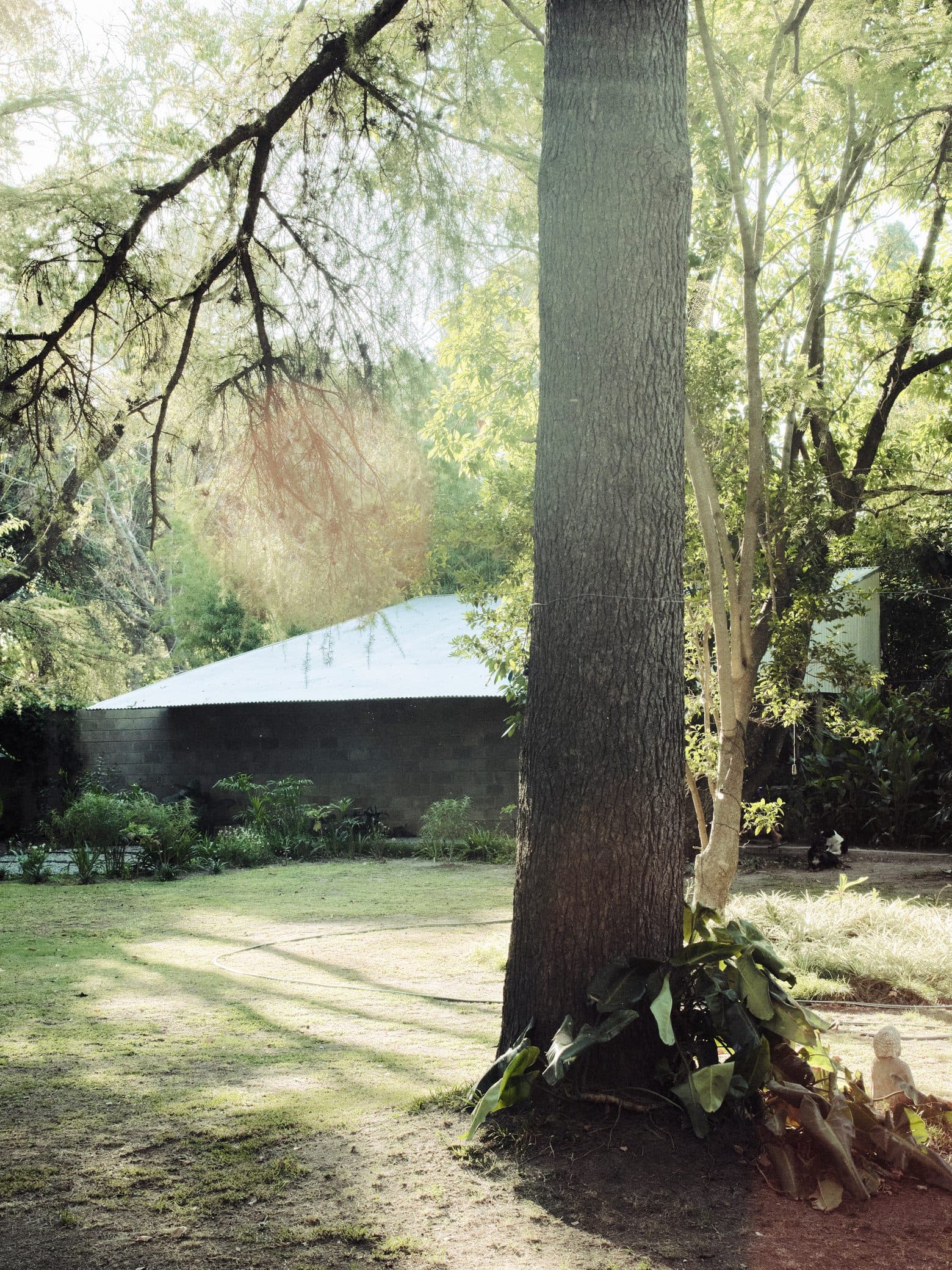
The Pilates Pavilion sets a semi-public program inside a private garden and asks how far a small building can open before it stops being a room. Rather than a sealed box dropped onto the lawn, the studio is assembled from a series of walls that fragment and structure the space, with a single continuous roof laid over them to define the interior. The governing move is one of definition without enclosure: the walls draw boundaries and organise the garden, but they never fully close it, so the pavilion reads as a fragment of the landscape given order rather than a volume set against it. That continuity is carried by the section as much as the plan. Oriented with its back to the north, the rear wall stops short of the roof, and in the gap between the two a semi-translucent surface takes over. Light entering there is filtered by the adjacent vegetation, which is left to act as a natural sunshade, so the wall that should close the room instead dematerialises into a band of screened daylight. Horizontal elements order circulation and use beneath the continuous roof, holding the interior together while the edges are allowed to soften. The plan is organised around a square of 10 × 10 metres. Toward the street, an internal courtyard of 5 × 10 metres holds the building back from the public realm, and the logic of pairing each interior space with an equivalent exterior void is repeated throughout. A core runs through the plan to organise circulation, and along its long side it reflects the lateral courtyards: the pilates room faces the internal courtyard, while the waiting area is set against a second courtyard that keeps its distance from the domestic garden. The enclosure is deliberately blurred, with the courtyards working as transitional spaces between programs and wrapping the user in a continuous sequence of exterior rooms. Approach reinforces the same intention. Entry is from the garden, where a band of tall vegetation forms the first separation from the domestic domain. A front overhang marks the threshold and leads into a waiting area that stays open to the exterior, and only from there is the pilates room reached. Throughout, the sequence of arrival is constructed in relation to long views toward the outdoor spaces, so movement into the building is measured against the garden rather than away from it. What the pavilion finally proposes is a way of adding to a garden without overwriting it. By fragmenting the ground into walls, roofs and paired voids, it introduces a new program while leaving the original logic of the site intact — an architecture that defines and orders its setting precisely by refusing to close it off.
Monkton
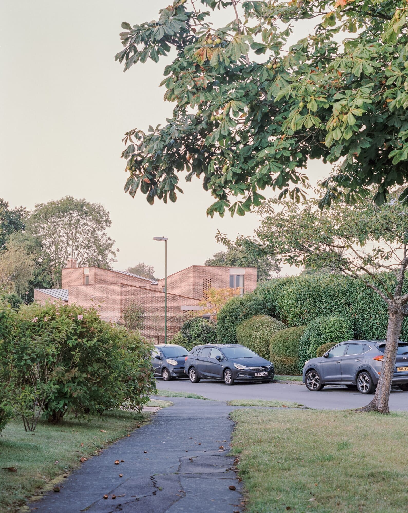
Sandy Rendel Architects has completed a new four-bedroom house on a brownfield plot within the modern fringe of the historic village of Cuckfield, West Sussex, replacing a dilapidated bungalow that had been poorly extended since the 1970s and had reached the end of its serviceable life. The site is a narrow, 70-metre-long plot behind the high street, backing onto the old village brick fields with distant views to the Downs. Its immediate surroundings offer no consistent grain — a piecemeal mix of styles and typologies that developed with little regard for the site — so the house responds instead to topography and to an awkward proximity with its neighbours, conceived to be physically robust, flexible in use and sensitive to a varied context. The site falls four metres from Ardingly Road to the garden's southern edge, and the house follows that slope, stepping down the hill so that ceiling heights grow more generous the deeper the plan reaches into its principal living spaces. At ground level it is laid out as a simple rectilinear plan, cut into around its perimeter to draw daylight further into the interior and to form sheltered external spaces. Out of this plinth rise three bedroom "towers" at first floor, each reached by its own private stair — distinct territories for parents and their grown-up children rather than a shared corridor. Sandy Rendel likens the arrangement to a Carthusian monastery such as the nearby St Hugh's Charterhouse, where two-storey hermitages for the solitary activities of individual monks are linked by a cloister and the other key communal spaces. The towers carry simple mono-pitch roofs, each oriented in a different direction to break down the mass of the building at the upper floor. Their separation gives each tower a dual aspect over the garden while preventing overlooking of the adjacent properties on the east and west boundaries. At the entrance, a covered external link connects the main house to a separate single-storey garage and annexe wing, the two framing an entrance yard. Built to a pragmatic construction approach, the house is finished in a palette of robust, self-finished materials chosen to weather naturally and develop character, echoing the tonal and textural qualities of the red clay brick and tile that surround it: a waterstruck soft red brick laid in gritty lime mortar, accented with precast concrete elements and the crisp detailing of copper roofs. Internally, the structural logic stays legible, zoned by different treatments — areas of exposed Douglas fir ceiling joists, painted brick drums enclosing the spiral stairs, and a bespoke cruciform steel column. The house is built around a fabric-first approach, with a high-performance envelope, an air-source heat pump and a whole-house MVHR system; it achieved an EPC B rating at completion, and a photovoltaic array with battery storage — deferred for budget reasons — is scheduled for installation this year, expected to bring that up to an A rating. Its long-life, loose-fit strategy treats the plan as a series of generous, adaptable spaces: a ground-floor bedroom and separate annexe, linked to the main house by a covered walkway, currently serve as a home office and gym but are designed to also suit a small Airbnb. Construction proceeded as a self-build with client direct-employed subcontractors, starting on site in April 2021 and completing in March 2024 — a drawn-out process that began during Covid and fitted in around the availability of funds and the client's other work.
Aeschylou - Trikoupi
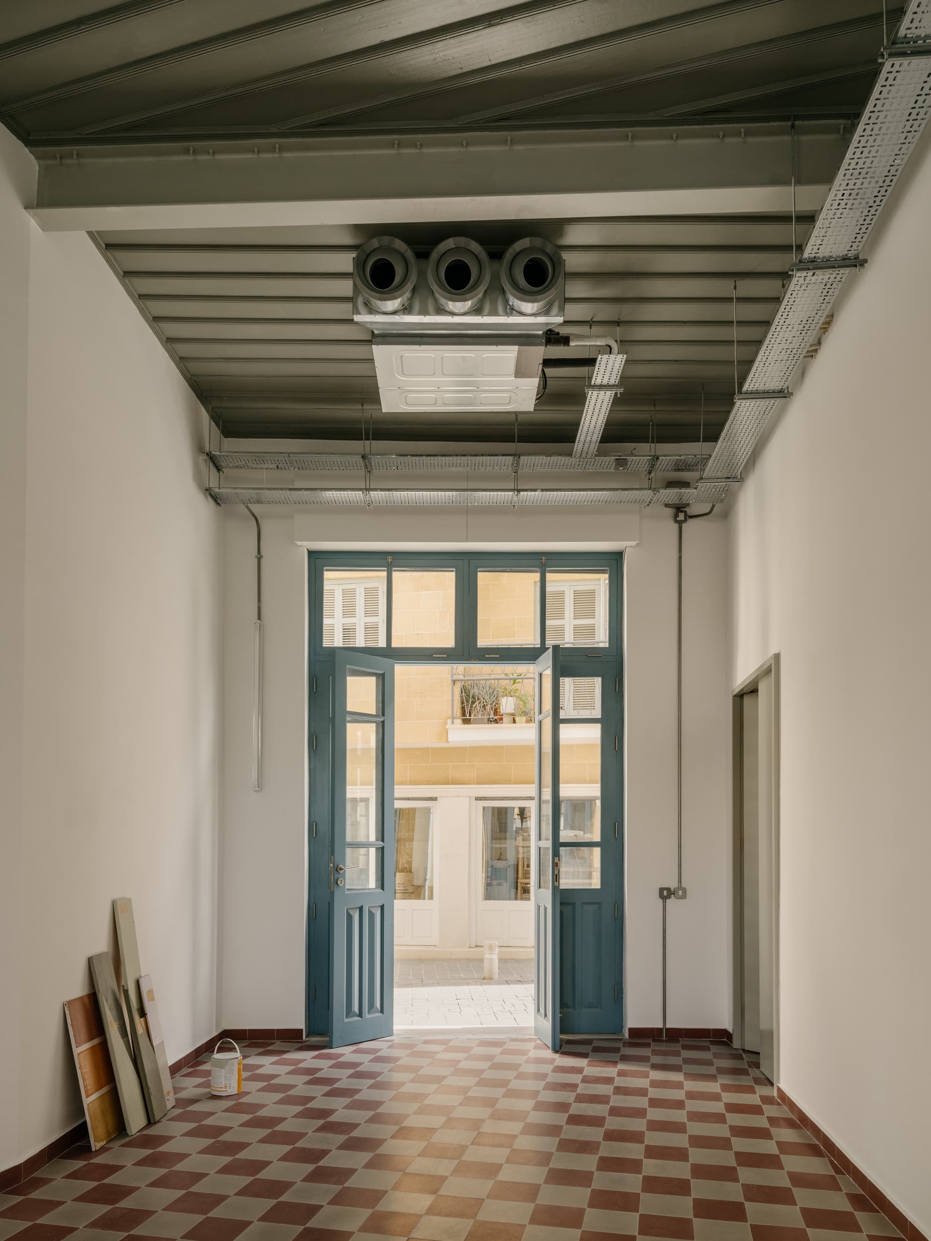
A listed three-storey building from the 1920s stands at the apex of a triangular block in the walled city of Nicosia, where Aeschylou and Trikoupi streets meet. Its rounded façade follows that geometry, turning the corner rather than meeting it. The restoration by Anastasiou Misseri proceeds from a decision that governs everything after it: the building keeps the uses it was built for. Commerce stays on the ground floor and a residence occupies the two floors above, so the work becomes a negotiation between an inherited fabric and the demands of contemporary living rather than a change of programme. At street level the existing shop has been fully restored into a flexible commercial space, composed of two interlocking areas and a small back-of-house room. Mechanical and electrical installations are left exposed — a decision that keeps the interior spatially legible and leaves it adaptable for whoever takes it on next. The residence is reached separately, through a side entrance at ground floor. A timber staircase rises to a central hall on the first floor, which distributes to the bedrooms, bathrooms and a reading room, with the main living spaces placed on the top level. The original layout is retained throughout, new features and services threaded through the existing fabric, and material choice and tectonic expression are used to hold a subtle contrast between old and new. The one substantial addition sits on the original terrace. A lightweight extension bridges the kitchen and living room on the top floor to form a dining space that can open fully, extending onto the terraces on either side; beside it, a small polygonal volume contains an exterior toilet. Both are clad entirely in zinc sheets. The material does two things at once — it is durable, and it declares the addition as an addition, so the new work reads as a distinct layer rather than an imitation of what it joins. The restoration itself was carried out with traditional construction techniques. Existing stone masonry walls were repaired and structurally reinforced, and walls and floor slabs were reconstructed faithful to their original design and construction methods. Timber window frames, shutters and doors were restored, and the existing staircase delicately conserved. Tiled floor finishes were replaced with replicated handmade clay tiles reproducing the original patterns, while timber flooring was reintroduced in every room that originally had it, laid in the exact orientation of the original planks. What the building already offered has been kept in play. All levels carry generous floor-to-ceiling heights and varied fenestration types, with balconies oriented north, east and west, and the top floor holds panoramic views across Nicosia. Set within the narrow streets of the walled city, the building's rounded corner and its position at the apex of the block give it a presence that the restoration reinforces rather than restates. The result is a building that performs its original two lives again, with the century between them left visible.
Raw House
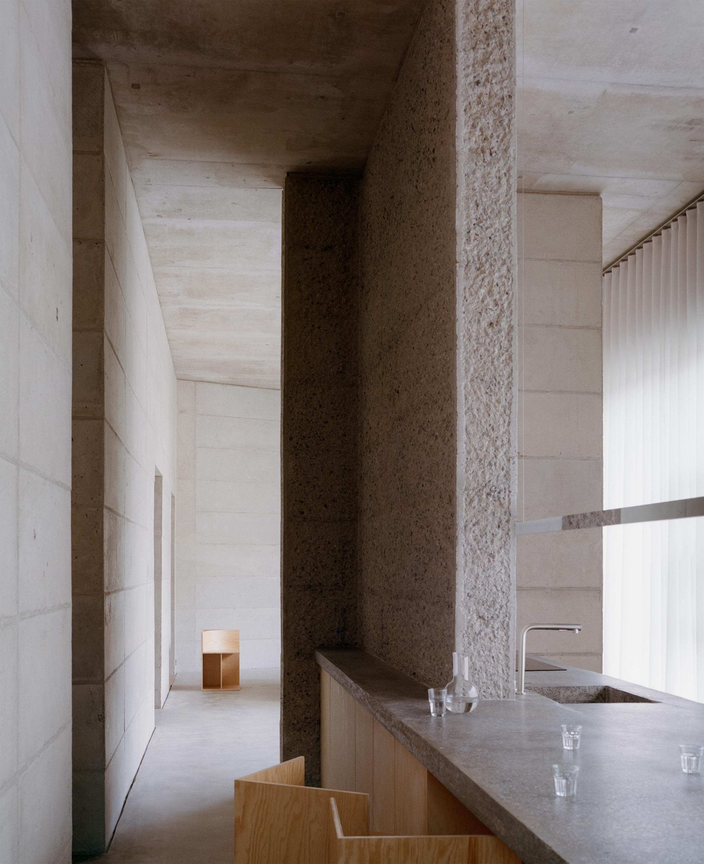
Raw House is a mixed-use development located on the East side of Seoul, South Korea, designed to harmonize with its natural and urban surroundings. The project includes an office, residential flats, and a penthouse that also serves as an office space. Its southern façade frames expansive views of the surrounding lush foliage, inviting nature into the interiors, while the northern façade takes a more reserved approach, creating a buffer from the street. This contrast highlights the project’s tectonic design, with the bold materiality and clean lines establishing a strong architectural presence that balances openness and privacy. Raw House is a compact mixed-use development in Seoul. The brief, written by the architect, was to create a durable structure that prioritises spatial clarity and lived experience over market expectations or visual excess.In an age of blurred realities and overstimulation, where people are increasingly pushed to perform or pretend, this project offers a retreat — a home where one can feel real and at ease. To support this, materials are kept in their raw state. Concrete, stone, and timber are allowed to be what they are, not for effect, but to offer a quiet, honest presence. Nothing is covered, nothing disguised; the architecture does not perform — it simply supports. Care and attention were given not only to materials, but to their placement. Every wall and ceiling were precisely drawn and instructed: from Euroform lines in exposed concrete, to divisions in plywood and stone, to floor slab layout and timber flooring orientation. A universal grid was established across ceilings and floors to connect spaces and allow walls and furniture to read as objects placed within a larger field. Where possible, joints are minimised so stone, and timber surfaces appear as singular masses rather than panels. This brings a sense of unity and continuity throughout the space. Raw House is not about doing more — it is about doing less, with greater care, to create a space that feels grounded, present, and deeply human. Raw House reconsiders how buildings in dense urban contexts can offer stillness, focus, and connection to nature without isolation or visual clutter. It challenges the idea that more rooms, higher density or decorative finishes define value. Instead, it prioritises lived quality and sensory clarity. One quiet innovation lies in how every square metre was intentionally used. A semicircular stair landing reduces unused corner space, acts as a street-facing visual marker, and allows an opening on the north — framing a view of the building’s own geometry while softly bringing in light without compromising privacy. The southern orientation of the building guides the entire spatial layout. Living areas are placed to benefit from full sun exposure and framed views of the wooded hillside, while private rooms are placed to the north, buffered from noise and light. Ceilings are freed of visual noise by omitting direct lighting. Instead, indirect lights wash walls softly from their ceiling junctions, creating an ambient and restful atmosphere. This also allows occupants to personalise the space with lighting and furniture of their own choosing. The innovation in Raw House is not technical but spatial and experiential. It reduces architecture to its essentials while increasing user agency and emotional resonance. It demonstrates how design can respond to complexity with quiet precision — creating a place where one can slow down, feel grounded, and shape their own way of living. Raw House offers a small but thoughtful model for better urban living. It promotes environmental responsiveness and user wellbeing through orientation, material restraint and spatial calm. Passive strategies define the spatial layout. Communal living spaces and the kitchen face south, taking full advantage of daylight and seasonal warmth. Bedrooms are located on the north side, shaded from direct sun — supporting better sleep and reducing cooling demands. The building’s concrete structure provides thermal mass, absorbing heat during the day and releasing it at night, while also helping to moderate indoor humidity. Lighting was carefully considered to support rest and cognitive ease. Instead of ceiling-mounted lights, concealed indirect lighting gently washes down from the ceiling’s edge, softening the space and encouraging relaxation. This creates an environment that is both visually calm and physiologically supportive, particularly in the evening. Though plywood was used, it was applied selectively and in combination with more durable materials like reinforced concrete and stone. Surfaces are simply finished, minimising the need for replacements, coatings or maintenance. Built-in elements were kept to a minimum to reduce material waste and allow personalisation over time. This is not a showpiece of green technology, but a quiet and durable structure that embraces sufficiency, long life and adaptability. Raw House is beneficial because it does less — carefully. It speaks to the possibility that small, precise choices in design can meaningfully support both the planet and the people who live within.
Cherry Orchard
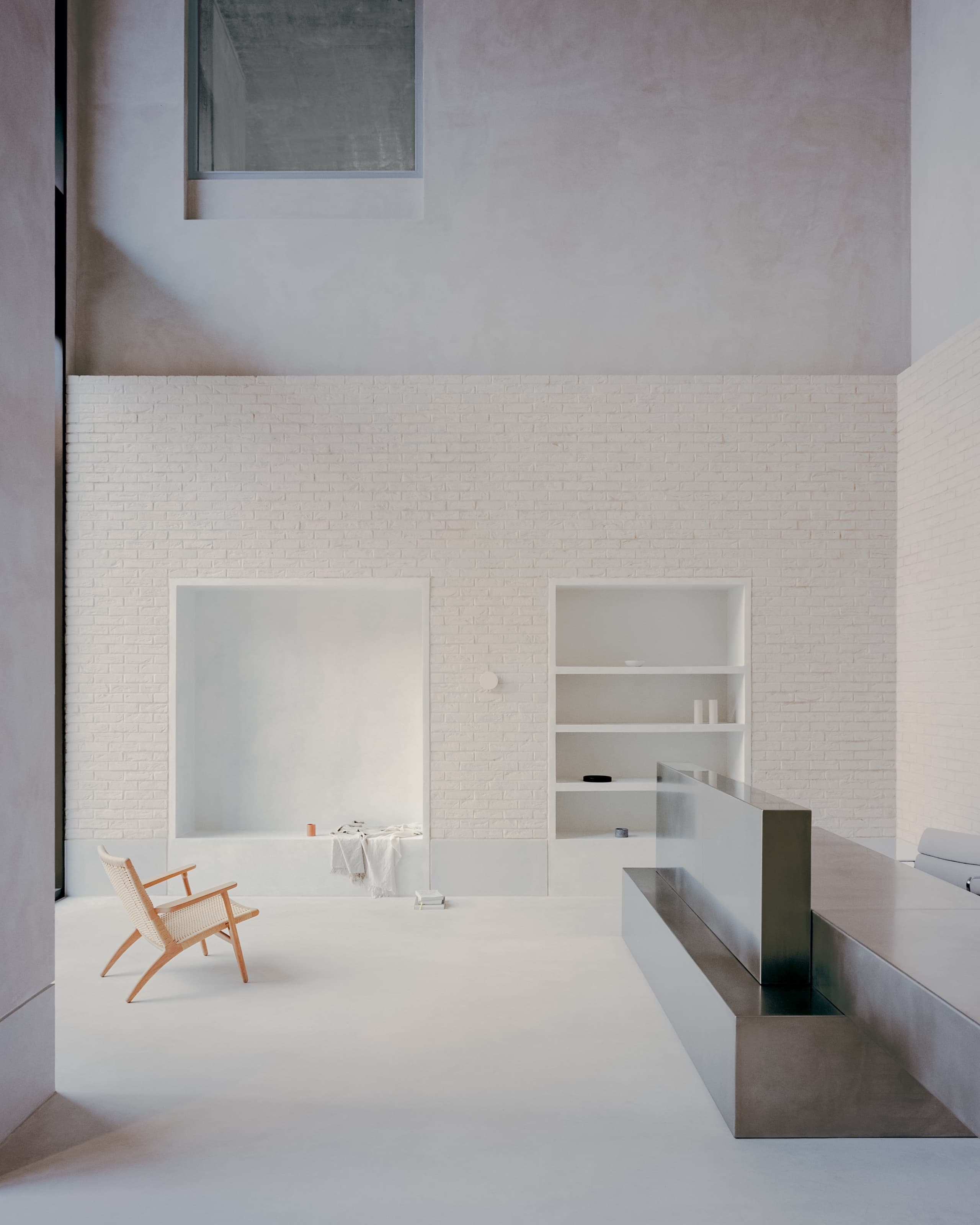
Actual Office has completed the fit-out of a series of shared living spaces in South London, defined by a simple but strong design idea and curated material palette that balances warmth, durability, and spatial clarity. Collaborating with a dynamic client, Actual Office established a unified design vision and applied it to a series of interconnected shell spaces, transforming them into a refined residential environment. At the heart of the scheme, a triple-height entrance hall is flanked by domestic-scaled spaces above. These are linked via three large apertures to establish visual connections between floors, contributing to a sense of openness and spatial continuity. Meanwhile, a solitary column at entry level frames the opening to a deep clay-coloured mailbox chamber. The upper-floor spaces are accessed through white-oiled oak joinery integrating kitchens, seating, and storage. This approach allowed for a largely free and open plan, with functional zones subtly defined through reveals within the timber. Floor to ceiling voiles wrap the perimeter, softening the relationship with the surrounding urban environment, creating a calm and introspective atmosphere. Working closely with local makers and artisans, Actual Office also designed a series of bespoke furniture pieces that reflect the restrained material palette and language of the interiors. A monolithic concierge desk fabricated entirely from hand worked stainless steel creates a sculptural focal point and anchors the entrance hall. On the first floor, two large custom timber tables act as focal points, promoting spontaneous interaction whilst reinforcing the project’s emphasis on material continuity and craftsmanship.
Swop South Melbourne
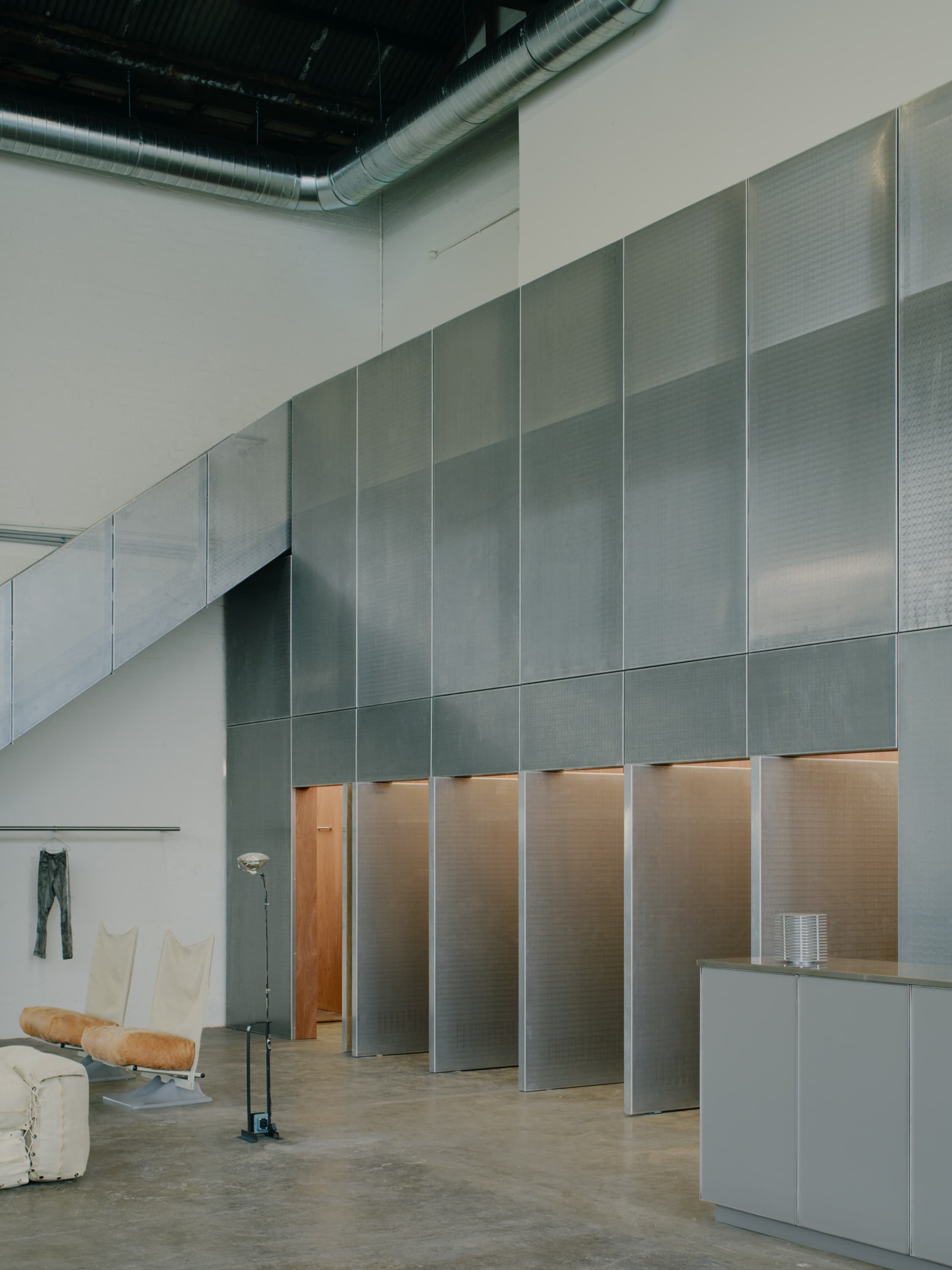
Swop South Melbourne takes the secondhand store — a typology built on volume and turnover — and slows it down. The largest outpost yet for the national resale chain, it occupies a 1938 warehouse on Clarke Street that had passed through a long sequence of uses: one of Australia's first Coca-Cola factories early on, and more recently an axe-throwing venue and a Crossfit gym. None of those left a usable retail plan behind, and that absence became the opening. With no conventional shopfront logic to inherit, William McRoberts and Joseph Gardner of Studio Gardner could treat the building as a found volume and ask what resale looks like when it is given room to be approached slowly. The shell does most of the arguing. Nine-metre ceilings and steel-framed windows on every side give the 500-square-metre floor its character, and decades of alteration had left the structure confused rather than legible. The design resets it rather than re-narrating it, treating the height and the raking daylight as the project's primary material. Into that volume comes a single decisive element: a perforated aluminium mesh wall dividing front of house from back. It is a restrained move that does a great deal — light passes through the fine surface, throwing shifting shadows across the floor and catching reflections of the original steel windows, so a static partition reads as something closer to weather. Fixings are concealed within the mesh and services threaded through without breaking the openness, so the intervention never competes with the room it sits inside. That restraint sets up the plan. With the mesh wall doing the dividing, the floor is left largely open, the long warehouse section legible end to end, and the clothing given the space to be read as display rather than stock. The brief, as the client framed it, was for the store to feel less like a shop than a gallery — a Parisian or New York gallery, elevated but still accessible — somewhere a visitor lingers rather than transacts. The loose, unpartitioned arrangement is what makes that pace possible, and it scales: a larger floor lets the curation breathe where the chain's earlier rooms could feel crowded at the weekend. Gardner softens the industrial frame through curation rather than construction. Vintage and contemporary pieces, drawn from local and international designers, are arranged into zones that sit between a design gallery and a room you might settle into — a vintage inflatable sofa by Günter Sulz alongside a custom steel coffee table by Sydney's Galerie Terminus, the brutalist Stos lamp by Melbourne's Brud Studia, and a four-metre tree set in an Australian-made planter. The fit-out leans on local makers for its working pieces, with the clothing racks built by Brunswick East's Weston Fab and joinery by Cessa Furniture. The effect dissolves the usual line between display and use: furniture is both exhibit and invitation, and the secondhand clothing inherits some of that same considered attention. What the project finally proposes is that resale need not be transactional in its spaces any more than in its ethics. By resetting a heavily altered warehouse, holding its volume open and ordering it with a single luminous screen, Swop South Melbourne gives ordinary pre-loved clothing an unusual measure of reverence — and argues that the slower, more deliberate way of looking usually reserved for objects behind glass can be extended to a rack of used coats.
Patio House
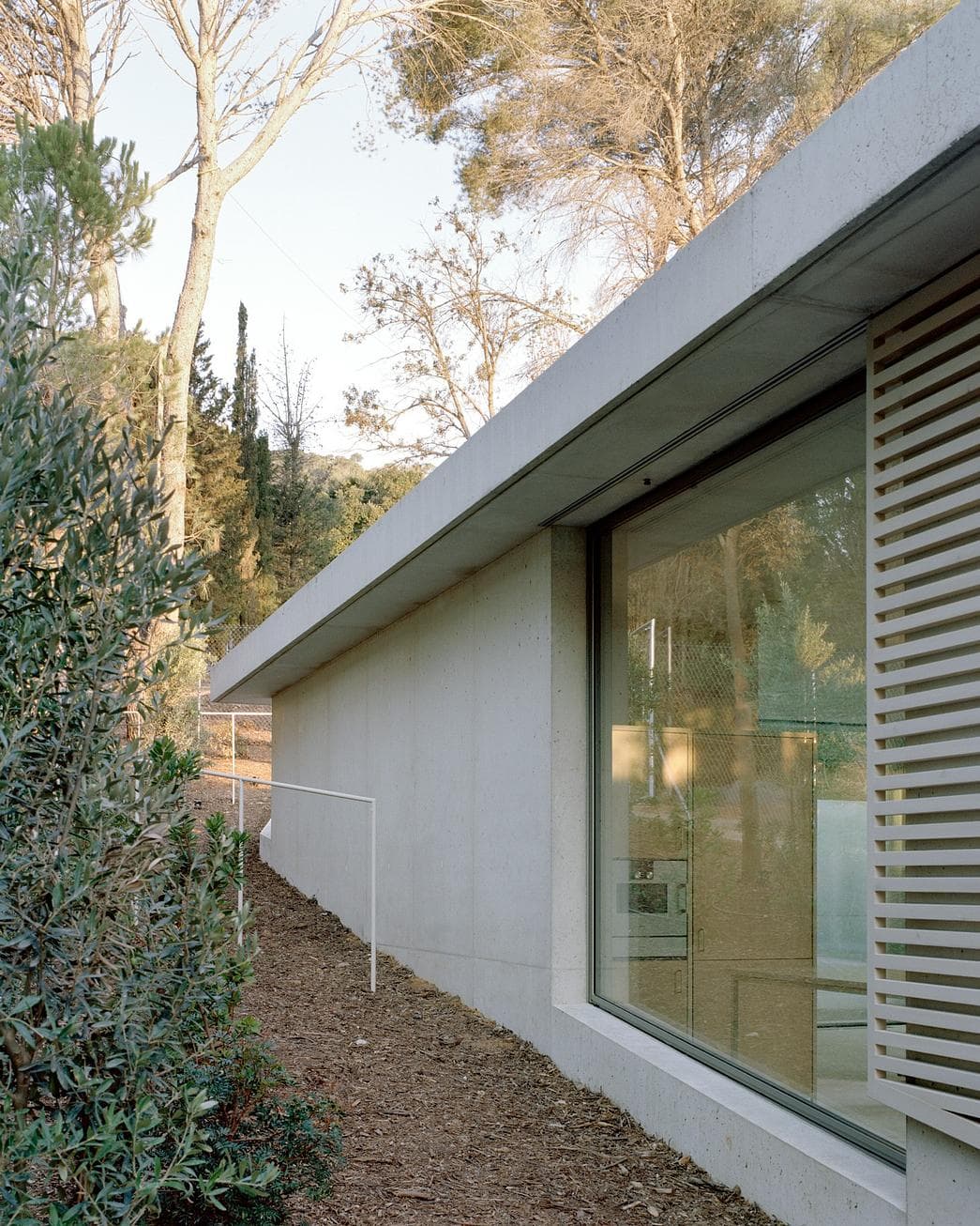
Patio House by Arquitectura-G, located in Costa Brava, is conceived as a calm architectural response to a sloping landscape, where built form and terrain are carefully interwoven. Rather than asserting a dominant gesture, the project follows the existing contours, organizing the house as a sequence of spaces structured around a central open void. At the heart of the design lies a square courtyard measuring 15 by 15 meters. This open space, defined by a grid of slender columns, contains a reflecting pool and three trees, establishing a quiet focal point for the dwelling. The surrounding colonnade operates as a transitional zone, accommodating movement while also functioning as an extension of the living areas. Its ambiguous character allows it to shift between circulation space and place of occupation. Partially embedded in the hillside, the house moderates its relationship to the environment through the use of wood and slatted screens. These elements filter light and air, enabling the façades to open towards the courtyard while maintaining a degree of enclosure. Above, a thin, horizontal roof plane unifies the composition, reinforcing the project’s geometric clarity. Internally, the spatial organization is defined by gradual transitions rather than fixed boundaries. A circular staircase introduces a vertical connection, maintaining the overall continuity of the architectural language.
Anem
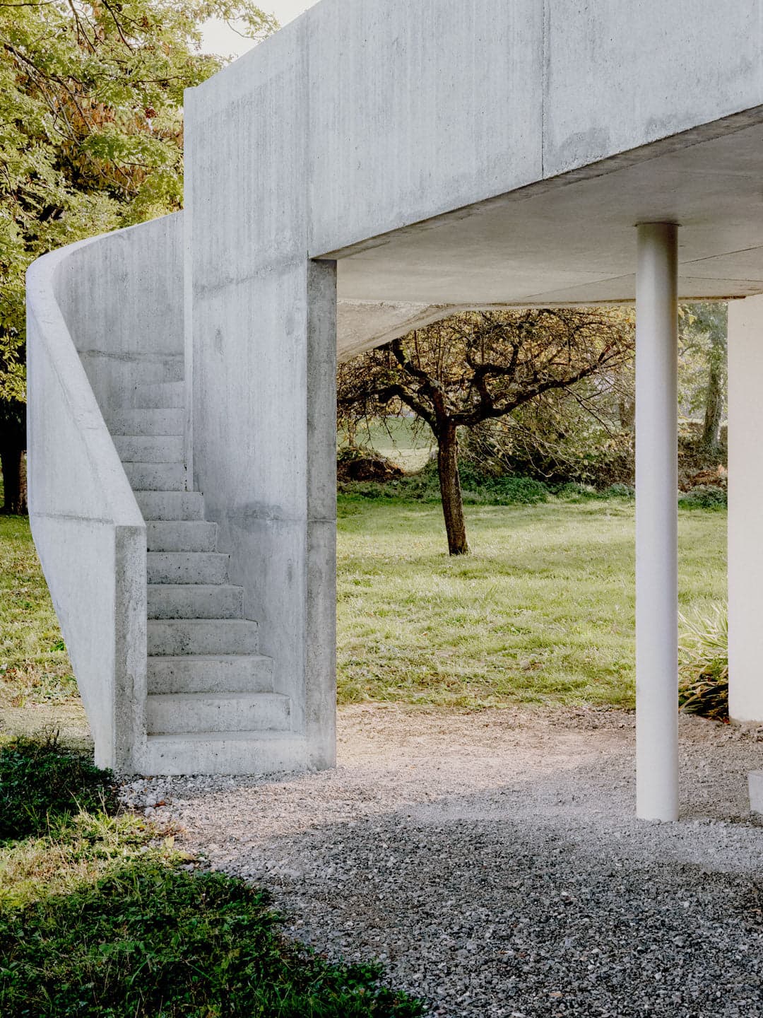
Little has been documented about Anem, a residential extension by Alors Studio in Maxilly-sur-Léman, Haute-Savoie. Despite its discreet presence online, this project offers a compelling study of materiality and spatial refinement. In this article, we attempt to analyze and shed light on its architectural qualities. Nestled in a tranquil landscape, Anem emerges as a minimalist concrete addition that seamlessly integrates with an existing vernacular residence. Defined by raw materiality and geometric purity, the intervention is a study in restraint, where architecture enhances its surroundings rather than imposing upon them. Alors Studio’s approach prioritizes clarity in form and function. The extension, composed of robust concrete volumes, establishes a strong yet understated presence, responding to the vernacular elements of the region with a contemporary sensibility. Inside, the added concrete materiality comes back in the countertop of the kitchen. While a newly build cabinet is built in a materiality that echoes the window frames in the original authentic building, creating a visual and textural continuity between old and new. The dialogue between these materials reinforces the project's thoughtful approach to integrating contemporary interventions within a historic setting. By embedding the new volumes into the existing topography, Anem extends the living spaces with a quiet confidence, enhancing the house’s relationship to its landscape. The project stands as a testament to Alors Studio’s ability to craft spaces that are at once bold and harmonious, redefining the essence of contemporary residential extensions. Below, the architectural plans and sections illustrate the spatial organization and design details that define Payz House. These drawings reveal the interplay between volumes, the thoughtful transitions between spaces, and the material relationships that ground the house in its environment.
Openfield House
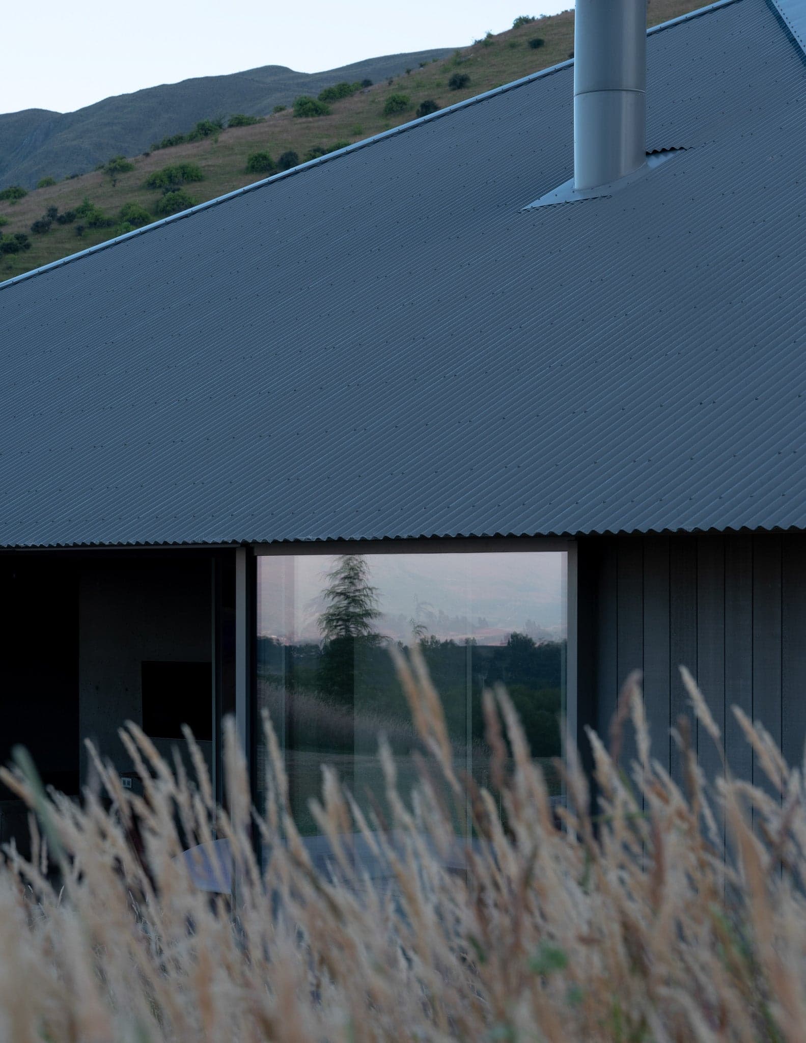
At its core, Openfield House is defined by a simple proposition: what remains when architecture is reduced to its most permanent elements. The project distinguishes between what is fixed and what is temporary, imagining a future in which the lightweight components fall away, leaving behind a composition of stone objects embedded in the ground. This conceptual clarity is expressed through a series of heavy concrete volumes that rise directly from the terrain. These elements anchor the house, forming its centre and giving weight to the otherwise open field of occupation. Around them, lighter cedar-clad volumes gather beneath a corrugated metal roof, establishing a tension between mass and assembly, permanence and change. The plan operates as a continuous field rather than a sequence of rooms. Organised on a square grid, it allows spaces to expand, contract, and reconfigure in response to daily life. Openings are not fixed but negotiated—large sliding panels and timber screens move along an external track, dissolving enclosure and enabling the house to shift between states of exposure and shelter. This condition is most evident at the perimeter. Rather than a defined façade, the house is wrapped by an intermediate zone—an extended threshold that recalls the spatial logic of the Japanese engawa. Here, walls are released, and boundaries become thickened. Concealed sliding doors disappear into the built mass, while a low concrete upstand traces the edge, maintaining a constant line even as the enclosure changes. The distinction between interior and exterior is not removed, but continuously deferred. Only then does the house fully register its setting. Located within the expansive terrain of New Zealand’s Crown Range, it aligns itself with the region’s utilitarian precedents—miners’ huts and agricultural sheds—through its square footprint and restrained material palette. Yet these references are abstracted, allowing the building to operate less as a replica and more as an extension of the landscape’s underlying order. Material restraint reinforces this position. Concrete, stone, and timber are deployed not as finishes but as conditions—each contributing to a reading of the house as something both constructed and unearthed. The architecture does not sit lightly on the land, nor does it attempt to disappear. Instead, it establishes a measured continuity, as though it has always existed in some latent form. Openfield House ultimately frames inhabitation as a state between movement and stillness. It is a place that can open entirely to its surroundings or withdraw into itself, maintaining a constant dialogue between body, space, and terrain.
Stumpy Gully House
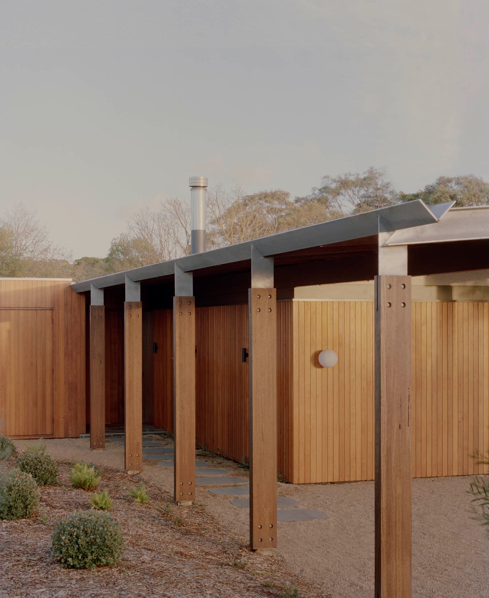
Stumpy Gully House begins from a question about how to build in a place that is quietly being eroded by its own popularity. Sited in the coastal hamlet of Balnarring, on the Mornington Peninsula and on unceded Boon Wurrung Country, the house responds to a street where newer dwellings sit full-width with minimum setbacks, presenting double garages to the road. Against that pattern the project — a collaboration between Stavrias Architecture and markowitzdesign, led by Adam Markowitz — proposes something closer to the older grain of Balnarring: a bushy frontage that holds the house back from the street and lets landscape, rather than parking, define the public face. The plan is linear, and that decision does most of the work. Rather than opening to a conventional western back yard, the house turns its full length along the northern side boundary, so that every key space looks onto a single landscaped run that the architects describe as the big Australian side yard rather than the big back yard. This linear garden, designed by Jo Ferguson, threads past the living spaces and ties them together. The succession of rooms flows out into it through a northern glazed wall, while perpendicular timber-lined walls slip through that glazing to act as privacy baffles, ordering the space both inside and out without resorting to corridors. Entry is placed at the midpoint of the house rather than at a front door, delivering you centrally to the living space and dispensing with long internal passages. The arrival point looks south through a large window onto a cool courtyard before drawing you north into the central living room, which opens completely to the garden through large stacking timber doors in warmer months. The kitchen's southern courtyard offers a summer respite, served by a custom steel-plate breakfast bar through a servery window. Westward, the children's corridor widens into a rumpus space lit from the north, fitted with joinery that carries a television and a cork display wall, a linear daybed and desk, and roll-away toy boxes. At the opposite eastern end, the parents' room and its ensuite — the latter with a Japanese onsen-style timber bath — face a private garden screened by the same baffle walls. Material is handled as continuity between outside and in. External cedar cladding is pulled through the glazed wall to define the baffle walls on the interior, so the flow from exterior to interior reads as a single move. Dark-stained Victorian Blackbutt marks the structural hardwoods against lighter painted tones, and pebbledash render on the exterior, drawing on Japanese and Arts and Crafts references. Warm Victorian Blackwood runs through the kitchen joinery and custom furniture, set against recycled Victorian Blackbutt; a palette of eucalypt greens and warm whites holds the living spaces together, turning playful with terrazzo and colour in the family bathroom and subdued with brass and earthy greys in the ensuite. Craft is integral to both design and construction. Door hardware, picture rails and furniture were custom-designed and made in collaboration between architect and craftspeople — among them a butcher's-block island bench of solid Blackwood, built from more than a thousand end-grain blocks glued together and carried on contrasting Blackbutt legs, and hand-carved door handles 2.4 metres high. Several of Markowitz's own pieces are integrated into the house, including the Flea Chairs and Fred Table in the dining room and the Plane Bed, first designed for Peter Stutchbury's Cabbage Tree House, here given a custom headboard and bedside table. What Stumpy Gully House finally argues is that sensitivity to a changing village need not mean nostalgia. By orienting the whole house to the north along its side, holding a planted edge to the street, and binding interior and garden through a disciplined set of timber walls, it offers a model for development that is considerate of frontage, form and passive solar logic at once. The project was recognised as winner of Residential New over $1m at the 2023 ArchiTeam Awards.
Mixed-use building
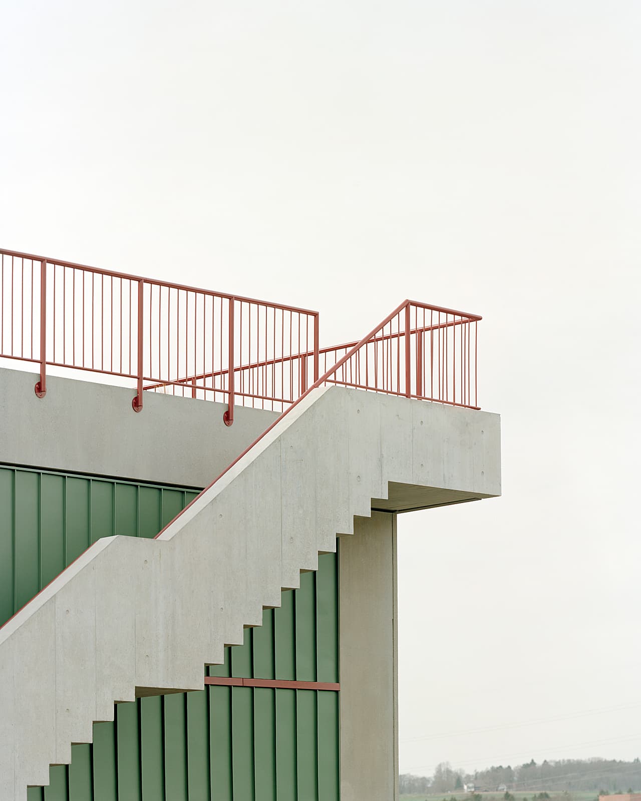
Mixed-use building located in Forel (Lavaux), on ground that is neither quite town nor quite country — an activity zone at the edge of the agricultural area. Its programme answers that in-between condition directly by stacking two unlike lives in one volume: industrial premises across the first two levels, two penthouse apartments above. Rather than reconcile the two into a single character, the project lets each keep its own logic and simply layers them, so the working floors and the domestic ones read as distinct registers held within one form. The lower two levels are conceived for maximum flexibility, so that spaces can be adapted and combined as their occupants require. To keep those floors continuous and uninterrupted, the building carries no internal stairwell to the apartments above — the one element that would otherwise fix a point in the plan and divide it. Access is pushed to the envelope instead: a shared elevator, reached directly from outside, serves the apartments, while private external staircases sit at either end of the building. Circulation to the homes is thus kept off the working floors entirely, leaving them free to be let, subdivided or recombined without a fixed vertical core running through them. Above, the two apartments are organised around a central core that gathers the shared bathroom and kitchen units. From that core the plan offers two ways to move: along the north side, a hallway runs the full length of the apartment and connects it end to end; along the south side, movement passes through the common living areas themselves, with the kitchen acting as the pivot between dining room and living room. One route is service and passage, the other is inhabitation — the same journey read either as corridor or as a sequence of rooms. What the building proposes is a way of keeping incompatible uses in a single frame without smoothing them into one another. By moving all access for the apartments to the outside, it protects the openness of the industrial floors below; by turning its living spaces around a central core with two parallel paths, it gives each home both a direct spine and a slower way through its shared rooms.
Lege
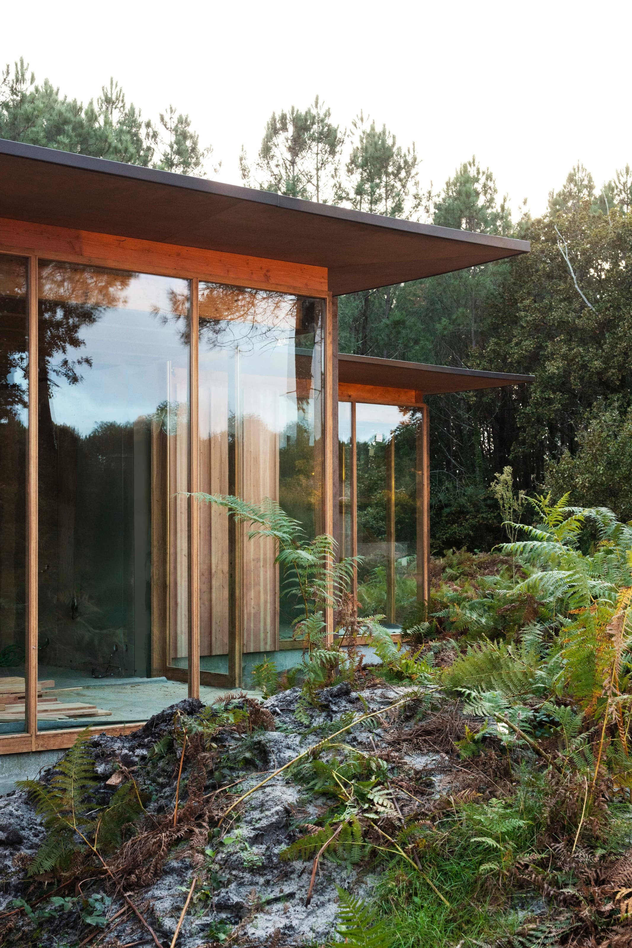
The triangular geometry of the plot set the terms for this family house. Rather than resist the awkward angle, the architecture absorbs it: the plan steps inward in a series of recesses, an indented figure that follows the boundary lines and, in doing so, organises the dwelling into three distinct territories — one for the children, one for the parents, and a shared collective space held between them. This tripartite logic is made legible in the building itself. Load-bearing cross-walls of board-formed concrete, left raw, mark the seams between the three zones while lending the volumes their thermal mass. The walls do more than divide; they register the structural and environmental thinking of the house in a single gesture, the grain of the formwork kept visible as a record of how the material was made. There is a quieter narrative beneath the finished building, one of intentions only partly realised. The cross-walls were conceived in rammed earth — a geo-sourced, low-carbon material the architect argued for — but the clients were not persuaded, and the masonry façades the project nearly received were avoided only at the last moment. Virtuous architecture carries a cost that cannot always be met, and the house is honest about the negotiations that shaped it. What survived those negotiations is timber. Brought in at the final stage, its materiality settles the single-storey, generously glazed house into the surrounding pinewood, dissolving the boundary between the built form and the trees. The house sits low and open to its setting, less an object placed in the landscape than a structure that has come to rest within it.
Private House in La Claye
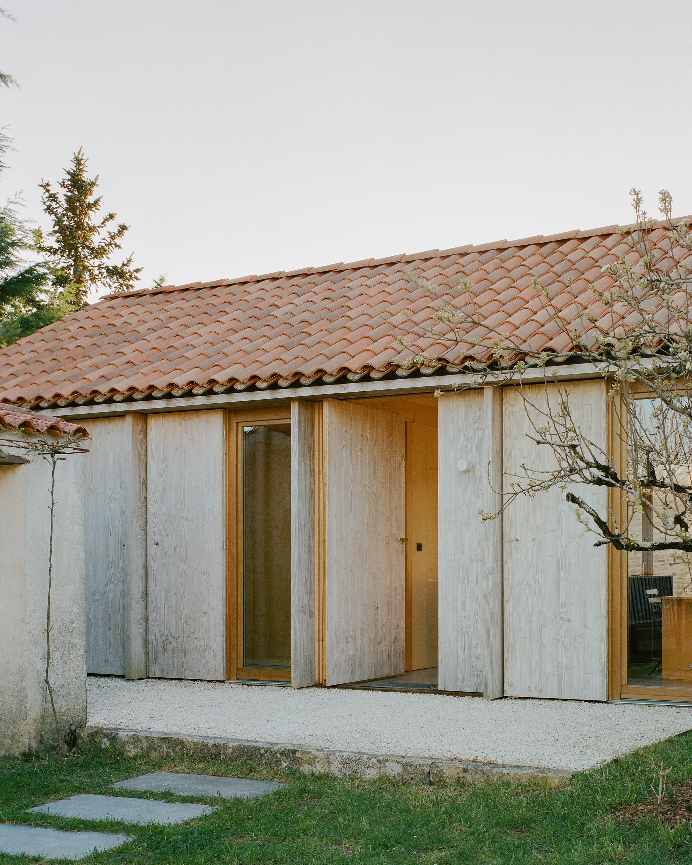
The plot had been left over for as long as anyone could remember: a corner of the village that once belonged to the property next door and served it as kitchen garden and chicken run. What remained on it — a 25 m² chicken coop and a well said to be among the most productive in La Claye — was not cleared to make room for the house. atelier iso took both as fixed points, and the position of the building follows from them. The house is aligned north–south, in line with its neighbours, and turns its gable ends towards the Rue du Lay, the same profile the village repeats along its streets. That orientation leaves the coop and the well untouched and divides the roughly 300 m² plot into two gardens of different character. At the corner, an avant-jardin acts as a threshold to the Rue du Bourg and lets the house open outward; to the west lies a second, more sheltered garden. The living space sits between them, connected to both and extending into each, with a bedroom to either side, each with an open bathroom holding a shower and washbasin and a mezzanine able to take a second double bed. The two long façades are not treated alike. The house opens more generously to the western garden than to the eastern one, and the hierarchy is set out in the structure itself: a full structural bay on one side, a half-bay on the other. The elevations facing the public realm and the property boundaries are built in reclaimed local limestone, taken from the plot and a neighbouring parcel, so that the house reads as part of the same sequence of stone walls and gable ends that defines the street. The longitudinal façades facing the gardens are clad entirely in timber. The structure is timber throughout, resting on an exposed polished concrete slab and set out on a regular 600 mm grid that governs both plan and elevation. Each module is marked externally by a post; between the posts, three-layer Douglas fir panels serve as both enclosure and cladding. Shutters and a pivoting entrance door in the same material let the envelope close into a single continuous surface with no openings visible. The exterior timber is treated with a silicon- and potassium-based product that weathers it towards the grey of driftwood, beneath a roof of traditional canal tiles. Inside, poplar plywood lines the walls, partitions and built-in furniture, with plasterboard restricted to the wet rooms. Tables, the kitchen bar and the bookshelves were designed and made from offcuts left over from the build, which extends the logic of the reclaimed stone into the interior. The envelope combines the timber structure with wood-fibre insulation — 200 mm in the walls, 300 mm in the roof — and the bioclimatic strategy stays similarly plain: the east–west plan allows cross-ventilation that largely removes the need for mechanical cooling, and solar protection comes from the building's own overhangs rather than added devices, calibrated for a house occupied mainly in summer. Apart from the earthworks, foundations and concrete slab, atelier iso built the house themselves. Self-building gave the studio direct control over the construction and allowed details to be worked out on site through trial and adjustment, so that the design continued to develop through the build rather than being fixed before it.
The Inverted Farm
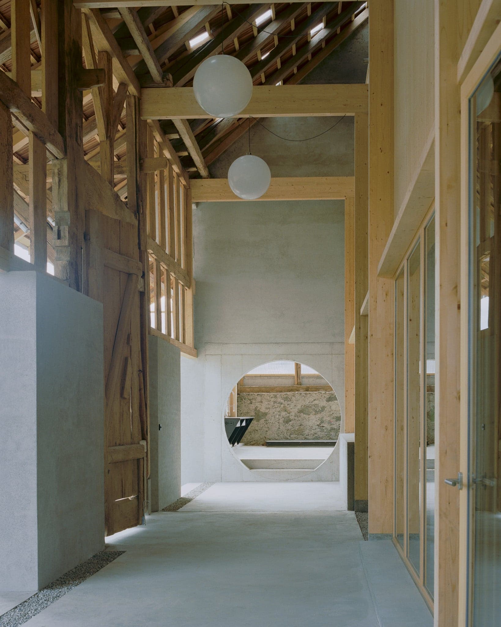
The Inverted Farm by BARD YERSIN architectes is a conversion project in La Bruyère, Vuisternens-devant-Romont, that transforms a typical 19th-century regional farmhouse. Originally designed to bring dwelling and agricultural functions together under a single roof, the building faced modern challenges. It was deprived of its farming use, located outside the building zone, and featured an exceptionally large volume that was difficult to maintain given the limited habitable floor area permitted. In this context, the client’s mixed housing and permaculture program represents a rare opportunity for a coherent requalification of the whole. Because the single-storey surface of the existing dwelling is insufficient for the owner’s needs, the project reverses the original uses. The former agricultural volume accommodates the new home, while the south-facing dwelling is completely emptied and converted into a greenhouse dedicated to permaculture. Since the barn space remains oversized for domestic requirements, the design strategy introduces a self-contained volume set back from the existing envelope. The resulting intermediate areas alternately serve planting zones and covered outdoor spaces for the house. To anchor the new dwelling in the building’s constructive logic, it is conceived as a timber structural grid, set out on the module of the existing roof structure and complemented by timber and glass walls. This system efficiently transfers the roof loads while limiting the exogenous character of the inserted volume. The plan organization follows the rhythm of the original structure. The bays corresponding to former haylofts accommodate the main spaces, benefiting from double-height volumes and through spaces. The segments aligned with the former stables and storage areas are subdivided by terracotta brick cores housing the service spaces. Lateral enfilades connect the different rooms, reinforcing the perception of the building’s exceptional dimensions.
La conception III
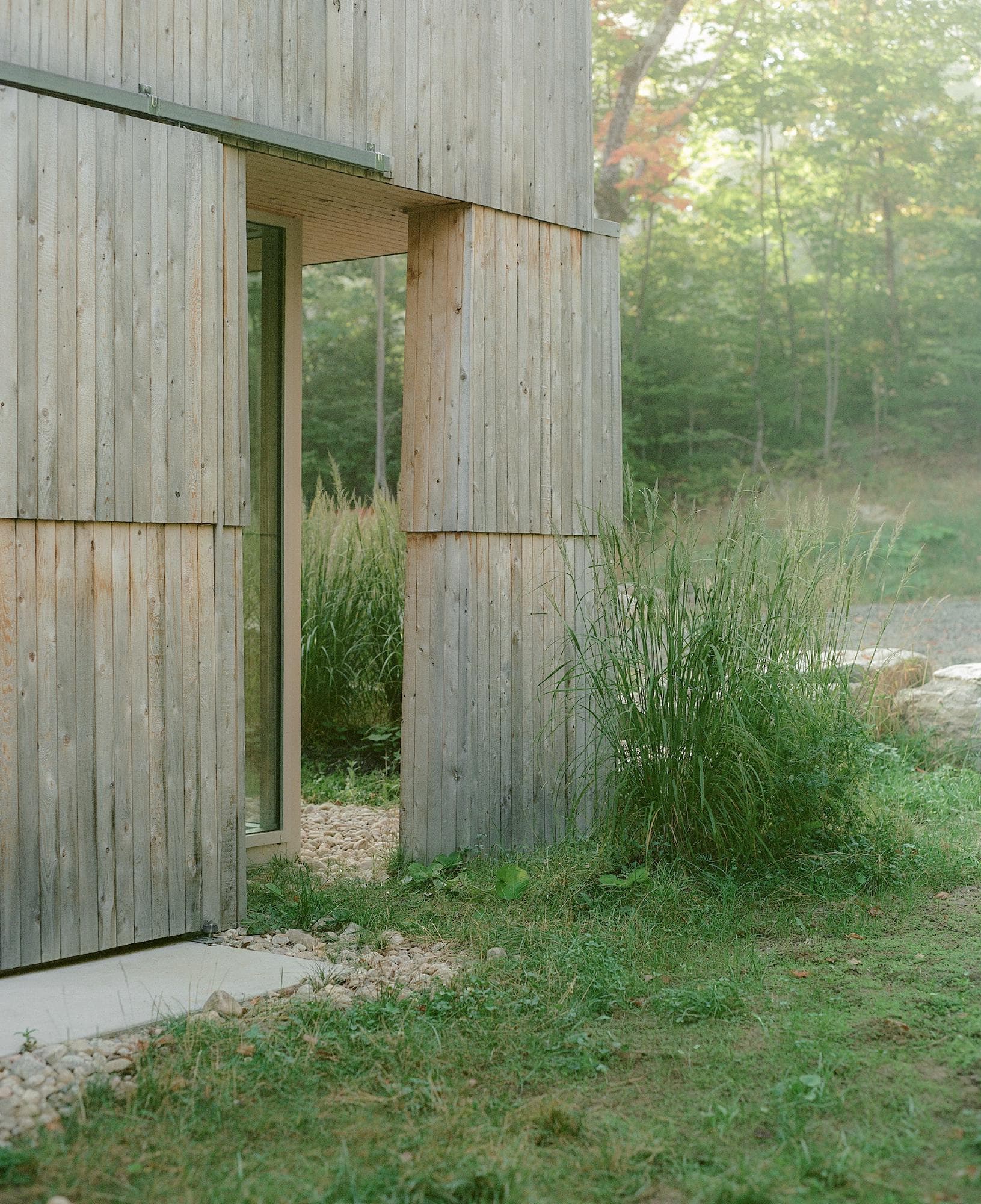
La Conception III takes its governing idea from geology rather than building convention. The project borrows the structural qualities of natural, brittle stratifications — the way layered rock organises itself and the porosity that opens up between its bands — and translates them into the order of a small building. It is a gîte touristique in La Conception, in Québec's Laurentian region, and the stratified logic is what gives a modest 120-square-metre volume its sense of depth: the building reads as a stack of layers rather than a single sealed mass. Those layers are not only an image but a working system. Each stratum steps back or projects forward, and it is in these setbacks and projections that the architecture finds room for what it needs — canopies where the volume oversails, terraces where it draws back, railings where an edge is exposed. The structural move and the programme are therefore the same move; thresholds and shelter are produced by the section rather than added to it. The expression carries through to the skin, where overlapping planks of local cedar restate the stratification at the scale of the cladding, each board casting a drop shadow on the one below so that the facades register as a fine horizontal grain of light and shade. Inside, the same attention to layering becomes a question of intimacy. The plan is arranged as a graded sequence, moving from the more open living spaces toward the quieter sleeping quarters, with acoustic comfort treated as part of that gradient rather than an afterthought. The progression from public to private is calibrated so that the transition between waking and resting parts of the house is felt as a continuous easing rather than a hard division — appropriate to a building meant to be lived in briefly, by guests, as a place of retreat. The section culminates above the bedrooms. An intimate rooftop terrace, held within the surrounding Laurentian Forest, extends the upper floor into the open air and gives the upstairs rooms a measure of outdoor space carved from the canopy. It is the last and highest of the building's strata, and the one that most directly ties the house to its setting: where the lower layers manage shelter and threshold, this one simply opens to the trees. What La Conception III proposes, in the end, is that a building can be small and still feel composed of distinct worlds. By reading architecture as sedimentary — a set of layers that shelter, divide and finally open — Chaudier turns a compact guesthouse into a graded passage from ground to canopy.
WHITE HUT
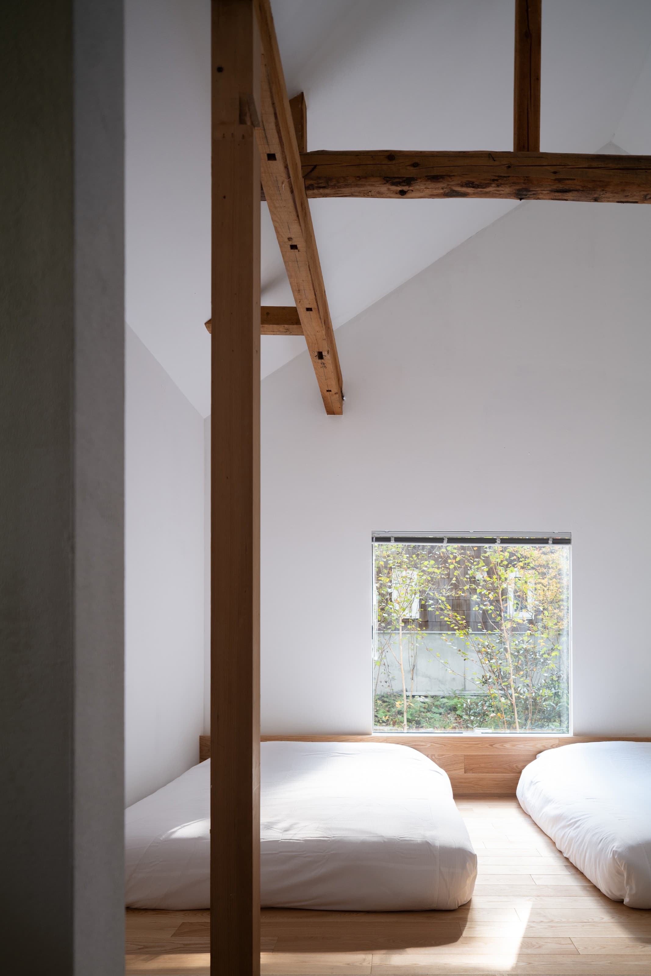
WHITE HUT is the renovation of a small villa located within a holiday-home development in Kita-Karuizawa, Japan, originally established during the country’s period of rapid economic growth. Over the course of half a century, a discrepancy emerged between the memory of development inscribed in the land and the time accumulated by the surrounding forest. The project seeks to reconstruct, through minimal architectural operations, the quietness and sense of freedom once inherent in the villa typology. At the time of its original construction, the house is thought to have existed as a simple structure closely connected to the forest. However, successive developments in the surrounding area, together with repeated and uncoordinated extensions, gradually enclosed the building within the “backs” of neighboring plots. As a result, the house lost its visual openness and spatial relationship with nature. Rather than rejecting these conditions, the project began by reinterpreting them. We inverted the notions of “front” and “back” within the site and discovered a clear north–south visual axis extending toward the surrounding landscape. This axis, named the “light axis,” became the primary organizational principle of the renovation. During demolition, the removal of the existing ceilings revealed a sectional composition in which house-shaped forms repeated in similarity. Taking this latent structure as a clue, a series of openings was introduced along the light axis to reconnect the fragmented rooms. Through this operation, light, views, and circulation were reorganized into a continuous spatial sequence. The interior was composed using highly abstracted materials and restrained detailing in order to reduce visual noise and soften clear functional boundaries. Existing structural members and beams were intentionally left exposed, allowing the accumulated time of the building to remain visible within the renewed space. The architecture avoids excessive self-expression and instead foregrounds the relationships between light, structure, and the forest. The light axis functions not only as a device for daylight but also as a spatial framework that selectively draws the surrounding environment inward while giving order and rhythm to everyday life. Gradients of light shift with time and season, quietly reflecting the atmosphere of the forest within the interior. Through these interventions, WHITE HUT attempts to create a calm and layered environment where stillness and freedom coexist, gently reconnecting the architecture to both the memory of the site and the landscape beyond.
Exhibited works
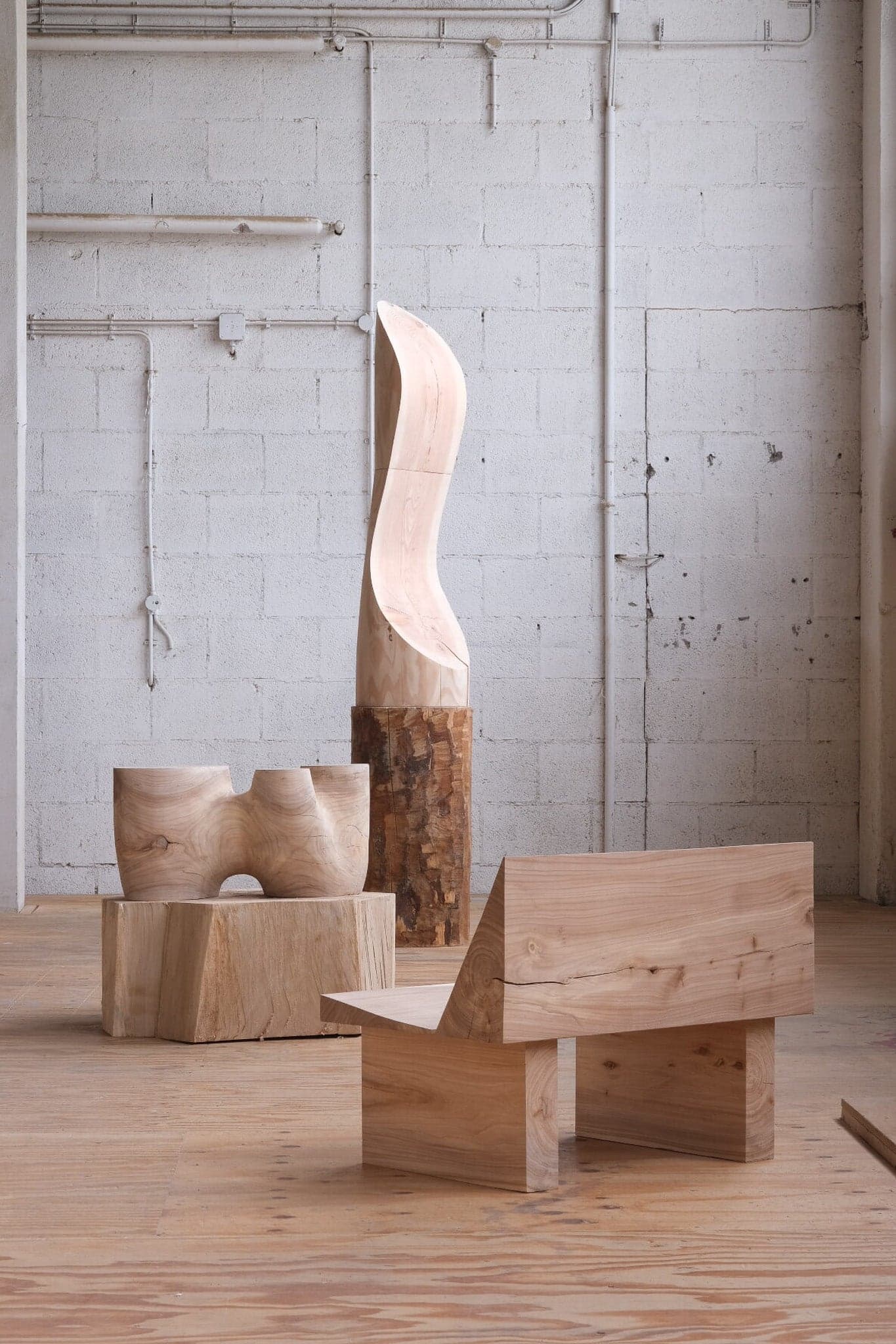
Finnish-born designer Jonas Lutz creates objects of bold simplicity and elegant solutions, often with a tacit playfulness. His objects instantly reveal a continuous search for the novel and undiscovered. Simplicity of form is well balanced with a gentleness that invites the touch and a modesty which speaks of a deep comprehension of materials and a desire to elevate their qualities.Jonas finds inspiration in Nordic furniture traditions as well as in the lively design culture of his adopted country of the Netherlands. Fueled by an upbringing in a creative milieu his instinct and sensibility in the work with materials intimates that of a sculptor’s act. This act is much replicated in the way he gives himself design briefs triggering investigations of materials and concepts, often inspired by objects of use in his home.Jonas Lutz studio is located in Rotterdam, the Netherlands. He studied at the Carl Malmsten furniture school in Stockholm, Sweden, and has a bachelor in design from the Design Academy in Eindhoven, the Netherlands. ^Text by Otherprojections The inaugural exhibition at the Huidenclub in Rotterdam featured the work of Jonas Lutz. The showcased collection primarily featured objects created during his residency at Atelier Van Lieshout the previous year. Alongside these pieces, a selection of new works highlighted the ongoing evolution of his creative journey.Set against the raw, industrial backdrop of the Huidenclub, Lutz's pieces found a harmonious context that accentuated their materiality and form. Each object invited viewers to reflect on the intersection of craftsmanship and conceptual exploration, challenging conventional perceptions of functionality and design.Jonas Lutz's work has has gained international recognition, having been featured in collaborations with Isabel Marant and displayed at the prestigious Vitra Haus in Basel. More of his designs and projects can be explored on his website here.
Borna Park
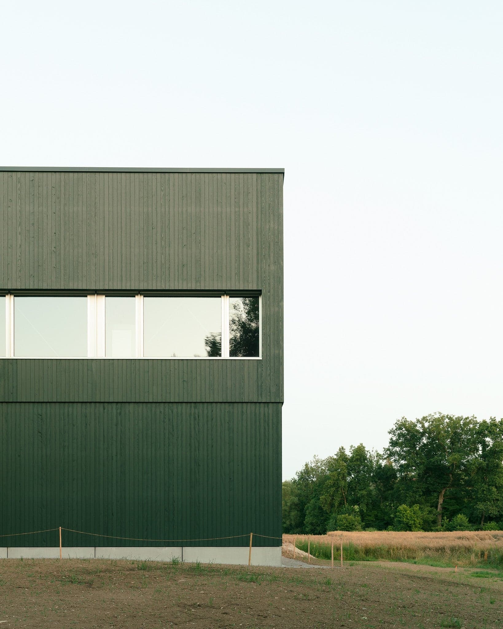
At Borna-Park, everyday life unfolds in close dialogue with the surrounding landscape. Meadows, open fields, and the tree-lined Pfaffneren river frame the site, but nature here is more than a scenic backdrop—it becomes the defining identity of a residential and working community. The development comprises two distinct buildings: a residential building and a workshop, both specifically designed to support people with disabilities. Set freely within a generous park landscape, the buildings are connected by gently curving paths. The daily walk between home and workplace becomes an integral ritual, offering continuous sensory engagement with weather, seasons, and nature. The residential building is organized as two interconnected units, linked at ground and basement levels. Public and communal functions are located on the ground floor, including a dining hall with catering kitchen, cafeteria, and administrative spaces. Oak furniture, suspended acoustic elements, and polished concrete floors create an atmosphere that is both representative and welcoming. On the upper floors, the residential groups are arranged as open, flowing sequences of spaces. Living and dining areas are embedded within this spatial continuity, making communal life a natural part of everyday routines. A warm palette in floors and bespoke carpentry, combined with exposed wood and concrete surfaces, results in a cohesive and inviting interior environment. The workshop building is conceived as a two-storey hall structure in timber construction. Its plan is divided into three functional zones, with a large, double-height storage hall at its center. This central space acts as both an architectural and functional mediator between the different workshop areas. A distinctive shed roof floods the interior with daylight and supports an expansive photovoltaic system spanning the roof surface. Inside, a structural framework of beech wood defines the character of the space. Together with openly routed technical installations, it lends the interior a direct and robust expression. Generous interior glazing establishes visual connections between the various workshop areas, allowing daylight to penetrate deep into the building while enabling clear lines of sight for staff supervision. Borna-Park demonstrates how architecture can foster dignity, community, and autonomy through spatial clarity, material warmth, and a profound connection to the landscape—shaping a place where care, work, and nature coexist seamlessly.
Spring Hill House
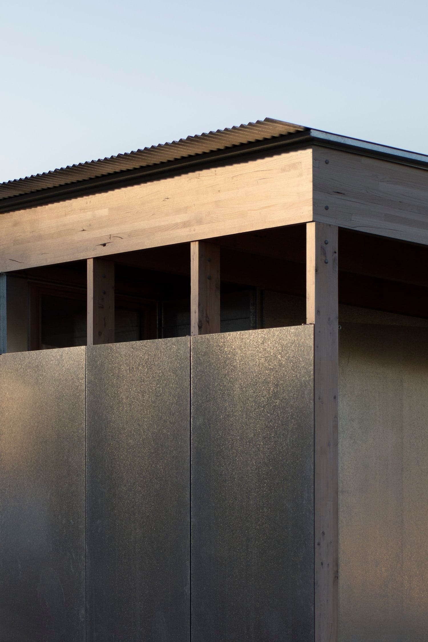
The site was purchased by an author seeking a tree change having lived in inner city Melbourne for many years. The dwelling is part of a larger project to re-imagine and revitalize the underworked paddock into a place of habitation, connection and reflection. The site slopes in north south direction and have been sculptured into subtly undulations from surface water that seeps through the ground from the adjacent Springhill. The dwelling is sited towards the high point of the site adjacent an outcrop of granite that forms an imperceptible rise to the north of the building site, offering both a foreground for aspect from the dwelling and obscuring view and noise from the road. Like much of rural Australia, haysheds are dotted through the Macedon Ranges. Their simple forms reflect rational necessity. Often located on high ground, their figure in the landscape contributed to the Australian myth of shelter and defiance. The project extends upon these themes to create a place within the paddock. A large roof stretches beyond the enclosed spaces to act as a place-maker, defining the area of habitation from the treeless grass expanse. Pitching north south to align with the fall of the land, the large roof collects the dwellings drinking water and energy. The roof is held up by a series of glulam portal frames creating clear flexible space that shelters the internal and external activities of the dwelling. The project removes circulation space from the plan. Internal spaces often overlap and form dual purpose. Service areas are located as a cluster in the center of the plan and form the main delineation between the work spaces and the living space. Sleeping is located to the east of the dwelling to capture rising sun and expansive view. Living space is organised to the north and west overlooking the outcrop of granite to and capturing the warmth of winter sun. Working space is arranged to the south, making use of diffuse light. Materials have been selected which are utilitarian in purpose. Large sheets of galvanized sheet metal have been applied to the outer layer of the building. Durable and robust the metal provides the main weather protection for the building while also reflecting the hues of the paddock, giving the building its character. The internal space consists of a burnished concrete slab and birch plywood. Concrete stabilises the internal living environment, providing cooling mass during summer months and heat redistribution during the winter. Plywood provides warmth to the space both acoustically and atmospherically. The proportions of the dwelling are determined by 1.2m structural grid aligned with standard material sizes. This minimized the amount of material wastage and, more fundamentally, is a proportion developed in relation to the human hand. The use of a monochromatic palette amplifies the aspect from the large window openings. View and ventilation are separated. Solid ventilation panels are organised throughout the dwelling to enable cross flow ventilation that can be controlled from space to space, leaving view and aspect clear of obstruction. Plan | 1. Entry 2. Kitchen 3. Dining 4. Living 5. Guest Bed 6. Bedroom 7. Bathroom 8. Study 9. Laundry 10. Terrace Section | 1. Entry 2. Kitchen 3. Dining 4. Living 5. Guest Bed 6. Bedroom 7. Bathroom 8. Study 9. Laundry 10. Terrace
Chamboirat
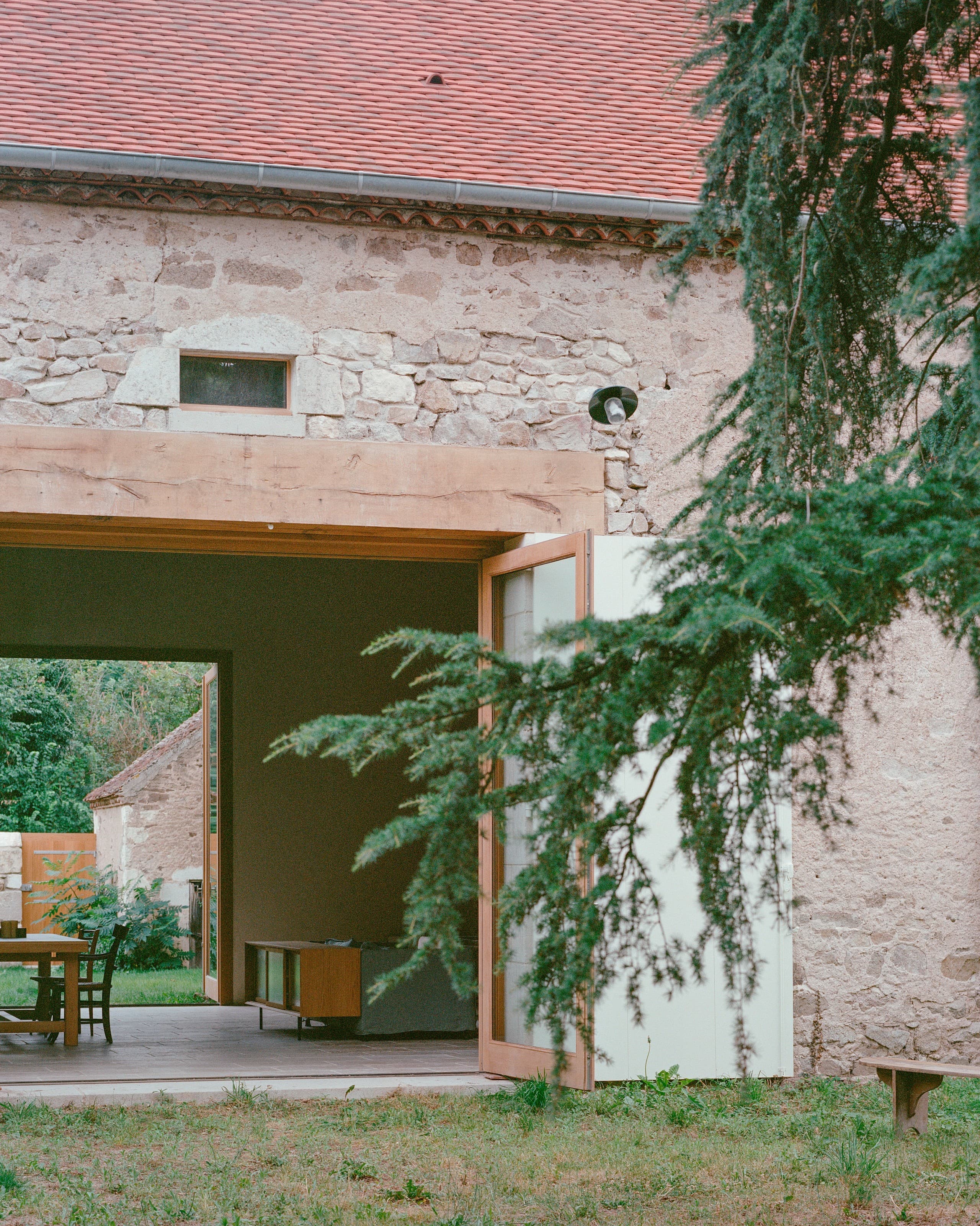
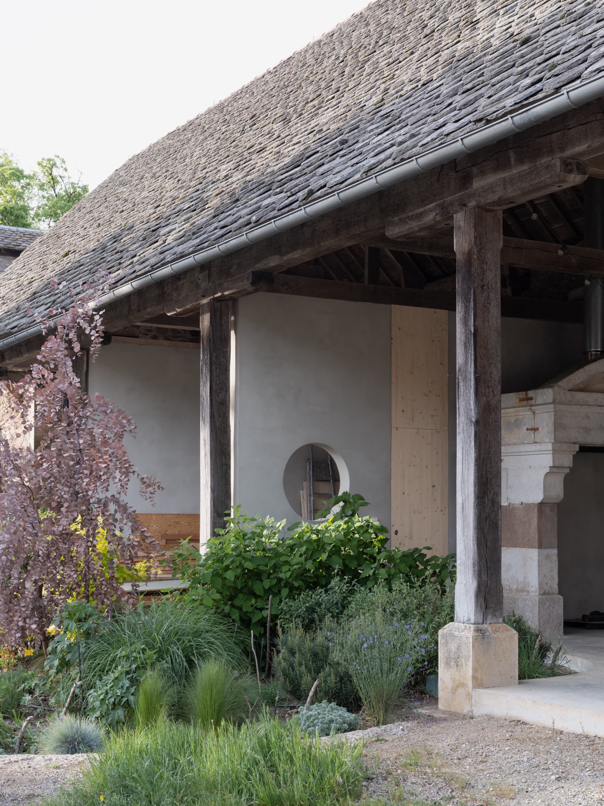
This project aimed to transform an ancient farmhouse into a family home in Chamboirat, a small hamlet in the Auvergne countryside. This two-century-old barn was a common rural heritage in this part of France. Once inside, however, it revealed a remarkable material presence: 9-metre-high stone masonry walls, an impressive timber frame, generous volumes... It became clear that our intervention should primarily respect the distinctive character of the place. COVE Architectes therefore pursued a careful and thoughtful rehabilitation, privileging continuity with its built heritage over disruptive actions. We emphasized the use of minimally processed local materials and artisanal techniques, inspired by the craftsmanship employed in the building’s construction two hundred years ago. The stone walls were stabilised with lime mortar and selectively repaired using cut stone, then insulated with a lime-hemp render finished with a lime-sand coat. The existing timber frame, preserved to its main structural elements, was complemented with new oak beams, rafters, and planks treated to ensure a unified appearance between the old and new parts. Transforming this farm into a gathering place required creating a large central space where the whole family could come together. We thus removed the stable wall that divided the central area, allowing for an open volume that encompasses the shared spaces : kitchen, dining and living room. To open this area to the back garden, we created a large opening in the north facade, mirroring the existing gateway on the south facade. This new aperture was constructed with cut stone jambs and solid oak lintels. Outside, the only modifications to the facades were the addition of white wooden shutters and glazed oak windows, while the existing outer coatings and exposed stones were intentionally left as they were. A range of targeted actions allowed us to provide the edifice with longevity and comfort without betraying its nature.
Found Founded Headquarters
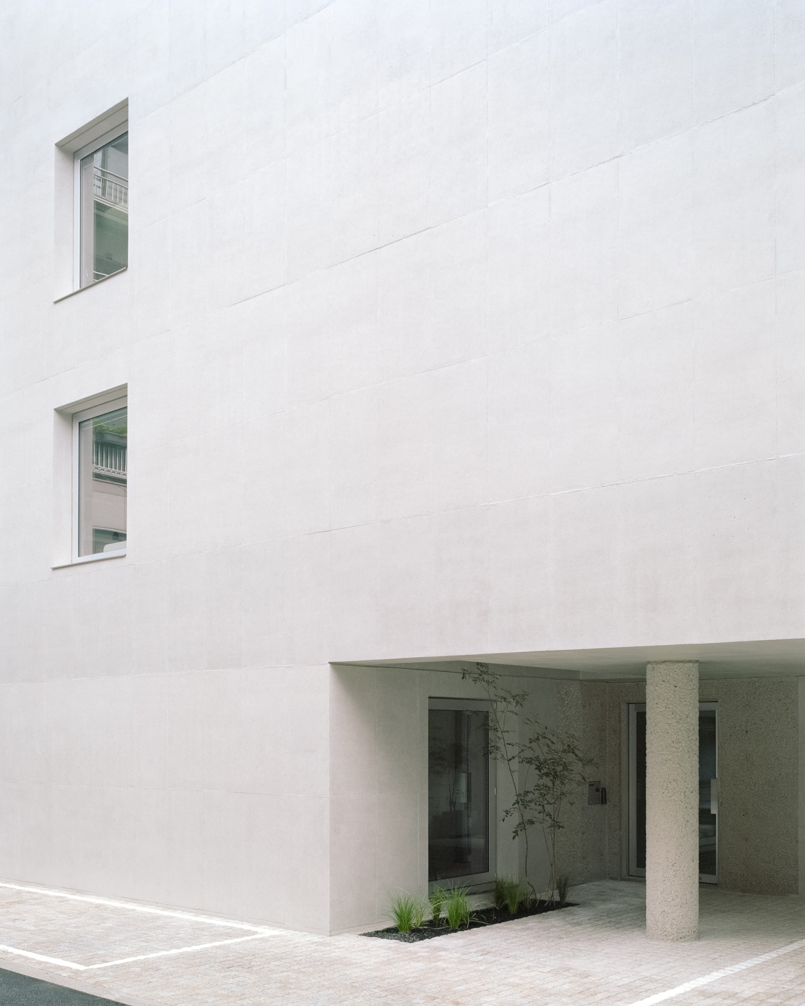
Found Founded works across scales and disciplines — product and furniture design, spatial design, graphics and digital experiences — and its new headquarters is conceived less as a finished image than as a container for that range: an environment in which the studio's people, work and the things they make can accumulate over time. Order Matter designed the building as a flagship showroom and office, extending the commission to bespoke furniture and custom lighting elements, on a site in Seogyo-dong that sits one layer removed from the district's busy commercial streets. The surrounding neighbourhood is low-rise and residential: multi-family houses and older homes alongside external staircases and incremental extensions, a familiar Seoul landscape in which traces of different periods coexist. Within it the building takes its place as a simple, solid volume, sitting among the overlapping elements around it while holding a presence of its own through the clarity of its form and material — an attitude the studio relates back to the work of Found Founded itself. It opens to the city only where necessary. Rather than extending views in every direction, openings are positioned where light and particular views are welcomed, while voids and gardens establish more measured relationships with the outside, so that the complexity of the city recedes once inside and is replaced by light and planting at close proximity. The approach is organised around two elements of the same concrete structure: a circular column carrying the building, and the entrance beyond it. Both are chipped, their roughened surfaces set against the smooth concrete around them, so that the eye moves from column to entrance and each reads at once as part of the whole and as an element in its own right. The rough surface also indicates where to enter, and works as a surface that receives light — sunlight falling through the void above casts shadows of varying depth across its texture through the day, while the planting alongside changes with the seasons. Beyond the entrance the ground floor opens into a communal space set one level below ground, conceived much like the living room of a house and used for informal gatherings, everyday conversation and rest as much as for meetings and events. From the lowered floor the garden planting is seen from below, putting nearby greenery rather than the surrounding city in view, and stepped seating rises towards the rear until it meets the back garden again at ground level. Movement upwards follows light coming down: a skylight sits over the central stairwell and the staircase is left as exposed concrete rather than wrapped in a further finish, so that daylight reaches through the building, guides the way up and connects the floors in a continuous vertical sequence, changing the appearance of stair and concrete as it shifts through the day. The second and third floors share a single spatial order — an open workspace and one separate room, a model-making room below and a meeting room above — with differences in the direction of light and in the views their openings frame giving each floor its own atmosphere. In the workspaces the exposed concrete of the communal areas gives way to solid timber flooring and white-painted walls, the material character growing gentler as the building moves from shared spaces towards the places of everyday work, and the warmth of the timber softening daylight as it spreads across walls and ceilings. For a design studio daylight matters not only to the atmosphere of a space but to seeing materials and colours accurately, so orientation and openings were arranged to let light and air pass through the interior: windows on the north and south sides of the workspaces bring light from different directions and open to create a path for cross-ventilation, openings towards the external void admit softer indirect light, and windows on different floors are positioned so that they do not directly face one another. Everyday comfort is meant to come from these basic considerations — orientation, openings, daylight and air — rather than from strategies added on top. Following the light upwards, the stair reaches a roof garden, modest in size but loosely divided by structure and planting into areas that stay connected while allowing someone to step aside within the same place. Here the city, encountered only in fragments from inside, opens up again as the roofs and houses of Seogyo-dong. The slender rooftop railing follows the rectilinear form of the building before curving gently around its corners, disappearing among the planting in places and rising above the concrete wall elsewhere to read from the street as a single line — a deliberate looseness within an otherwise ordered frame, and a measure of the building's larger intention: to hold Found Founded as it is today while remaining a calm, solid centre that the accumulation of planting, objects and work will slowly change.
Eavesdrop
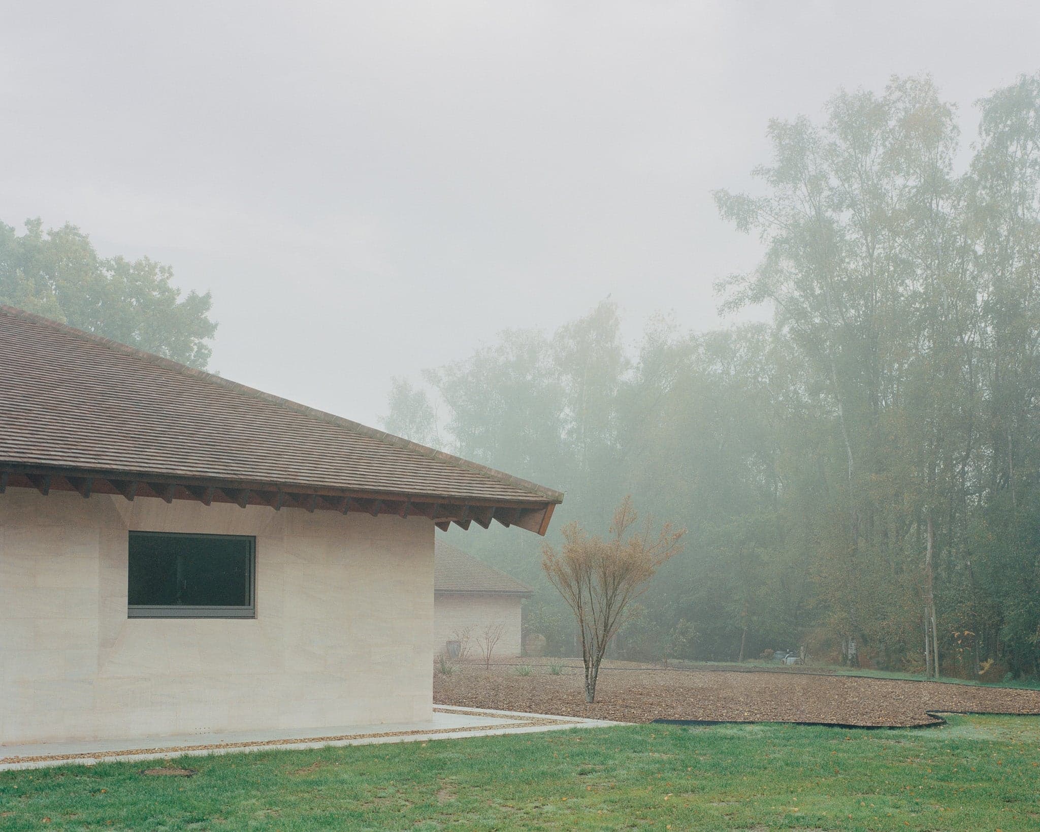
Eavesdrop is a country house set within the High Weald Area of Outstanding Natural Beauty (AONB) in West Sussex. It was designed by practice founder Tom Dowdall as a home for his parents to enjoy in their retirement. The house sits in the grounds of their previous home, a Grade II listed Lodge house, where they had lived for more than forty years. They are both keen gardeners and had created a magical formal garden in their previous home. The brief was for a home that did not require as much maintenance, could easily ‘open up’ to entertain friends or host family, had gardens that were more manageable in their retirement and for the home to be a part of the landscape. The house sits off a long garden wall that connects two large oak trees and divides the landscape between the existing formal gardens to the north and a wild meadow to the south. The form, materiality and structural logic of the house draws reference to the simple agricultural buildings of the High Weald, which sit so proudly within their landscape, with their sweeping, often sunken roofs and simplicity of construction. The stone refers to the Wealden Sandstone of the listed Lodge, though using a harder Clipsham stone, and displaying different tooling and cutting techniques to its surface. The skewed roof line, which rises towards the South West corner of the house, creates a hierarchy to the interior spaces, the highest point being the main living area. At the centre of the house, and conceived as the most important ‘room’ of the house, is the courtyard. It organises the plan; living spaces to the West side and the sleeping bedrooms to the East. It is a room that provides fresh air and sunshine whilst protecting from the winds. A room with plants to be appreciated all year round; specimen trees, grasses, plants and herbs. The courtyard is fully openable with large sliding glazing on all four corners, offering cross ventilation on the hottest summer days and an alternative way to move through the house. ^ Text by Tom Dowdall
Pinetum
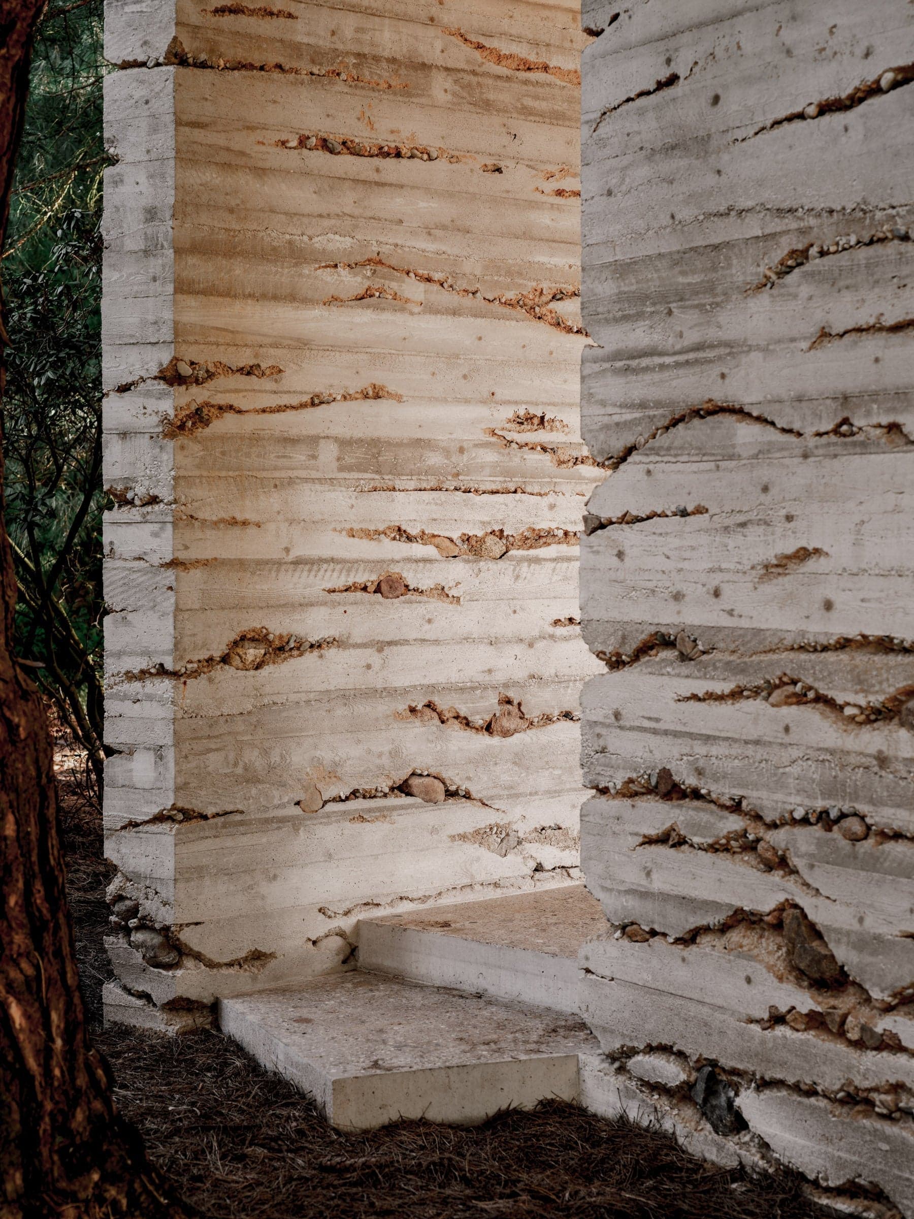
In 2018, a competition was held for a new pavilion in the Pinetum Blijdenstein botanical garden in Hilversum, attracting 135 architectural firms, including several prominent international names. Following a rigorous selection process, which narrowed the field to eight, then four, proposals, Enzo Valerio's design was selected as the winning entry. Over the next few years, the design evolved through close collaboration with Pinetum Blijdenstein, alongside efforts to secure funding for construction. After obtaining a building permit in 2022, numerous tests, material samples, and design iterations were conducted, culminating in the pavilion’s initial staking out in March 2023. Enzo Valerio’s studio is distinct in its hands-on approach, allowing continual refinement and adaptation throughout the construction phase. The pavilion’s architectural form comprises three robust, monolithic walls that appear to emerge naturally from the forest floor, seamlessly blending with their surroundings. A fluidly connected floor flows between the walls in three distinct directions, each creating a unique atmosphere and function. Above, a cantilevered roof appears to fold organically around the surrounding trees. The entire structure was crafted from a custom concrete mixture, incorporating sand excavated from the pavilion’s foundation and stones gathered on-site. This blend, featuring Hilversum’s characteristic yellow sand, lends a warm tone to the concrete. Hilversum’s soil plays a significant role in the pavilion’s design. This region is notable for its sandy subsoil, which has formed over centuries due to glacial and fluvial processes. The sand is not just a structural component but is integral to the design, embodying a connection to place. During the pouring of the pavilion walls, sand and stones from the garden were added to create horizontal striations, evoking the stratified layers seen in the area’s natural terrain. These bands highlight the weight and solidity of the structure, providing a visual narrative of the land’s geological history. In contrast, the pavilion’s floor features a polished finish that reveals embedded stones, showcasing a spectrum of colors and textures found in the garden’s soil. The roof was poured in seamless formwork, creating a smooth, reflective ceiling that brings the lush greenery of the garden into the pavilion’s interior. The process of creating this pavilion, blending thoughtful design with meticulous craftsmanship, is documented in the film At a Garden’s Pace by Juan Benavides, which premiered at the Architecture Film Festival Rotterdam (AFFR). The film offers an immersive look into the pavilion’s construction, where Enzo Valerio and a team of young architects, employed simple yet inventive techniques to explore and emphasize the “nature of concrete.” Under the attentive eyes of the gardener and garden visitors, their dedication illustrates that construction is as much a creative and integral part of the design process as any other stage. This meditative documentary highlights how exceptional design, coupled with skilled craftsmanship, can transform even a modest commission into a living work of art.
La Conception IV
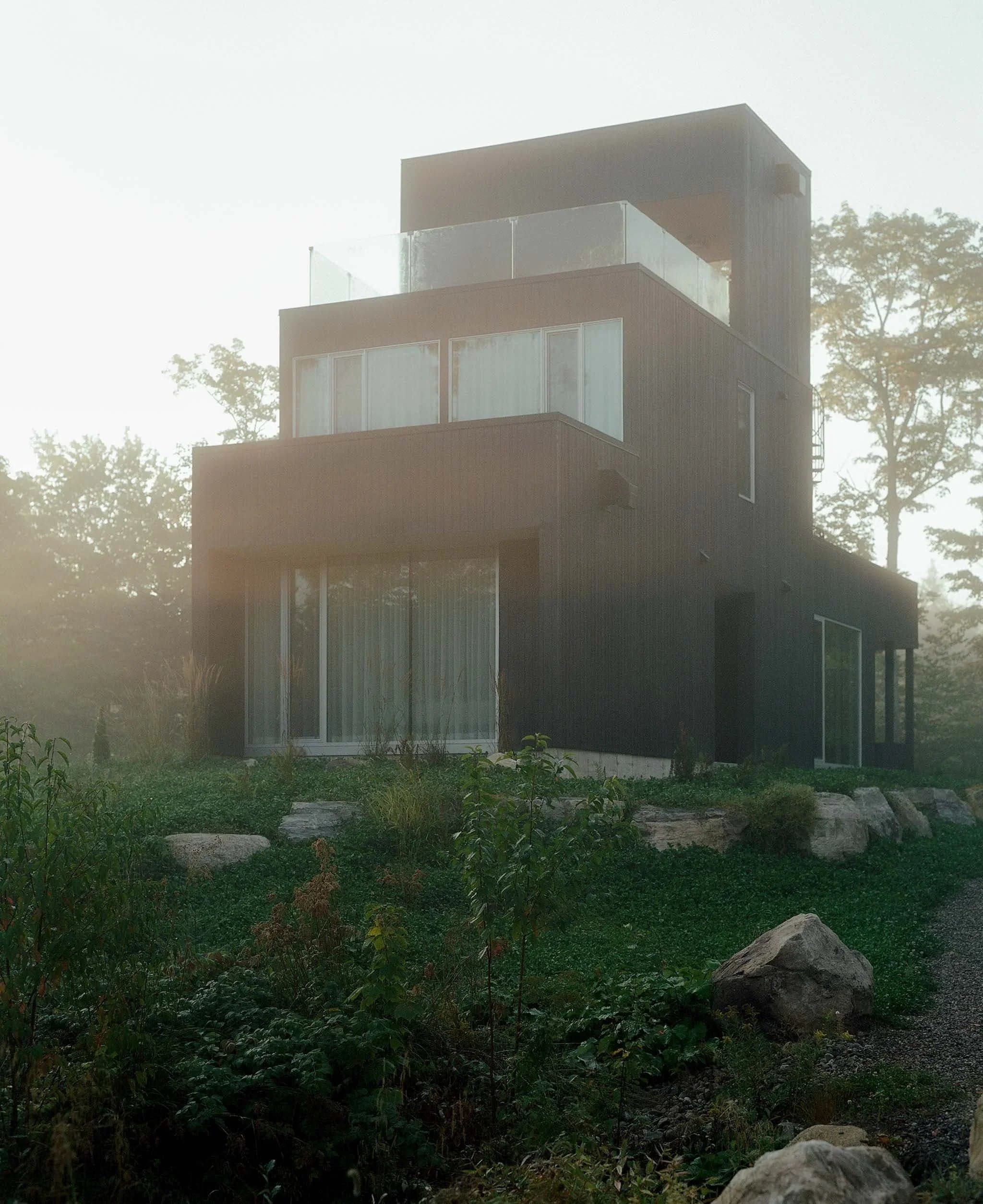
This project, with its sculptural language inspired by the work of Canadian artist Rolland Poulin, is an exercise that seeks to highlight the sublime qualities of the Laurentian Forest through the contrast between the building and its surroundings. The pure, monochromatic aspects of the project do not compete with the lush vegetation but rather engage in a dialogue with it. As the seasons change, one approaches the building and discovers it like a "found object", where the architectural journey culminates in a third-floor terrace/lookout offering views of the mountains. The interior layout is designed so that the promenade leads to the discovery of the project's many attractions. The design also provides diverse access to nature, including multiple entrances at ground level, the extent of the openings, and two sheltered terraces to maximize the outdoor experience. Source: www.nicolaschaudier.com
Farmhouse renovation
The project involves the rehabilitation of a former farmhouse building that had long stood vacant. Originally used to accommodate agricultural workers, it forms part of a group of structures arranged around a central courtyard. The clients’ primary ambition was to transform this place into a welcoming retreat where family and friends could gather and spend weekends together. The design seeks to establish a new continuity between the three main volumes—the open barn, the central building, and the dovecote—which had previously been fragmented into a series of small, compartmentalized rooms. This continuity is achieved through the creation of two distinctive openings in the load-bearing walls, linking the spaces from the tower to the planted barn. Until now, the building lacked any true outdoor living area. The former barn has therefore been reimagined as the main outlook from the living space: a semi-interior landscape whose curved forms echo the newly created openings, establish a dialogue with the farm courtyard, and frame the massive stone fireplace, carefully preserved and brought back into use. The layout of the rooms is determined by the logic of the existing façade openings. None of these openings has been altered or removed; instead, the project seeks to make full use of the specific qualities of each one. On the upper floor, the intermediate ceilings have been removed to reveal the generosity of the original volumes and to maximize the natural light provided by the existing dormer windows on the main façade. The tower regains its original vertical character, exposing once again the mechanisms of the bell structure above, which formerly punctuated daily life on the farm and have now been restored. The new spaces are designed to accommodate flexible and evolving uses while remaining adaptable over time. The upper-level living room can alternately function as a dormitory during gatherings, with mattresses stored within the stepped seating arranged around the central hearth; a private performance venue using the tiered seating and curtain at the back of the room; a screening room; or a variety of other uses. This reorganization is accompanied by a comprehensive thermal renovation. The thickness of the existing masonry walls, combined with new internal insulation that reveals the original stone façades previously concealed beneath a non-breathable cement render, contributes to both the building’s thermal inertia and overall comfort. The design also includes careful attention to bespoke integrated furniture. Built-in masonry benches emphasize the existing changes in floor level; a continuous run of cabinetry conceals the entrances to private rooms; stepped seating provides access to the half-level of the dovecote while incorporating storage and seating; and a library wall highlights the blind wall positioned behind the circular opening. Raw materials—concrete, ash wood, stainless steel, and sheep’s wool—are combined with bold accents of colour, creating a dialogue with the softness of curved lines and natural tones.
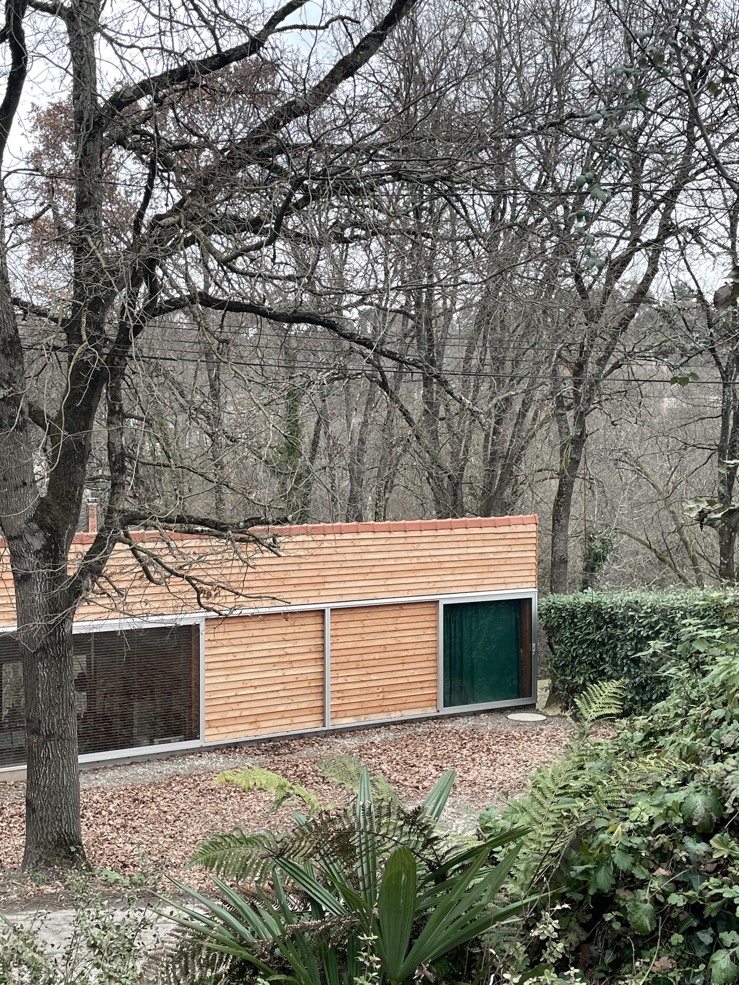
M45
M45 is located on a narrow, elongated plot sloping down toward a stream within a forested landscape. The building is positioned parallel to the site’s contour lines, allowing the terrain to be altered as little as possible and minimizing excavation. The volume follows the natural profile of the land. A mono-pitched roof accompanies the slope of the terrain, with its ridge oriented toward the access path. An extended roof overhang creates a sheltered outdoor zone, offering protection from rain and summer sun. The building rests on a base of polished concrete and concrete block masonry, which also forms the ground floor surfaces. The primary structure is constructed from solid Douglas fir timber. Two load-bearing rows of posts and beams—located at the ridge and along the wall plate—support the rafters. Their depth allows for the integration of wood fiber insulation within the roof structure. Glazed openings are fitted with sliding frames in natural aluminum. The roof is finished with traditional canal tiles. Solid façade areas are insulated with wood fiber and clad in overlapping Douglas fir boards. BAST (Bureau Architectures Sans Titre) is based in Toulouse, France. The studio’s work is grounded in a philosophy of revealing the existing elements of each project and questioning its context and meaning, often resulting in simple and essential architectural engagements.
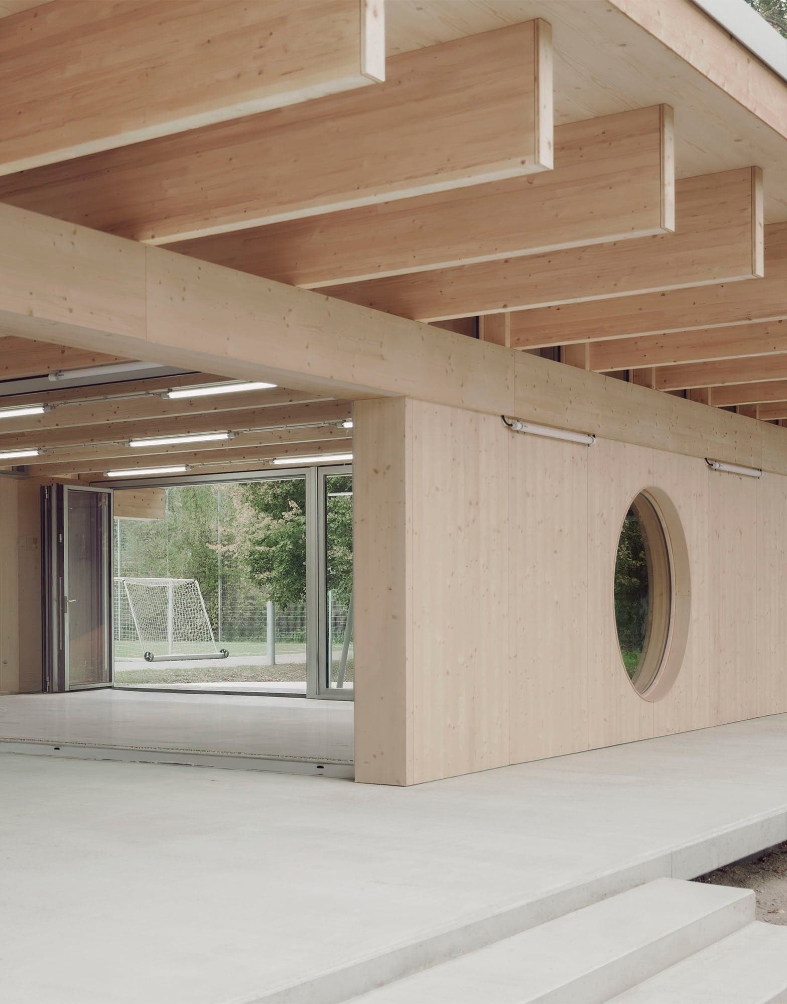
Engawa
The Sports Facility Ketzin is a compact, multi-use building situated between existing sports fields in Ketzin/Havel. Conceived as a shared facility for local sports clubs and schools, the project organizes its functions within a clearly defined and robust architectural structure. The design draws on the Japanese concept of the Engawa—a continuous wooden veranda that mediates between interior and exterior. This perimeter zone wraps around the entire building and provides access to all primary spaces, including the changing rooms and the club room. As an intermediate layer between building and landscape, the veranda supports circulation, informal gathering, and observation of sporting activities. Due to flood protection requirements, the building is raised on a solid concrete platform. This elevated base functions simultaneously as plinth, protective measure, and landscape intervention. Above it, a timber volume is constructed entirely from cross-laminated timber. Both the external walls and the roof structure remain exposed. Windows are positioned between the roof structure beams, allowing daylight to enter the interior while maintaining the legibility of the timber construction. The internal organization prioritizes functional efficiency and user comfort. Changing areas are arranged clearly and benefit from natural daylight and ventilation through skylights, reducing technical complexity. A transparent club room forms the social center of the building, accommodating club activities as well as public events and community gatherings. FAKT 132 combines a precise structural logic with a strong spatial concept, translating the idea of the Engawa into a contemporary sports facility rooted in its local context.
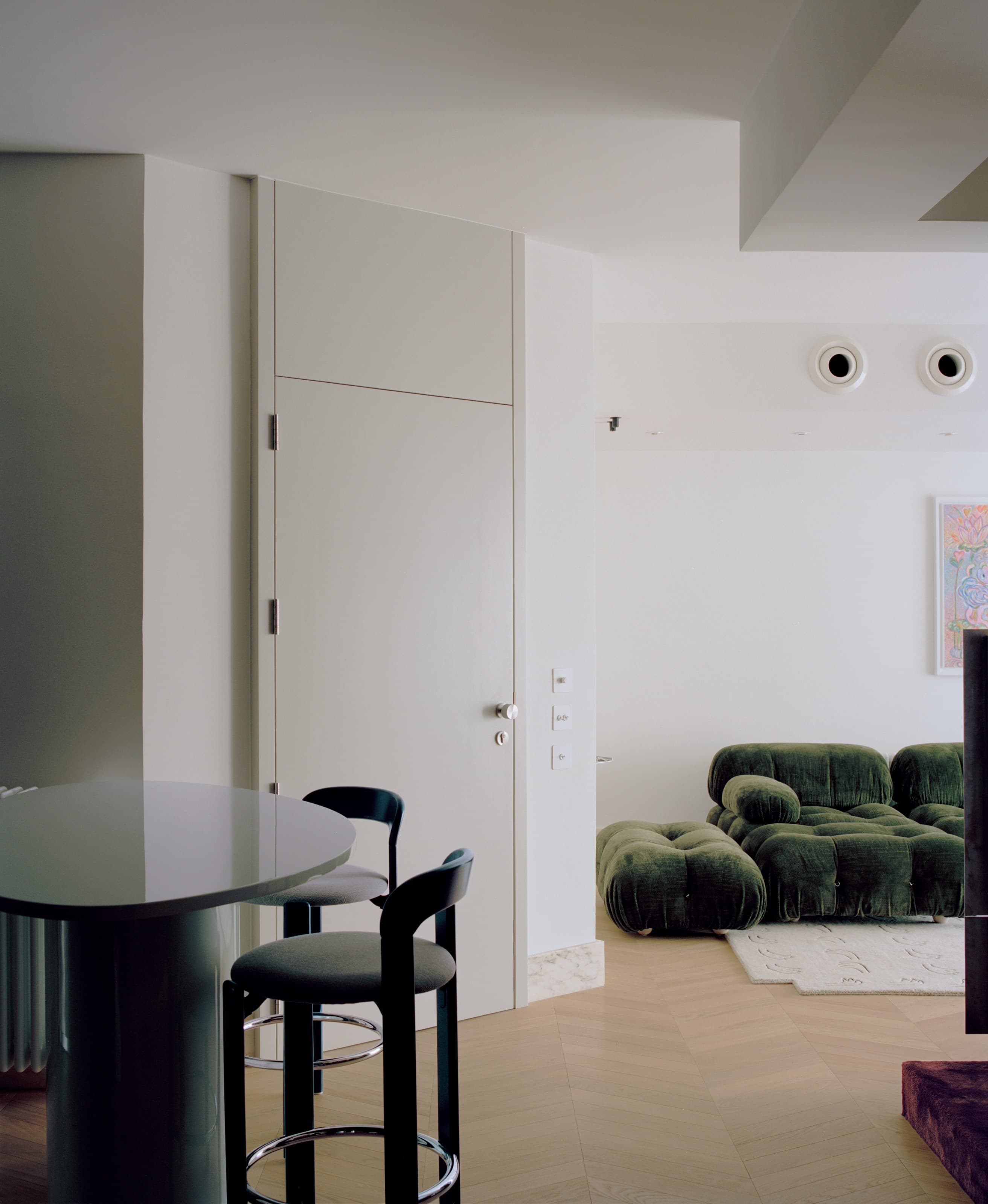
Apartment no.201
Anastasiou Misseri reworks an enclosed three-bedroom apartment into a luminous two-bedroom residence, where built-in architecture and a restrained material palette carry a single, continuous narrative. Inside an early-2000s apartment block, Anastasiou Misseri took on a dark, enclosed three-bedroom apartment whose common areas had been left fragmented. The renovation focused on reorganising those areas into a cohesive living environment, improving both visual and functional flow. Conceived in close collaboration with the clients as a curated pied-à-terre, the project trades a third bedroom for spatial clarity and refined detailing. The decisive move is architectural rather than cosmetic. By relocating the kitchen, the designers were able to introduce a continuous built-in element that begins as kitchen cabinetry and resolves, without interruption, into a display shelving system in the living space. It is a single gesture that ties cooking, gathering, and the showing of objects into one legible run — fitting for a home shaped around the appreciation of art. Beside it, a raised carpeted platform lifts a reading nook slightly out of the flow of the room, defining an intimate corner without the need for walls. Removing one bedroom did more than open up the plan. It freed the space for a generous walk-in wardrobe folded into the master bedroom, allowing the private rooms to share the same uninterrupted spatial logic as the living areas. Throughout, custom joinery in wood veneer and coloured lacquer sets the interior temperature, warm and precise in equal measure. Bespoke pieces — the kitchen table, the TV unit, the dresser — are treated not as furniture placed within the architecture but as extensions of it, drawn from the same language. Holding the composition together is a disciplined use of marble. It appears as a continuous skirting that wraps around each room, as the kitchen worktop, and again in the bathrooms as sinks and as the lining of walls and floors. Recurring with deliberate consistency, the stone becomes a connective thread, carrying the eye from one space to the next. Every element has been considered and designed to serve a coherent whole — a residence where spatial clarity, refined detailing, and a carefully chosen palette read as a single, unbroken narrative.
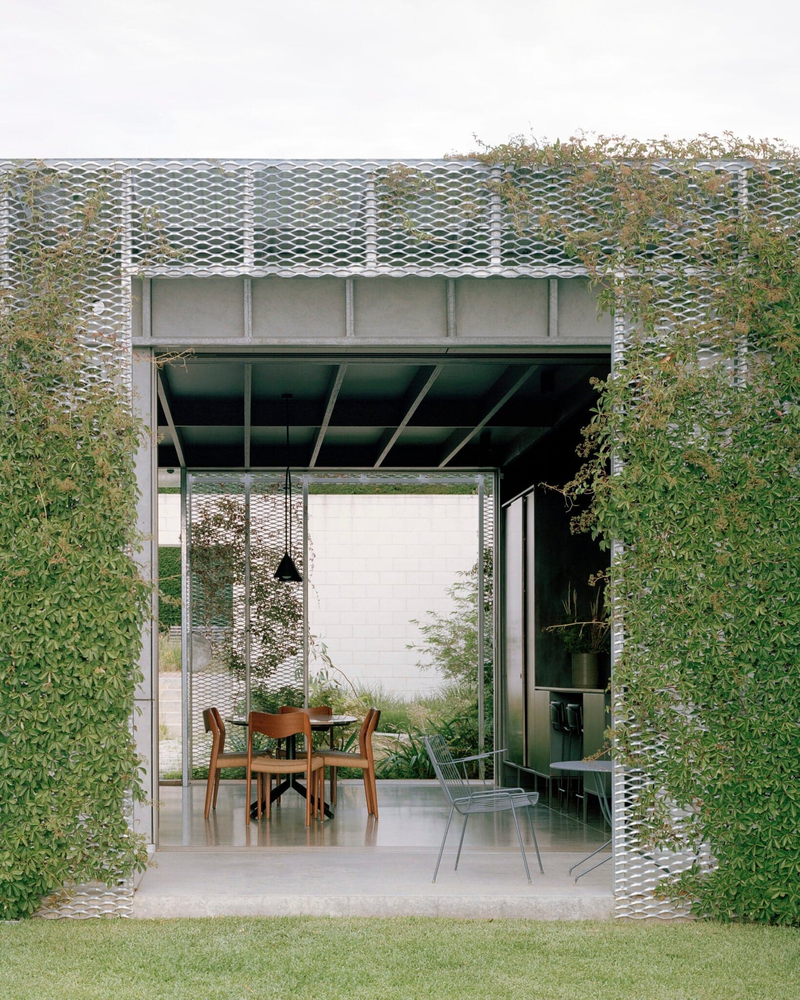
Hedge and Arbour House
Set in a leafy Melbourne suburb overlooking a bushland reserve, Hedge and Arbour House by Studio Bright redefines the relationship between suburban living and landscape. Instead of presenting a conventional façade to the street, the house is shielded by a tall, sculptural hedge that forms a walled garden at the front of the site. This green threshold transforms the approach to the home and allows the architecture to engage directly with its surrounding gardens and the parkland beyond. The main volume of the house is oriented east–west along the southern edge of the site to capture northern light and provide privacy from neighbouring properties. A perpendicular wing holds the living and kitchen areas, opening onto garden courtyards on both sides. This arrangement creates a series of connected indoor–outdoor spaces that are sheltered yet deeply integrated with the landscape. A delicate steel arbour wraps the building, enclosing a veranda space and providing support for climbing vines. This second skin softens the house’s robust masonry walls, offering protection from wind and harsh sunlight while lending the structure a lighter, more permeable character. The house is further defined by garden walls: one a retaining wall and the other enclosing the walled garden at the front, reinforcing the home’s sense of being embedded in its landscape rather than dominating it. Inside, the plan is efficient and practical. Children’s bedrooms open with sliding doors onto a shared corridor that doubles as a bench and study space, encouraging use of the common areas rather than retreat into private rooms. Toward the western edge of the site, where the land drops steeply, the house does not project out as an overt gesture; instead, it gently follows the topography, with the landscape-clad lower level stepping down to meet the ground. Sustainability was central to the project’s design. By prioritising passive strategies—optimising orientation for sunlight, enabling cross-ventilation, and minimising the need for mechanical heating and cooling—the house achieves environmental performance without technical complexity. The landscaping, developed in collaboration with Bush Projects, moves away from the traditional suburban lawn, introducing native plantings at the entry and maintaining a restrained open lawn to the rear. This considered approach to both architecture and garden creates a home that is compact, resilient, and deeply connected to its setting. Hedge and Arbour House was awarded the Harold Desbrowe Annear Award for Residential Architecture – Houses (New) at the 2025 Victorian Architecture Awards, recognised as a replicable and forward-thinking model for suburban housing where built form and landscape are integrated with sensitivity and innovation.
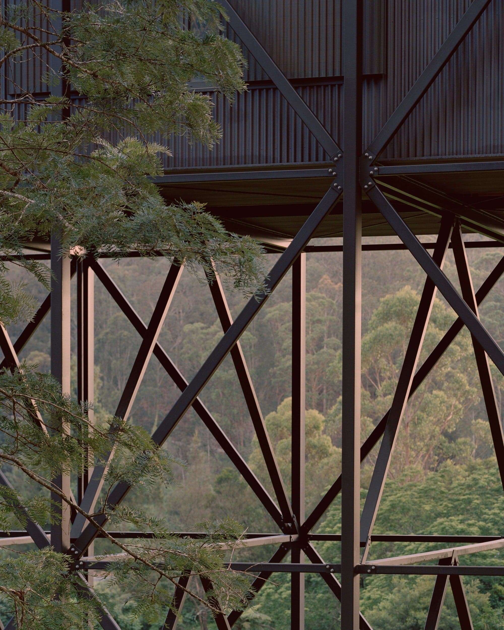
Bundanon Art Museum & Bridge
Situated on an 1,100-hectare property once home to artist Arthur Boyd and gifted to the Australian people, the Bundanon Art Museum & Bridge for Creative Learning repositions Bundanon as a cultural landmark — a place where art and environment meet in equal measure. The project expands Bundanon’s role as a centre for creative arts, education, research, and ideas, while making its $46.5 million collection publicly accessible for the first time. Developed as a suite of new buildings and landscapes, the scheme weaves together layers of history — Indigenous, pastoral, the Boyds, and the Bundanon Trust — into a single, centralised campus. Two primary new buildings anchor the work: the subterranean Art Museum, embedded in the slope and designed to be fire-resistant, and the Bridge, a 165-metre-long, 9-metre-wide structure suspended over a reinstated wet gully. The Bridge houses 32 bedrooms, creative learning and dining spaces, a public café, and breezeways that frame the surrounding landscape. It connects directly to the museum and existing heritage buildings via a shared forecourt and arrival hall. Climate resilience is central to the design. The Art Museum is concealed underground to shield it from bushfire, while the Bridge is treated as flood infrastructure, allowing overland flow to pass beneath it unimpeded. Together, these strategies aim for net-zero energy use and long-term adaptability to an increasingly volatile environment. The project’s success lies in the precision of its contrasts: a building that burrows into the earth and another that floats above it; solid defence and open resilience; a landscape both protected and engaged. In its completion, Bundanon has become not only a regional gem but a site of national and international significance.
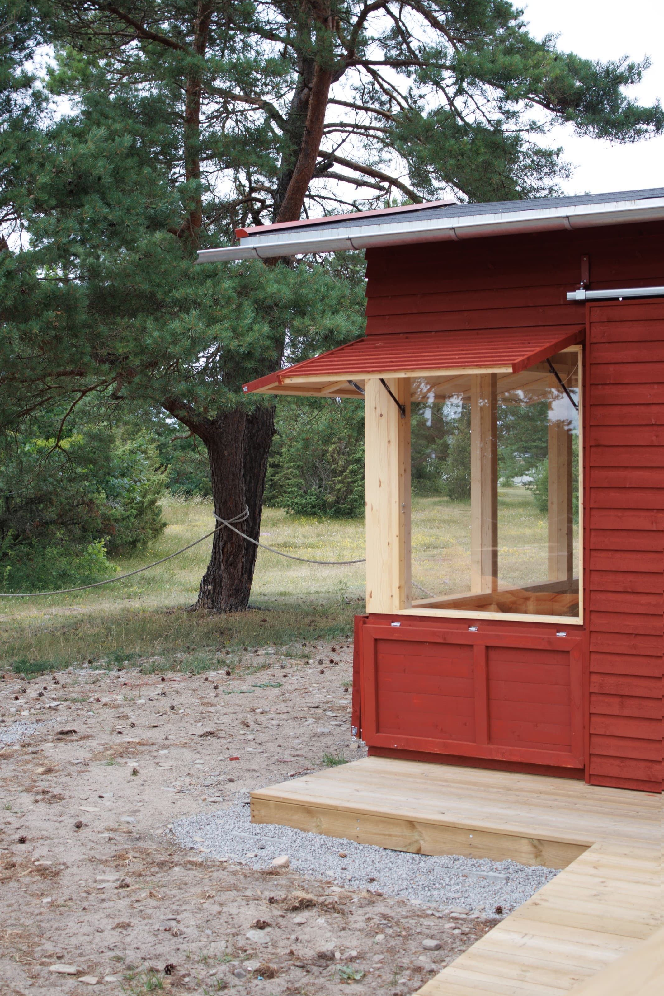
Skjulet Surf Bar
Skjulet Surf Bar is a small extension to an existing open-air bar on the west coast of Öland, the Swedish island in the Baltic Sea known as the Island of the Sun and the Wind. For decades Öland has supported a lively surfing community, and the strait between Mörbylånga and Kalmar is particularly popular for windsurfing, kitesurfing and wave surfing. Commissioned by Mörbylånga Municipality and Skjulet Öland, Dahlberg Busnardo's addition responds to the conditions of an exposed stretch of coastline, a landscape shaped by wind, shifting weather and seasonal occupation. The existing building, a former ice cream kiosk from the 1960s, set both the scale and the logic of the addition. Rather than replacing or transforming it, the project continues it through a new volume that holds an insulated kitchen and a sheltered gathering space. Together, the old kiosk and the extension form a sequence of open and enclosed spaces, allowing the bar to operate under changing weather while keeping its informal relationship to the beach. The extension is conceived as a simple timber frame. Its construction relies on ordinary dimensions, repetitive elements and locally familiar materials. The façades are clad in red-painted Fjällpanel, a profiled timber board widely used in Swedish agricultural and domestic buildings, while the roof is finished in bitumen felt. Horizontal timber shutters extend the envelope beyond the glazing, mediating between interior and exterior. In summer they filter sunlight and reduce heat gain; in the off-season they close the building entirely, leaving only a compact timber volume in the landscape. The project avoids architectural gestures in favour of constructional clarity: structure, enclosure and environmental response are resolved through the same set of elements, so that each component performs more than one function. The building seeks to be part of an existing coastal condition, where wind-shaped pines, juniper, grasses and low vegetation define the edge between land and sea. Its scale, material presence and restrained expression aim at continuity with the modest barns and storage buildings scattered across the island. Construction was carried out by Hansa Bygg and Karl Linus Bygg.
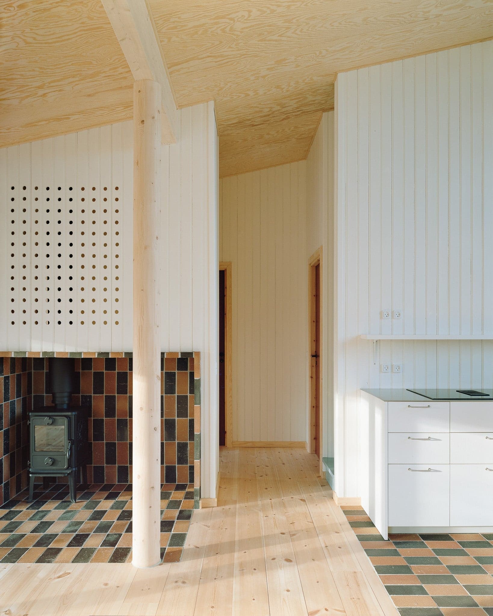
Two summerhouses in Rågeleje
Julius Nielsen OFFICE, a Copenhagen-based architectural practice, has completed two identical summerhouses in Rågeleje, Denmark. The project showcases the firm's commitment to material honesty, atmospheric sensibility, and ecological awareness. Each summerhouse spans 84 square meters and is designed with a straightforward yet thoughtful approach. Externally, the buildings are clad in vertical, untreated spruce boards, allowing them to age naturally within the coastal landscape. The choice of mahogany windows, some with aluminum detailing, introduces a refined contrast to the otherwise unembellished facade. Inside, the walls feature painted profile boards with bead moldings, while plywood-clad ceilings add warmth and texture to the interiors. The placement of the two structures is carefully adjusted to preserve the site's mature trees. To further minimize environmental impact, the houses are built on screw foundations, reducing CO2 emissions and preventing disruption to the trees' root systems. This approach reflects Julius Nielsen OFFICE’s broader ethos—balancing resource efficiency with a commitment to spatial richness. At the core of each house lies a simple wooden construction, anchored by a central column that organizes the plan while allowing for diverse spatial experiences. Thoughtfully placed openings frame views of the surrounding landscape, inviting changing patterns of natural light to shape the interiors throughout the day. The result is an architecture that prioritizes atmosphere—an approach that Julius Nielsen OFFICE embraces across its work. Founded in 2022, Julius Nielsen OFFICE is the culmination of its founder’s extensive experience in Denmark’s architectural scene. Alongside practice, Julius Nielsen has contributed to academia as a teacher and guest lecturer at the Royal Danish Academy – School of Architecture in Copenhagen. The studio engages in projects ranging from furniture and interiors to full-scale buildings, maintaining a curiosity-driven approach that ensures each work is rigorously conceived and deeply felt. Julius Nielsen has been recognized with prestigious grants, including a working grant from The Danish Arts Foundation and a travel grant from Dreyers Foundation, both in 2023. Whether designing small-scale objects or entire structures, the office seeks to craft buildings that endure—both physically and emotionally—through their sensitivity to context, materials, and the intangible qualities of atmosphere.
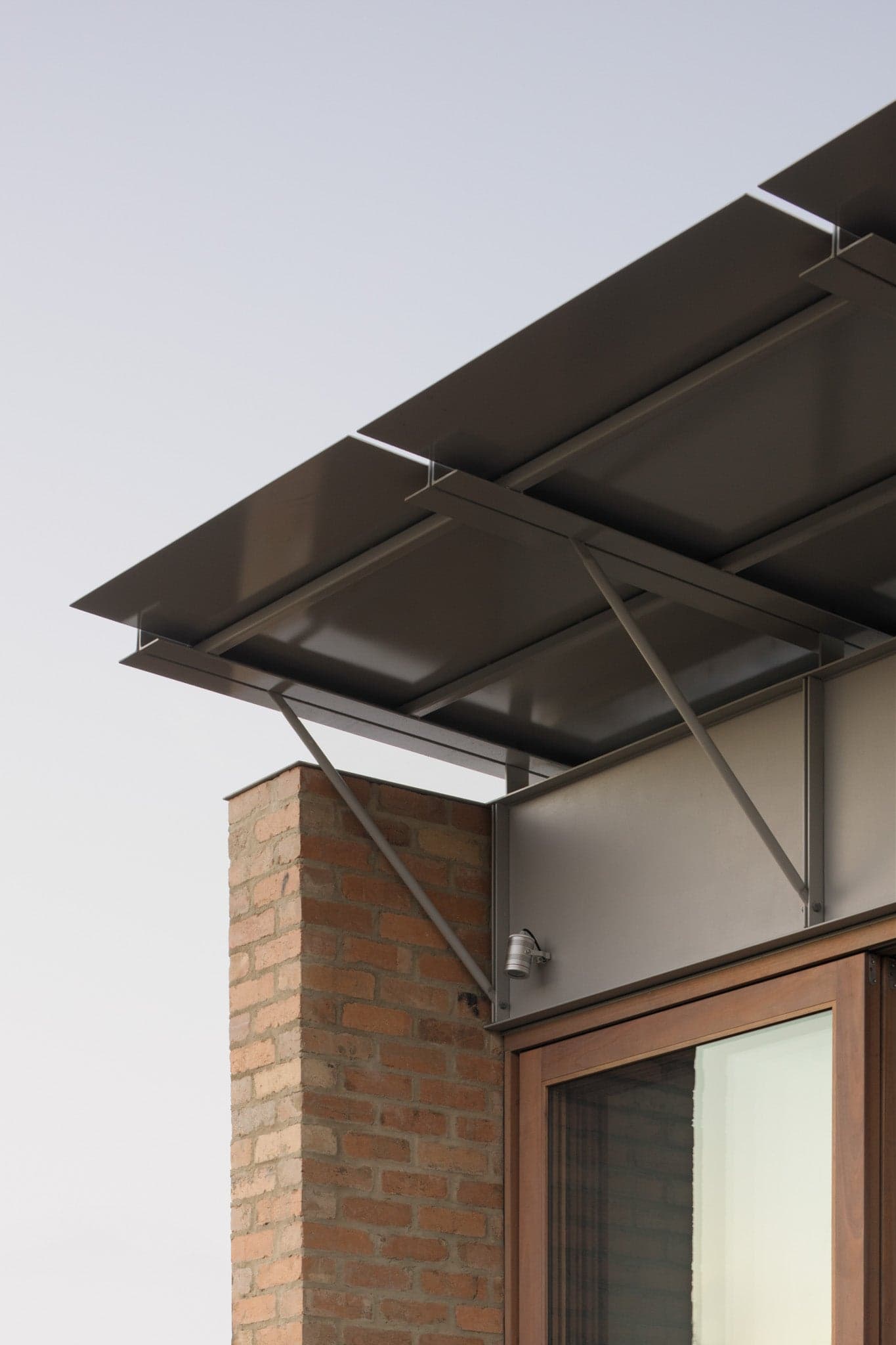
Westgarth
Designed for a young family, our Westgarth project comprises alterations and additions to an existing Edwardian style house with a typical symmetrical configuration of rooms arranged around a central entry axis. The challenge of accessing natural light from the primary southern orientation was addressed by establishing three key zones in the design, which acted as an overarching ordering system. Simply, the existing house of red flush joint bricks is allocated to bedrooms and work spaces, leading to a centrally positioned services block for bathrooms, utility and storage. This is then followed by a generous living volume which can be adapted to suit the family’s evolving needs. For practical reasons, the central services area is elevated above the ground, and then steps down to the bare concrete living area floor. Seven multidirectional sliding doors open fully to the contained rear garden, unrestricted to views and activity. Above this timber framed opening sits a steel, sun shading canopy, designed to be as thin as possible to achieve a sense of lightness in contrast to the flanking recycled brick walls. Appearing free of the building, the canopy is a continuation of our interest in early Australian kite and aircraft componentry, which we explore in our practice work. To assist with this legibility of the canopy, the diagonal, circular hollow section struts bolt to either side of equal angle cassettes and repeat along the length of the opening. Light is brought into the living space through a pair of north facing hinged doors, providing ventilation and access to two courtyards, including an enclosed fern garden to the west and a productive garden to the east.
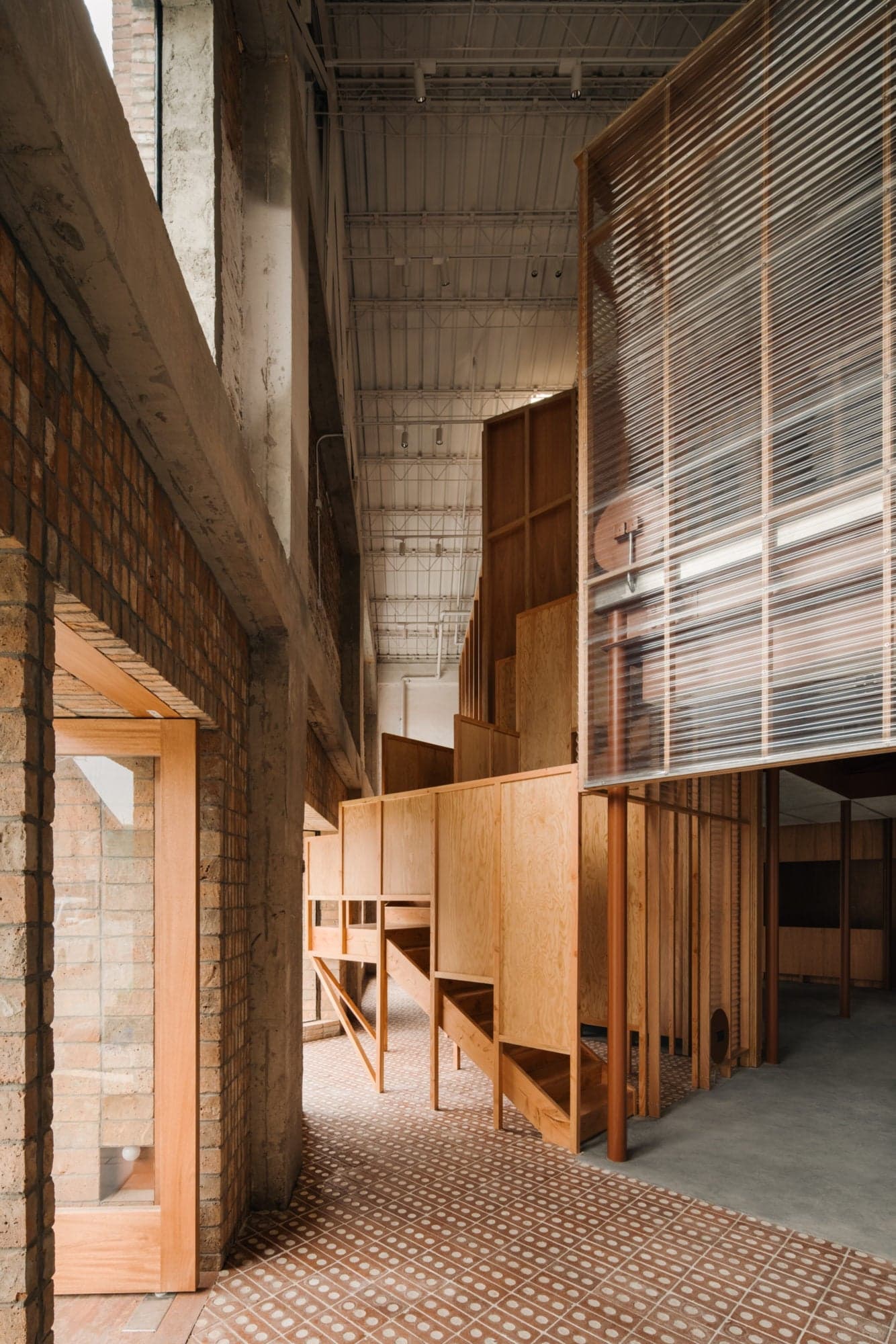
Ziinlife Beijing Store
Formerly known as Beijing textile warehouse, a factory with red-brick walls and pitch roof built in the 1960s has been transformed into a new showroom for a young domestic furniture brand, ZIIN. Atelier tao+c sought to balance the relation between existing site with the new function, exhibition and sale, background and objects by placing two intersecting square frameworks, which were rotated 45 degrees to detached from the original four walls, and formed independent nested buildings in a building.
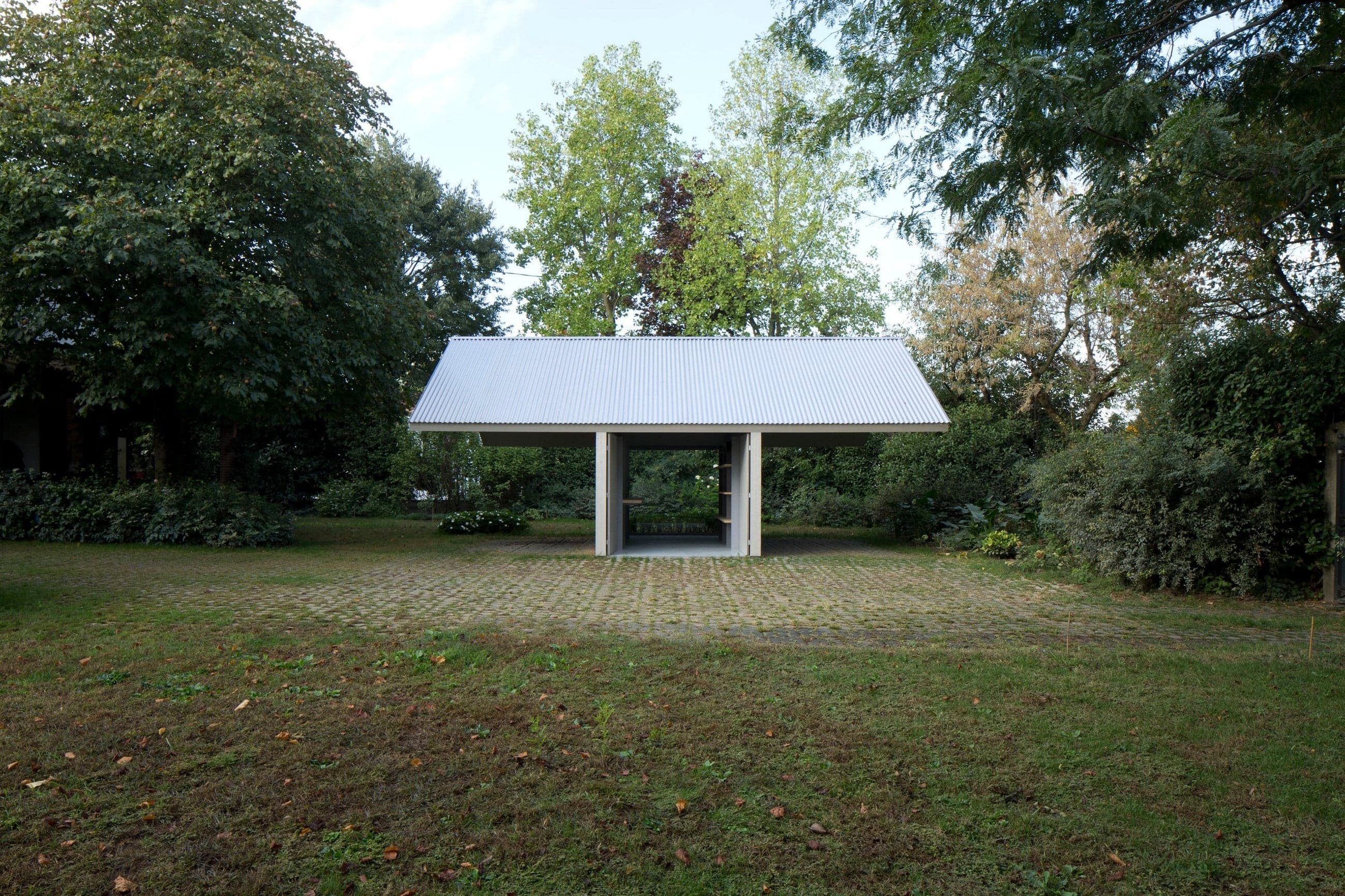
Workshop Garage
Nestled within the garden of a semi-detached house, Studio Spazio's Workshop Garage in a Garden is an exercise in structural clarity and spatial openness. Designed to accommodate two parking spaces and a workshop, the compact building is composed of four imposing wooden panels. Despite its modest scale, these panels introduce a striking presence, establishing a dialogue with the surrounding trees and natural elements.A defining feature of the project is its gabled roof, which rests crosswise atop the walls with only a single point of contact. This deliberate structural articulation minimizes enclosure, ensuring that the garden remains perceptible in all directions. Rather than segmenting the plot, the building fosters a connection between interior and exterior, subtly integrating itself into the landscape.Inside, the workshop is reinforced by thin metal pillars that lend stability to the structure. Due to their refined proportions, these elements read more as furniture than as conventional supports, further blurring the line between architecture and object.Ultimately, Studio Spazio’s approach challenges the typical notion of a garage as a closed, utilitarian space. Here, the architectural language emphasizes openness, materiality, and a seamless interaction with its environment, transforming a functional outbuilding into a spatially engaging structure.
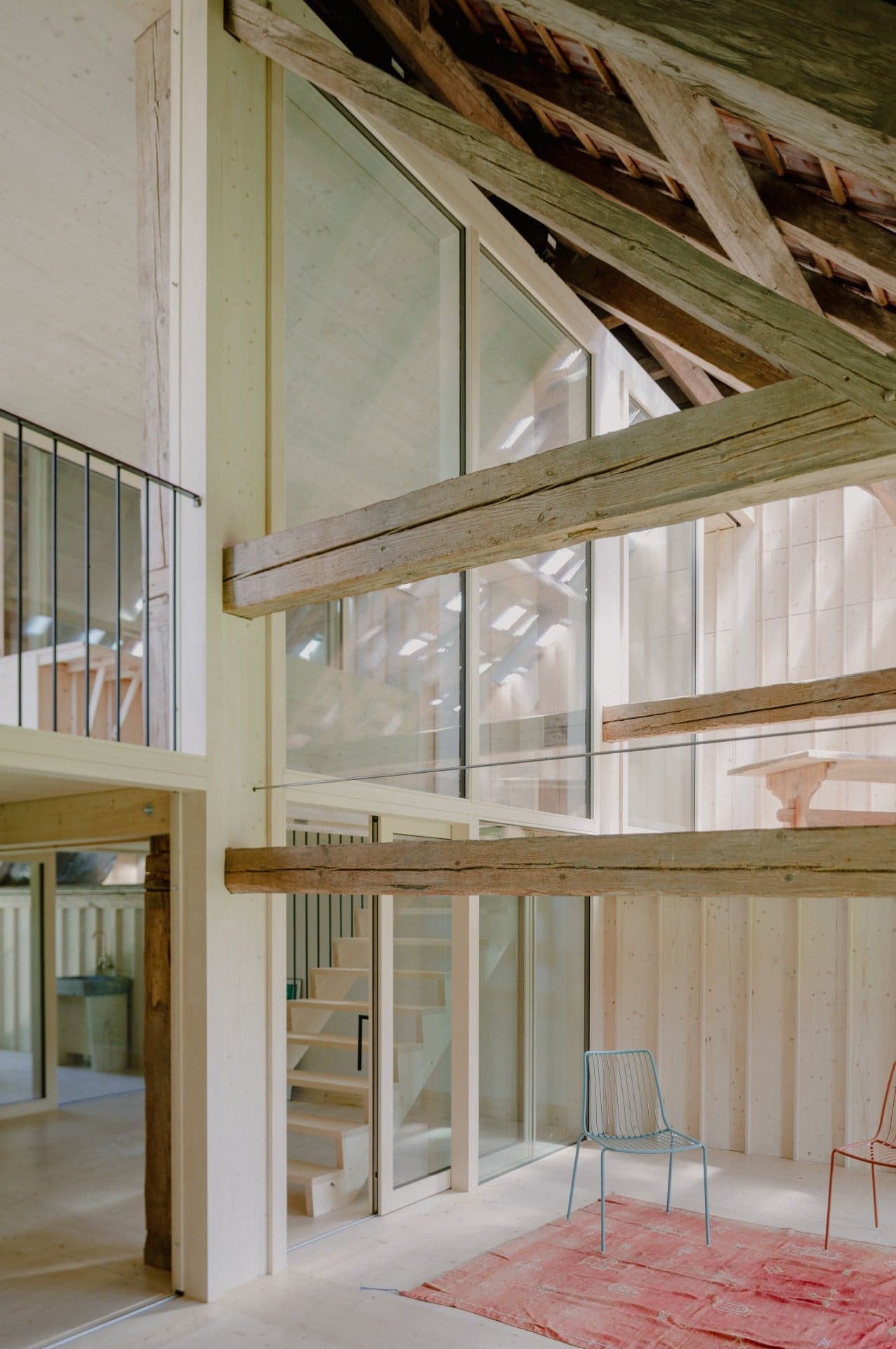
Transformation of a Barn
Inside an old 17th-century barn in which no line is straight, a wooden box with fully glazed facades takes place to accommodate a new apartment. The contemporary intervention constantly echoes the traditional Swiss agricultural constructions, reinterpreting some of their archetypes, diverting them from their primary use to generate a surprising dwelling, with unusual proportions, which revolves entirely around the enhancement of the historical wooden frame. Set back from the original envelope by 4m, the glazed box leaves on either side vast covered terraces, and intermediate spaces to invest, between the new apartment and the outdoor gardens. The main space, 3.15m high, is made accessible by the new barn bridge on the outside. Below, a lower space, 2.09m high, generates a welcome intimacy. When the sliding windows are open, the space expands to become this hybrid place that is neither completely interior nor completely exterior. Further back in the barn, behind a large wooden facade hide the bedrooms which also open onto the covered terraces. The bathroom, in the center, is covered with a "terminal", a typical trapezoidal vertical space previously used to dry food. Here, it ends with a window that opens and once again reveals the historical framework. The space is fluid, and opens and closes, according to the seasons and uses. The kitchen, mobile, moves. The stair hatch folds down. The light seeps through the panes of glass which alone betray from the outside the presence of a project in this old barn. The encounter between the historic and the modern construction creates spaces of unexpected proportions, with changing light, in which the inside and the outside sometimes mix, multiplying the possibilities.
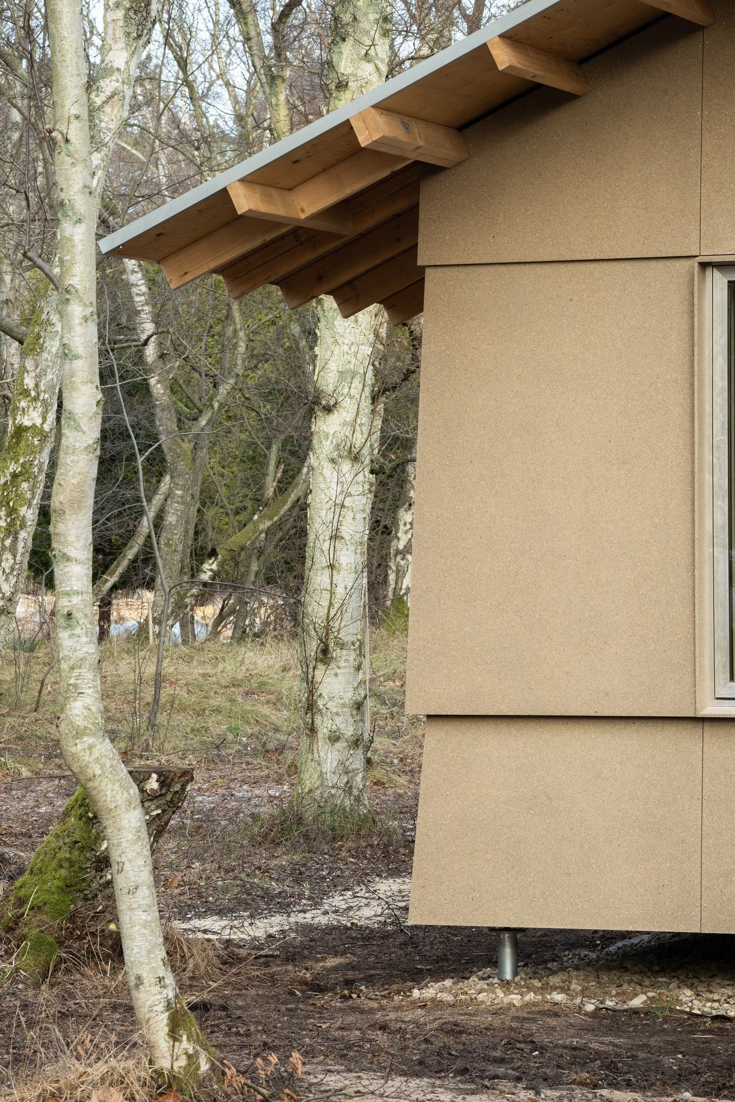
Between Birch
Amid a quiet forest clearing, Between Birch makes a case for architectural modesty. Designed by Kim Lenschow in collaboration with Pihlmann Architects, this small summerhouse demonstrates how careful choices in form, materials, and construction can result in a dwelling that is both ecologically and aesthetically light. With minimal disturbance to its surroundings, the house settles gently into the landscape—neither dominating nor disappearing, but attentively coexisting. The house is built without a concrete foundation. Instead, slender helical screw piles lift the structure above the forest floor, preserving the integrity of the site. This thoughtful gesture sets the tone for the entire project, where lightness becomes both a technical and expressive principle. A timber frame, clad in modest materials, holds the volume together. The house reads as both temporary and rooted, like a structure that could have always been there—or might just quietly vanish with the seasons. From a distance, the building appears as a compact gabled volume, but inside it surprises with vertical generosity. The proportions play with perception: small from the outside, spatially open within. A separate entrance leads to a small guest room, enabling spatial efficiency and privacy without sacrificing comfort. This division echoes the architectural approach—economical, yet refined. Material choices are guided by a philosophy of enough. Birch plywood is used only where the body meets the building: touch points such as interior walls, built-ins, and ceilings. Other areas are left raw, exposing structural timber and the layers of construction. This strategy reduces material use and invites occupants to read the building’s logic—a quiet celebration of process and assembly. The result is a space that feels temporal, translucent, and calm.Throughout the structure, detailing plays with the idea of lightness. Thinly cut metal fixtures in the bathroom, airy fiber insulation, and vertical facade elements that catch the sun at an angle all contribute to an impression of a building in soft motion—hovering, never heavy. It’s an architecture that reveals itself slowly, through shifts of light, subtle textures, and the rhythm of daily use. Between Birch is the result of a collaboration between Kim Lenschow—a Danish architect known for her quiet, context-sensitive designs—and Pihlmann Architects, a Copenhagen-based practice working at the intersection of architecture, material research, and landscape. Together, they present a shared vision for low-impact living: an architecture that treads lightly, but resonates deeply.
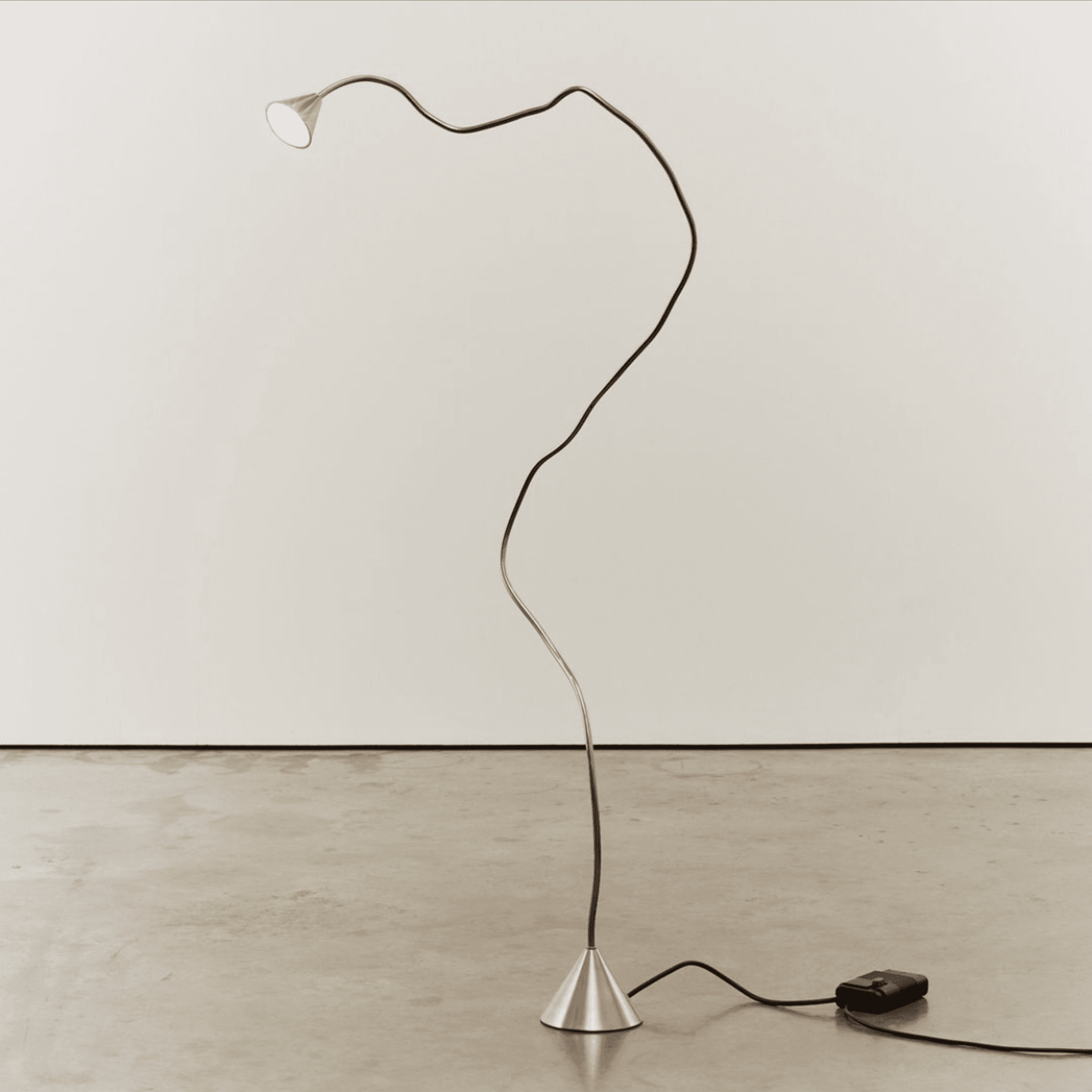
Papiro Lamp
Designed by Sergio Calatroni, an eclectic personality divided between art, design and architecture, the Papiro floor lamp embodies an enchanting mix of form and flexibility. With its distinctive, organic silhouette, Papiro is designed to be more than a light source—it is a sculpture for the home. The nickel finish complements its sinuous shape, creating a striking balance between industrial material and fluid form. Its unique, malleable design allows the lamp to be shaped and adjusted at will, making it an endlessly adaptable element within a space. Whether casting a gentle glow or standing in graceful repose, Papiro captures the eye as a poetic expression of light and movement, bridging the realms of functional design and expressive art.The lamp is currently manufactured by italian furniture brand Pallucco and is for sale over here.
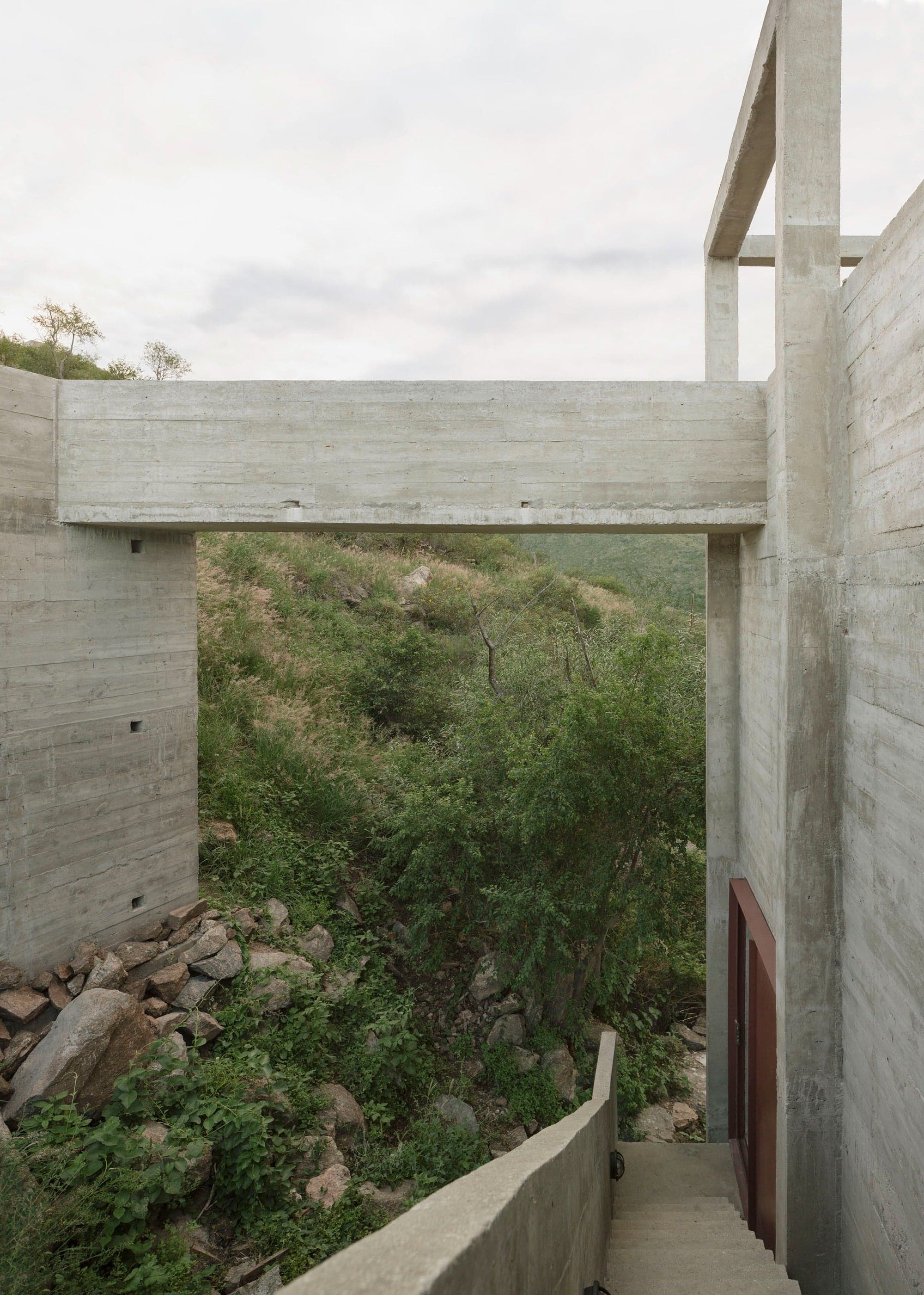
Casa Taller
Casa Taller La Paisanita is located in Córdoba on a site with an approximately 45-degree slope, overlooking a river and framed by views of surrounding mountains and treetops. Conceived as a place for living, working, and writing, the house is set within an environment characterized by solitude and quiet. The project is organized around a system of complementary contrasts. The lower portion of the building is conceived as a heavy element, while the upper volume is lightweight and rests lightly on its supports. In its open state, the house engages with the surrounding views and sunlight. When closed, it allows for a more inward-focused condition. Access to the project is arranged from the roof level. The roof does not exceed the highest point of the site in order to preserve existing views. From this upper entry, the building is gradually traversed downward, leading to an entrance at the lower level through a sequence described as contemplative. This route allows direct contact with the natural terrain. The architectural layout is defined by a clear geometry. A retaining wall establishes a relationship with the mountain, while a bridge extends from it to provide connection. The building’s narrow form follows the steepness of the site, compared to the footprint of a goat. In response to the slope, the program is stacked vertically across multiple levels, descending from the terrace to the ground.
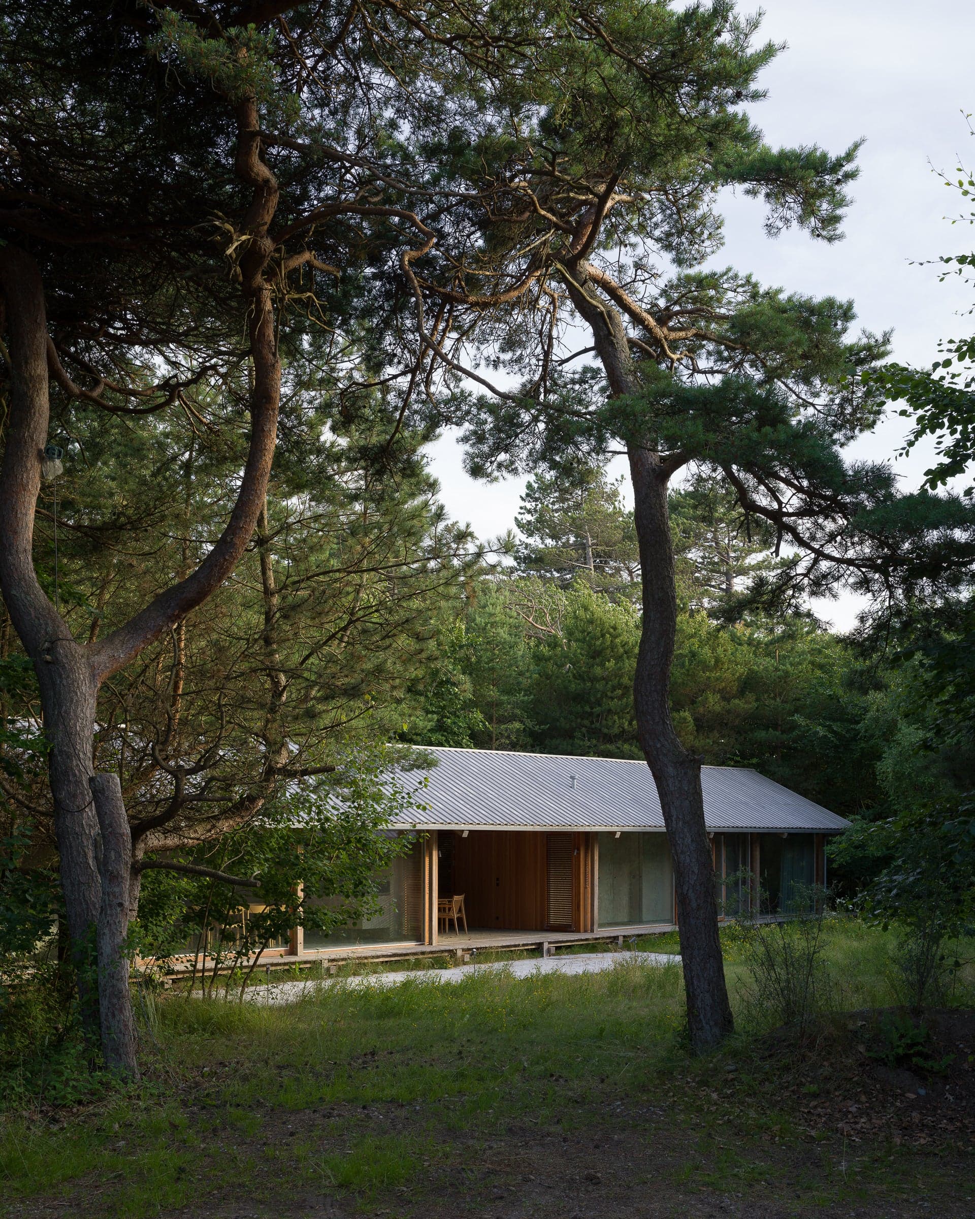
Summer Houses in Rågeleje
Tucked between deciduous and coniferous trees, shrubs, and rhododendrons, four houses lie in the clearings. Like wedges gently nestled into the vegetation, they create a complex built for four brothers. Located in the woods, but near the ocean shore, the houses are exposed to a harsh coastal climate. Along with the encircling vegetation, this setting has formed the architectural leitmotif. The houses are characterized by a modest appearance. Like small pieces, conscious of their size amongst nature’s grandeur, they are placed lightly on the ground. Each of them is dimensioned to adapt to the existing flora which permeates the site as a constant marked by continuous change. Every tree has been preserved and the buildings submit to their natural logic. This rhythm of nature is also evident in the buildings’ structures. They are constructed from four different types of wood which are combined, assembled, and positioned according to their inherent qualities. Solid robinia is used for the exterior timber structure including the roofs and decks to withstand the rough weather and sandy soil. Robinia glulam constitutes the load-bearing structure due to its constructive strength. Earthy nuances from the surroundings are refined on the inside. Furniture and lining are made of European pine, rich on figure and tactility, while slow-growing Douglas fir constitutes façade elements such as cladding, windows and doors. Flooring of handmade tiles provide a sense of weight that anchors the houses to the soil while allowing carefree movement between inside and outside. In the bathrooms, both floors and walls are clad with half-sized tiles, adapting the pattern of the full-sized tiles of the rest of the interior. Sinks are made of bright stainless steel which is contrasted by the pipes and faucets of patinated brass. The same programmatic core is repeated within all four buildings. Two annexes contain bedrooms and bathrooms while the two longer buildings additionally provide kitchens and living rooms. All the furniture, from cupboards and sinks, to handles, hinges and lamps, are made bespoke for the project. To encourage an intimate relationship between hand and house, the project appears deliberately as low-tech architecture which stimulates and enhances the interaction with its residents; like an analog toolbox made to be used. Together, the houses assemble a simple palette of sturdy materials and components, which salute the traces of both time and touch.
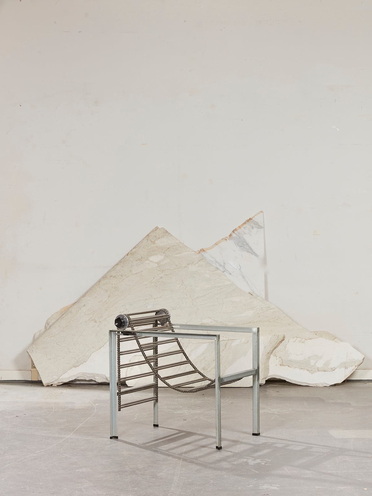
Comme des Garçons’ furniture collection
In the 1980s, Paolo Pallucco emerged as a pioneering figure in contemporary furniture design, though his initial impact came from reviving early modernist classics. Born in Rome in 1950 and trained as an architect, he brought forgotten icons like the Fortuny floor lamp, Robert Mallet-Stevens' 222 chair, and René Herbst’s Sandows chair back into production. However, his ambitions extended beyond reproduction—Pallucco was drawn to the idea of furniture as a platform for artistic exploration.This creative shift gained momentum when he began designing original pieces, often in collaboration with his then-wife Mireille Rivier. While Rivier grounded his more radical impulses, Pallucco’s partnerships extended to influential figures such as Comme des Garçons founder Rei Kawakubo. As design expert Boris Bourdet notes1, "I think that Paolo Pallucco always had a strong interested in design, but after reissuing design classics he met Rei Kawakubo and started producing her furniture for Comme des Garçons.“ This marked his full transition into contemporary design. For Pallucco, furniture was more than function—it was a conceptual statement. His designs often featured industrial materials and exaggerated forms that played with ideas of modernist minimalism while subverting its core principles. Poetry, photography, religion, and cinema all influenced his work, as seen in the Stalker chair—a steel and polyurethane foam piece with three precarious legs, directly inspired by Andrei Tarkovsky’s 1979 film Stalker. War was another recurring theme: the Tankette coffee table (1987) referenced tank tracks, the Barba d’Argento armchair (1986) suggested a machine gun, and the Bocca da Fuoco coat rack (1987) evoked an exploding cannon. Pallucco’s furniture disrupts modernist ideals of pure functionalism, offering an ironic critique of the relationship between war and modernist design. Pallucco’s encounter with Kawakubo in the early 1980s led to one of his most defining collaborations. After visiting a Comme des Garçons store in Tokyo, he and Rivier were struck by its radical aesthetic. Introduced to Kawakubo through a mutual friend, Pallucco soon began producing furniture for Comme des Garçons stores. His pieces, characterized by stark industrialism, aligned perfectly with the avant-garde sensibilities of the brand. One standout creation was a series of triangular nested tables made from steel and stone, set on caster wheels for easy reconfiguration in the store’s dynamic retail environment. Through his unconventional approach, Pallucco helped redefine the boundaries of furniture design. His collaboration with Comme des Garçons demonstrated a shared commitment to challenging norms, cementing his legacy as a visionary whose influence continues to resonate in contemporary design.
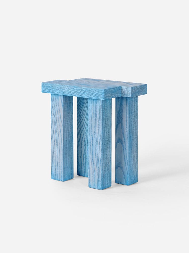
Elements Stool
엘리먼츠 시리즈는 재료의 질감과 다양한 마감 방식을 탐구하며, 각 재료들을 실험적으로 조합하여 제작된 시리즈입니다. 서로 어긋난 요소들의 조합은 어색해 보일 수 있지만, 공간 안에서 다양한 오브제들과 조화를 이루며 예상하지 못한 새로움을 발견합니다.엘리먼츠 스툴은 가볍게 앉거나 작은 사물을 올려두기에 적당한 형태를 가지고 있습니다. 단독으로 사용하거나 다른 시리즈와 결합하여 다양한 연출이 가능합니다. The Elements series explores the texture of materials and various finishing methods, and is a series created by experimentally combining each material. The combination of mismatched elements may seem awkward, but in harmony with various objects in the space, unexpected newness is discovered.The Elements stool has a shape suitable for sitting lightly or placing small objects on it. It can be used alone or combined with other series to create a variety of looks.The stool is for sale on Oryu Elements’ website over here.
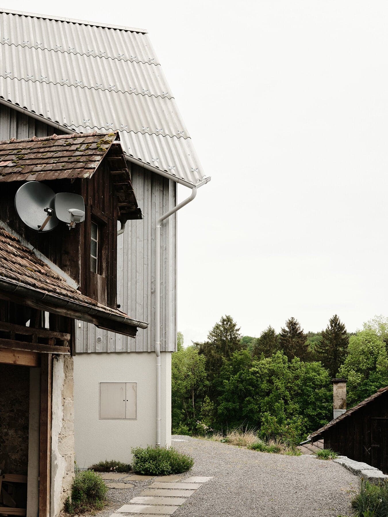
Hinterhueb
This residential building seamlessly blends into its surroundings despite its unconventional floor plan. It adopts the proportions and alignments of the existing structures, with a roof that becomes a natural part of the surrounding roofscape. The material palette and fenestration reflect familiar architectural elements, optimized for contemporary residential use. Constructed using a hybrid method, the façade's timber structure supports concrete floor slabs. The exposed concrete staircase, serving as a vertical spatial sculpture, provides structural stability while connecting the floors. A gallery elegantly links the kitchen and living areas, enhancing spatial flow. The entrance is set three steps lower, creating a subtle spatial hierarchy that emphasizes the transition into the home. Material authenticity is a core design principle—craftsmanship and meticulous detailing take center stage. Simple materials are elevated through precise planning and execution, as evident in features like the interlocking stone corners of the cement block walls and the continuous oak handrail. All built-in elements and interior walls are positioned at right angles to the façade, contributing to a sense of calm organization and spatial coherence. The result is a residence that reflects both traditional values and modern functionality, embodying a quiet sophistication through its careful attention to materiality and detail.
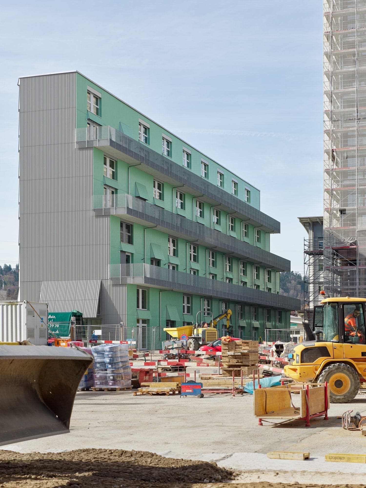
Zwhatt
The longitudinal residential building has been designed as a pilot project on the theme of “sufficiency”. The apartment building takes the form of an urban terraced row. Its concise building shape links with the adjacent residential tower block and corner shop to form a memorable ensemble that promotes a sense of identity. Based on the idea of sufficiency, the two-storey apartments are mainly intended for one-person or two-person households and are divided into S, M, L and XL types – not according to the number of rooms but according to their absolute size. This gives rise to a new type of apartment – the maisonette loft. The maisonette loft consists of a two-storey spatial configuration. Instead defining distinct areas via partitioning walls, the maisonette loft is divided vertically into two levels that are connected by the open gallery. The fittings are limited to a necessary minimum. The basic elements in each apartment consist of a galvanized-metal spiral staircase, a bathroom and a robust, expandable kitchen.
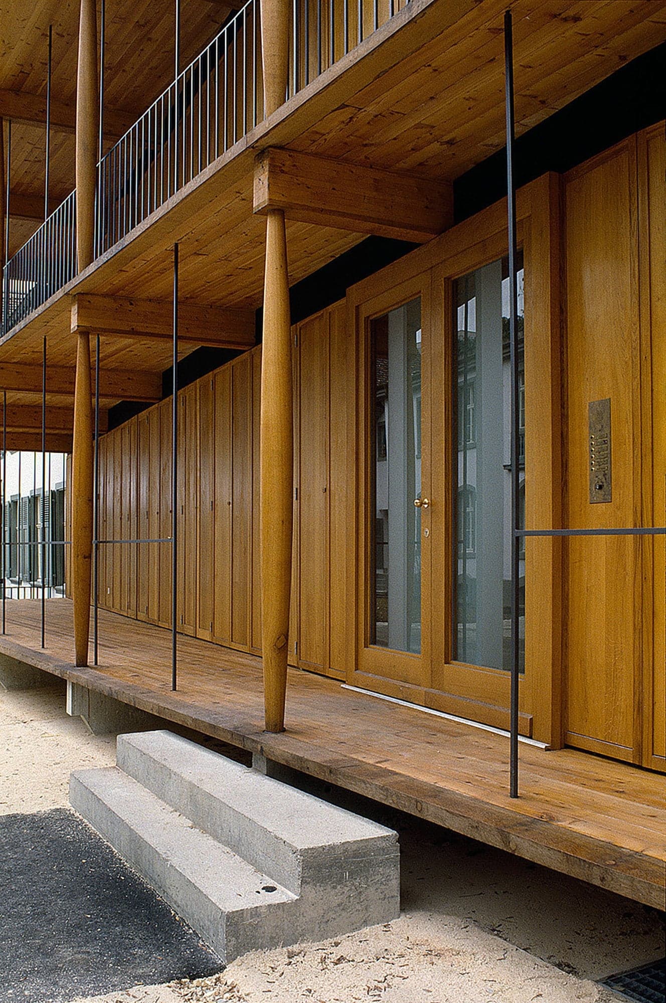
Apartment Building along a Party Wall
The new apartment building continues the grain of the quarter’s courtyard development, extending the façade of the existing wing. With the party wall forming the new apartment building’s eastern side, the organization of the rooms follows the linear configuration that contains a central staircase. Both the attic and the southern end of the building are treated as more independent configurationally elements, marked by slender supports and continuous glazing. The lower two floors are entirely clad with oak panels that form, together with the turned oak columns, a “surface” with varying depth, a kind of timber spatial layer between interior (living room) and exterior (garden).
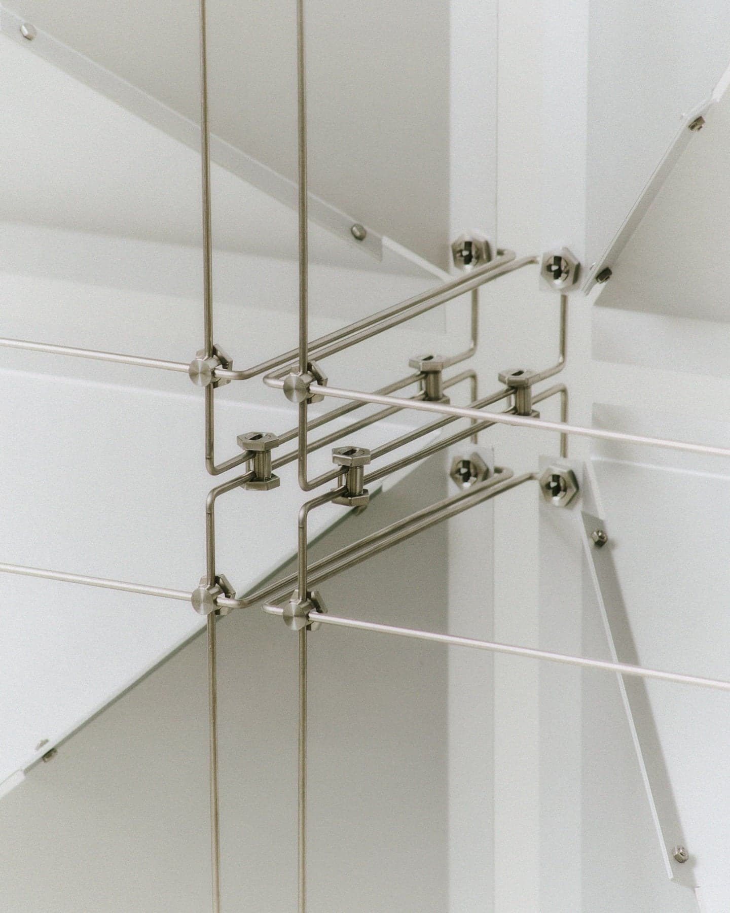
Reflector Lamp
The work of Copenhagen based design duo Frederik Gustav shifts across various functions, scales and contexts to create objects and installations that merge design, architecture and art. Focusing on the joy and excitement experienced through experimentation into building and construction techniques, their work transfers these emotions to the user through sensory objects that play with function, composition and materiality. The duo’s own curiosity towards materials such as wood is evident through exposed structures that retain and highlight the techniques that produce them. They utilise craftsmanship as an expression of narrative, illuminating stories centered around context of place, societal tendencies or notions of beauty. The process of each project assists in initiating the next, creating a strong structural and aesthetic language across their body of work. Operating from their workshop on the island of Amager, their practice is made up of Frederik Weber and Gustav Dupont. ^Text by Nikolai Kotlarczyk ^ Reflector (Photography by ©Peter Vinther) Frederik Gustav designed the Reflector light installation as a contribution to the Værktøj 1 exhibition, which took place at Gothersgade 30 and concluded on October 18, 2024. Reflector is a versatile lighting fixture that combines bent steel wires with aluminum screens. Its modular structure, connected by small, precise joints, allows it to be configured in various arrays, transforming from a single lamp into a large-scale installation with architectural impact. Visually, the aluminium sheets of Reflector evokes the aesthetic of a speaker system, playing with structure and light to create a dynamic presence in any space.
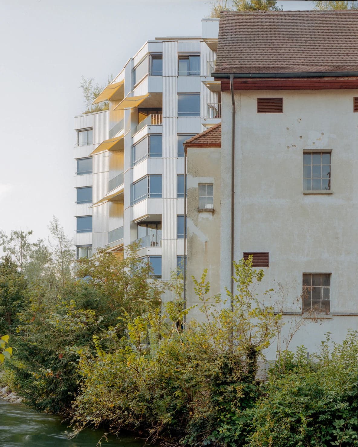
Turbinenhaus
Nestled in Derendingen’s Emmenhof area, the Turbinehaus establishes a dynamic connection with its industrial surroundings, positioned near the historic spinning mill to the east and a hydroelectric station to the south. Serving as a bridge to the natural landscape on the western side, it partners with Stage A’s residential building to anchor the central plaza of the former industrial site. Inspired by the concept of a turbine—an all-encompassing machine in constant rotation—the structure embodies this idea of motion, with spaces radiating from a central axis. The building’s design unfolds from a central, twisted core, where the staircase acts as the “axis” of the turbine, allowing the layout to spiral outward. Apartments are arranged with at least three-sided orientations, integrating fluidly with the surrounding environment like interlocking blades. On the ground floor, the building welcomes the community with flexible spaces for dining and commerce, creating a lively social setting within an adaptable layout. Above, 24 apartments are arranged across six floors, showcasing eight unique types. On the west side, split-level units with lofty ceilings open towards the canal, drawing nature closer to residents. Crowning the building is a communal rooftop garden, designed to accommodate diverse uses. The dense canopy of trees provides natural cooling and shade, while shared terraces offer residents spaces to connect and unwind, adding a social layer to the experience of living here. In this way, the Turbinehaus transforms into a connected social hub, harmonizing history, community, and nature.
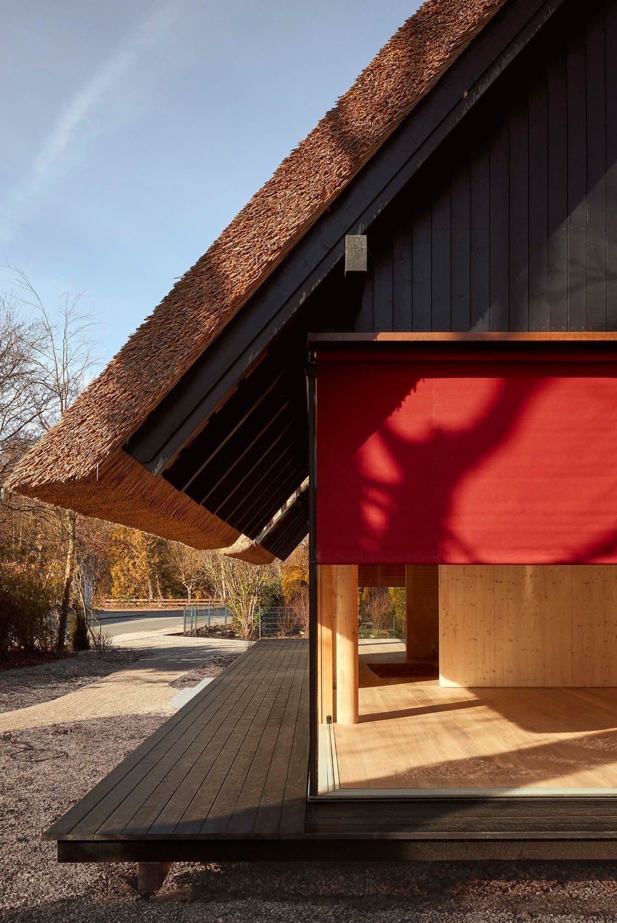
Timmerdorfer Strand
A steep, soaring roof with a deep eave and a central dormer above the entrance: at first glance, the building evokes the image of a primitive, archetypal thatched house. Only on closer inspection does it become clear that the wide, overhanging roof shelters not just one dwelling. The striking symmetry and the doubling of several fundamental elements reveal two separate homes, divided by a wall that runs along the ridge line. The house stands slightly elevated in a wild meadow and is entered from all sides via a continuous wooden veranda. Through the central entrance, one steps directly into the living or dining area on the ground floor. A staircase leads up to the first-floor hall beneath the dormer, from which the bedrooms and the gallery are accessed. The spatial character of each room—and its relationship to the surrounding landscape—is carefully calibrated according to its position within the building. The roof plays a defining architectural role. On the ground floor, the living spaces extend outward with a horizontal orientation. Floor-to-ceiling corner glazing opens them generously to the exterior, their depth capped only by the sweeping line of the eave. Large sliding doors expand the rooms onto the veranda in summer, from which three steps lead directly into the garden. The rising spaces beneath the roof are vertically oriented. The bedrooms achieve their full sense of volume only through an upward gaze: lying down, one looks toward the sky through tall, slender windows. The small workspace beneath the round dormer offers a long view into the distance—but only when seated. At the very top of the house, the gallery is lit exclusively from above. The higher one moves through the building, the more introverted the spaces become, ultimately turning inward to focus solely on themselves. NOTO Studio’s project is a study in duality—two homes sharing a single monumental roof, and two contrasting spatial temperaments shaped by their place within the structure. It is a house that shifts between openness and introspection, between landscape and retreat, choreographed by the quiet power of its roof.
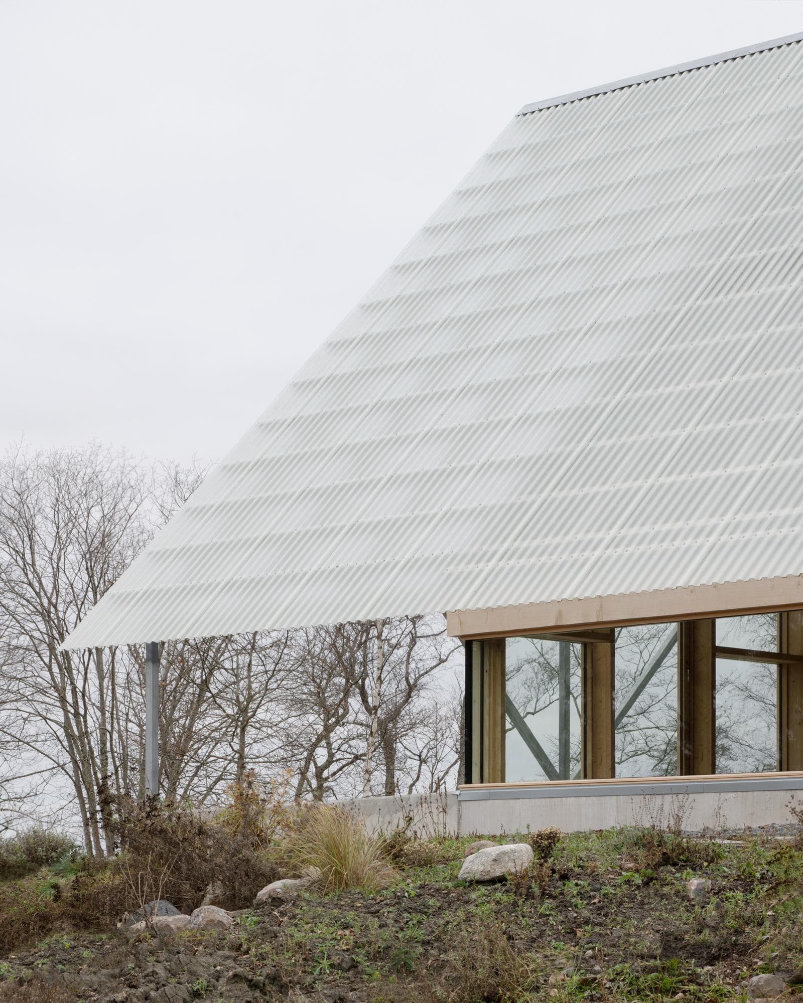
Detached House
The northern Stockholm archipelago is low key and less dramatic. The topography is rather flat, and the land still unexploited. Here, the client could buy their own island containing a small house, a tool shed, a barn and a boat house, all for a reasonable amount of money. Parts of the family live on the island, the mother of the client lives in the existing small house. When commissioned to build another house, it was decided to not make a farm-like cluster with the existing buildings but to take a more insular approach, recreating an archipelago of houses on this island. The house is basically like a tent sitting on a foundation cast in situ on the rock. It comprises four parts. At the back, towards the other houses, a closed service unit with beds, kitchen and bathroom. Next, delineating an open living room, a layer of glass on a structural wooden frame. At the other end, a corresponding frame in metal that also provides horizontal stabilization. Finally, an open fireplace creates a radial counterpoint to the striation of the plan. All support a vast corrugated polycarbonate roof that reaches down to a mere meter above the ground, providing a feeling of intimacy and framing unexpected views. The process continues. At this moment, the old boat house is turning into a new place to live.
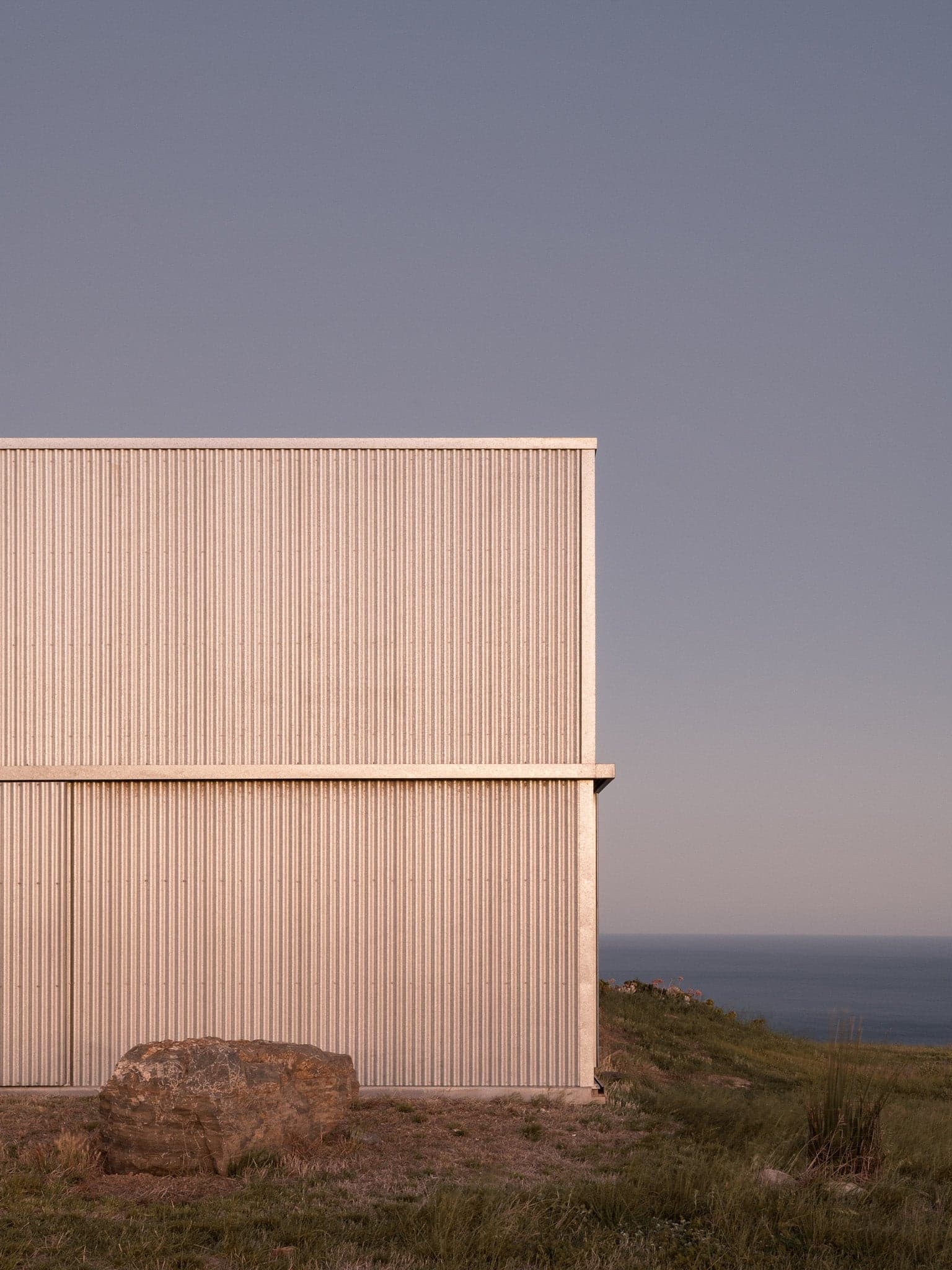
Carrickalinga Shed
Perched atop a hill in Carrickalinga, this residence reinterprets the Australian Federation farmhouse through a series of deliberate manipulations. Confronted with extreme winds, the design stretches the traditional farmhouse form into a square, carving out a central courtyard. The roof is inverted, shifting the verandah to the ‘wrong’ side—an adjustment that creates a sheltered eave over the garden, optimizing solar gain and access. Strategically aligned apertures frame views of the landscape, while industrial shutters allow the inhabitants to modulate light and climate, fine-tuning the home’s response to seasonal shifts. Every room enjoys a dual aspect, capturing both the sea and the protected garden. Heritage galvanized corrugated iron wraps the exterior walls and shutters, folding over the ridge to extend into the valleyed interior roof. Structural columns double as downpipes, harvesting rainwater and reinforcing the project’s sensitivity to its environment. With a restrained material palette and a deep respect for site conditions, the dwelling embeds itself within the landscape, minimizing its impact both visually and environmentally. In the words of the owners:“Finally, I’m homesick when travelling, missing the stunning visual geometry, light-filled transparent spaces, internal silence, serenity balancing wild farm ocean winds, milky way star filled bedrooms.No longer yearning to camp wild in the Flinders Ranges looking for peace, a break from work in firefighting and child protection. We have found it here, in this amazing place.Family, friends flock to visit, rest a while, gather in the simple yet magnificent rooms gazing upon the panoramic ocean through frames, pick herbs from the internal garden where little grandchildren play and learn, protected.We breathe deeply and live longer.”^words of the owners from Architects Ink’s website
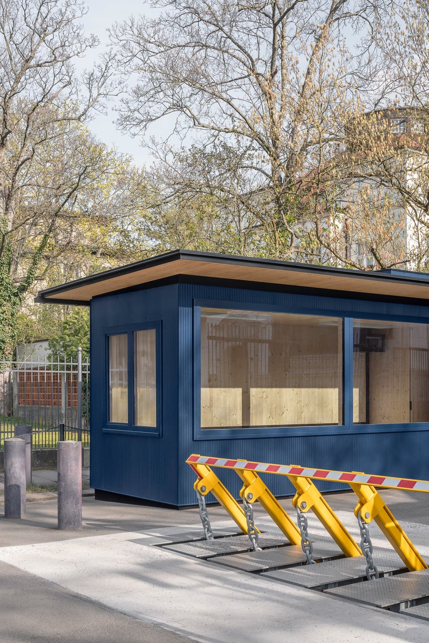
Polizeikiosk
Conceived as a permanent alternative to temporary container structures, Polizeikiosk by Büro Voigt introduces a compact, modular building type for the public presence of the police. Three prefabricated wooden units serve as work and break rooms, positioned in a highly visible urban setting at the U.S. Consulate in Leipzig. The project consists of three movable modules in sizes S, M, and L, each designed for transport by truck and rapid on-site installation. Manufactured entirely off-site in a carpentry workshop, the units were installed within 48 hours, including the removal of the former container structures. None of the modules are permanently anchored to the ground; instead, the existing road surface functions as their foundation, allowing the buildings to be dismantled, relocated, or replaced as needed. Notably, the construction avoids the use of concrete altogether. A dark aluminum envelope and a generously overhanging roof wrap around a timber load-bearing structure and interior lining. Through a careful selection of materials and proportion, the modules transcend their purely functional role. Large windows and refined detailing lend the buildings an unexpected civic presence, blurring the line between infrastructure, kiosk, and public architecture. Sustainability plays a central role in the project. The construction relies primarily on recyclable materials such as wood and metal, while the use of plastics has been reduced to a minimum. Timber defines the structure, insulation, and interior finishes. Solid spruce and pine are used throughout, with veneers deliberately avoided to emphasize material honesty and durability. Color operates as both identity and abstraction. A deep steel-blue tone, subtly referencing the police, unifies the three modules. Applied to the finely folded metal cladding, the color comes alive through shifting light and shadow. The delicate sheet-metal folds produce a textile-like surface—evoking tailored clothing, uniforms, or pleated fabric—imbuing the compact buildings with a surprising sense of elegance and tactility. Polizeikiosk demonstrates how infrastructural architecture can move beyond provisional solutions. Through modularity, material intelligence, and careful expression, Büro Voigt proposes a small-scale civic building that is both pragmatic and dignified.
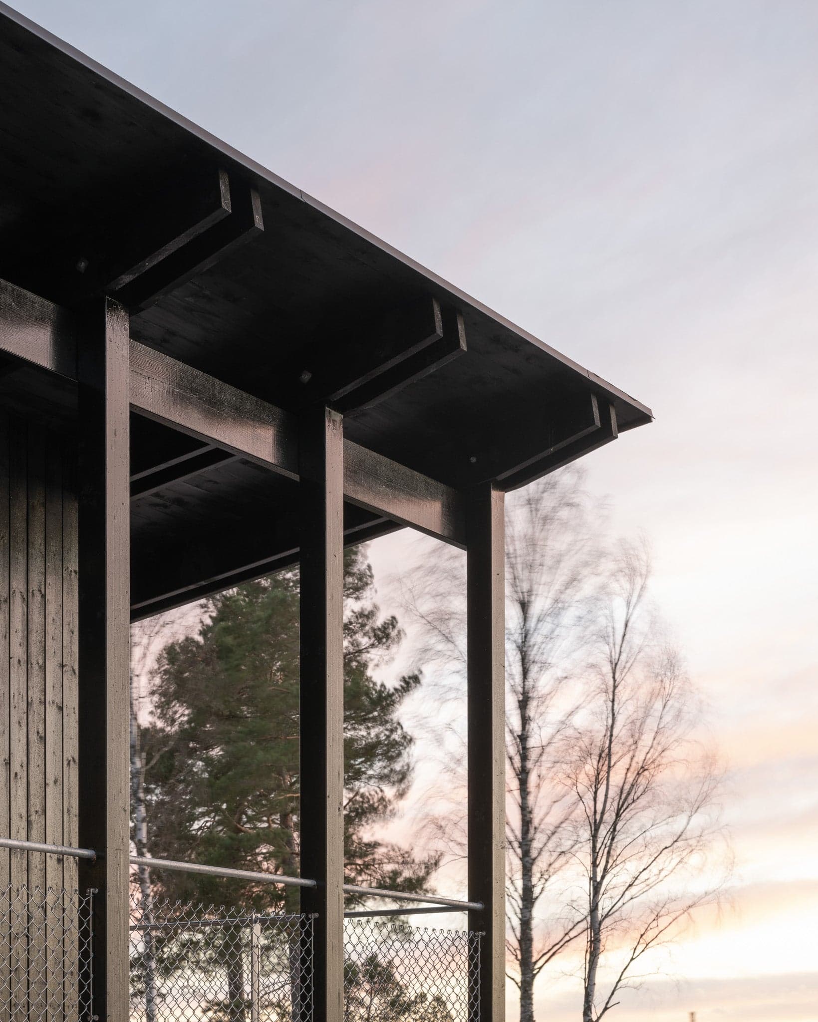
Alnö Guest House
Tucked into the sloping coastal terrain of Alnö, an island just outside Sundsvall in northern Sweden, this slender guest house offers a quiet counterpoint to the rugged pine forest and moss-covered stone. Designed as an annex to a 1940s timber log cabin, the structure extends the site’s architectural language in form, material, and tone. Measuring just 12.3 by 2.7 meters, the guest house is compact yet complete—containing extra bedrooms, a bathroom, and a small studio facing the sea. It follows the contour of the landscape, standing on a grid of slow-grown pine posts, reaching 2.1 meters above ground at its highest point. Beneath it, where the site naturally falls away, a parking space tucks into the underside—an efficient response that avoids the need for a separate garage. A covered deck runs the full length of the western façade, wrapping around to a small balcony at the southern end. This simple gesture mediates between interior and exterior, shielding the building from the northeast winds while offering framed views across the bay. In this way, the architecture defines both outlook and enclosure—it opens, protects, and anchors. The structure is stabilized by internal cross-bracing and steel tension rods, exposed as a quiet undercurrent of tectonic clarity. The pine cladding and framing are treated with dark brown tar paint, echoing the vernacular finishes of traditional Swedish log cabins and harmonizing with the site’s palette of bark, rock, and shadow. Modest in scale but precise in execution, the Alnö Guest House demonstrates a sensitive approach to building in nature. It neither dominates nor disappears. Instead, it takes its place—lightly held above ground, aligned with the trees, and open to the sea.
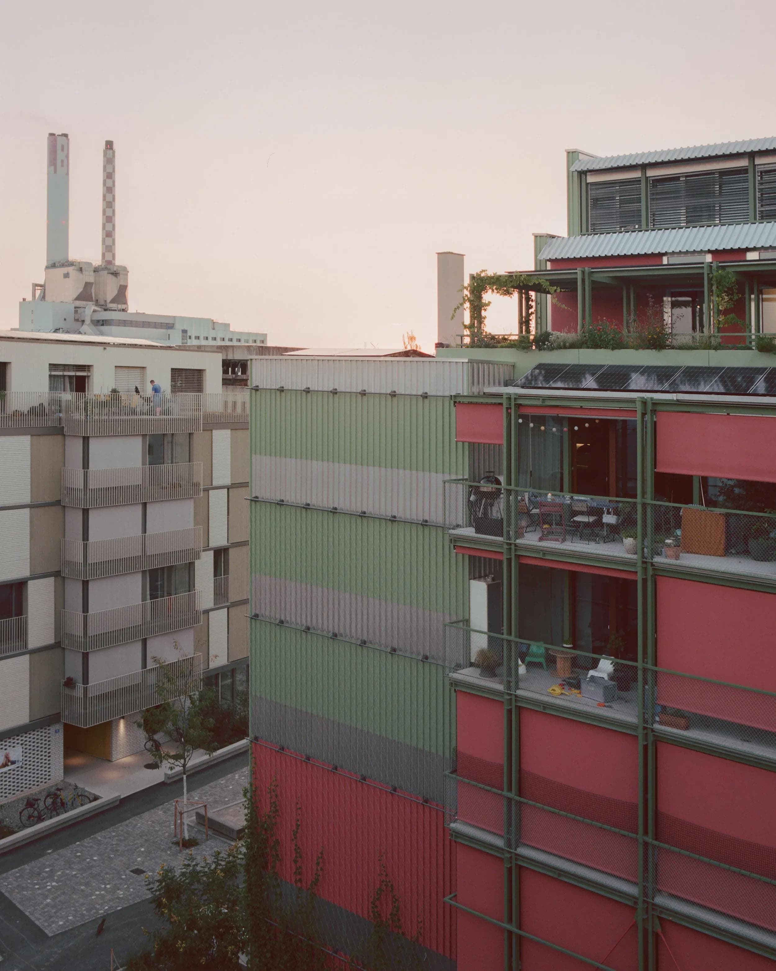
Conversion of a Wine Storage
In Basel, Esch Sintzel Architekten have transformed a former wine storage building into a residential complex, carefully balancing its monumental industrial character with the intimacy of domestic life. The most defining elements of the structure—the mighty mushroom columns—are retained as the central protagonists of the new design. Their robust forms are exposed and staged in different ways, allowing residents and visitors alike to experience their presence throughout the building. Two internal streets run the length of the house, weaving between the columns like urban corridors. These passages act as both circulation spaces and social zones, giving the building a spatial rhythm reminiscent of a small city within the larger urban fabric. Access to stairwells, laundry rooms, and entrances branch off from these internal streets, while a diversity of apartment typologies unfolds around them, accommodating different generations and lifestyles. On the mezzanine level, the inner street connects directly to the city outside through stairs and ramps, softening the threshold between public and private. Commercial spaces and a café occupy the prominent ends of the building, strengthening its urban address. At the top, the network of circulation culminates in a communal room and shared roof terrace, offering residents collective spaces that extend beyond the individual apartment. Esch Sintzel’s intervention demonstrates how adaptive reuse can preserve the monumental qualities of industrial heritage while embedding new forms of collective living. The Weinlager project exemplifies a city within a house—an architecture that stages history while shaping contemporary urban life.
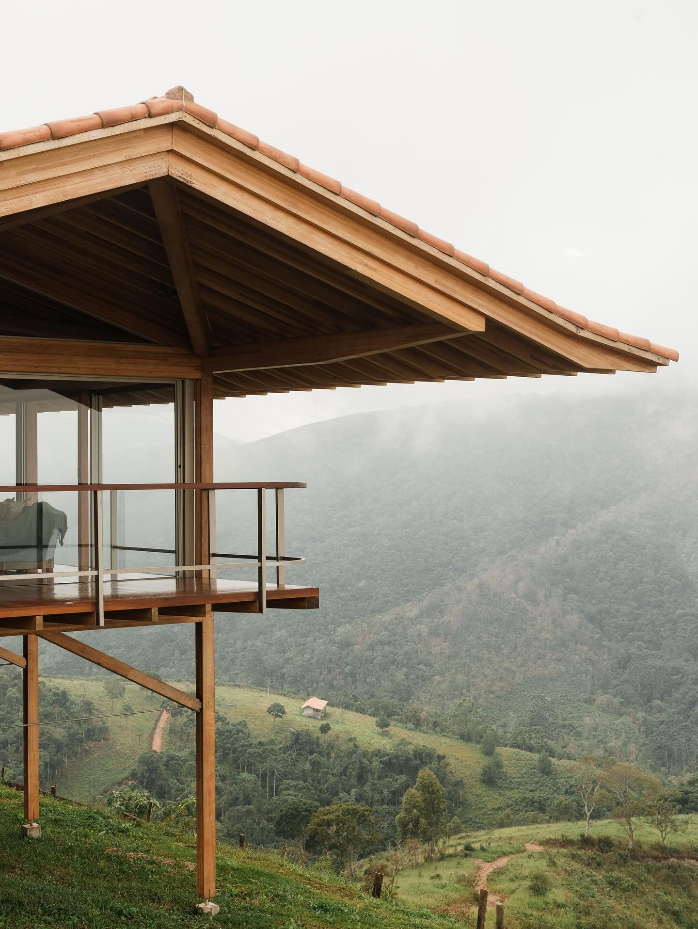
Casa na Fazenda Bocaina
In the Serra da Bocaina, Arquipélago and Mariana Caires have designed a residence carefully integrated into a steep mountain escarpment. The house is built around a massive rock, which defines the organization of the structure. A rhythmic wooden frame folds in an arc around the stone, held taut and stable by steel cables. At both ends, the roof extends outward, while an orange-tiled covering projects beyond the structure on all sides, accentuating its presence within the landscape. The exposed setting subjects the house to intense light, drifting mist, and sudden storms. The combination of timber and steel creates a lightweight yet robust framework, allowing the architecture to respond to the natural conditions of the escarpment. The structure’s precision contrasts with the unpredictability of its surroundings, balancing permanence with the delicacy of its integration. Photographer Pedro Kok documented the project over three days, capturing the way the house interacts with changing weather and light conditions. His images highlight the dialogue between the wooden frame, the protruding roof, and the surrounding mountain. Casa na Fazenda Bocaina exemplifies the approach of Arquipélago’s and Mariana Caires to create architecture that respects and engages with its context. By building around the rock and adapting the structure to the site, the project demonstrates how careful integration can enhance the experience of landscape, creating a residence that is both rooted and responsive.
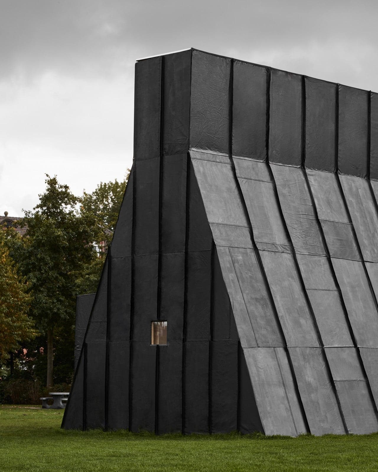
Two temporary structures
This page features two temporary structures executed by a Rotterdam based architecture practice named Atelier Tomas Dirrix. The first project we elaborate on is a temporay exhibition space for Unfair Amsterdam. The second structure is a pavillion done for the Horst Arts & Music Festival. The Temporary Museum is an intimate pavilion for art in the public domain. Built in one of the most visited parks in Amsterdam, the museum conceals a space for a secluded, personal experience of the work on display. Developed at a time of drastic measures and renewed physical relationships to the people and spaces around us, The Temporary Museum explores the significance of an exhibition space in the public sphere. Informed by a variety of architectural references outside the realm of the public building, it explores how to deal with the relationship between inside and outside, between openness and closeness; searching for an intimacy and sensitivity in experience. More like a hut or a chapel, the pavilion departs from the conventional spaces of the contemporary art museum, exploring the possibility of a human and specific 'white cube’. A place of solitude and contemplation rather than a big spectacle, the Temporary Museum encourages close interaction between visitor, artworks, and architecture. Inspired by the ultimate temporary structure – the tent – the building is simultaneously mysterious and primitive. Hidden within the black exterior, four white walls seem to hang from the sky; forming an atrium at once compressed and monumental. Around it, the wooden A-frame structure is exposed, creating small niches. A glazed annex and two small windows frame views to the outside, or let park visitors sneak a glance of the exhibition inside.Materiality, expression and representation derive from a research-based approach where standard building materials merge with experimentation. The outer layer is made from recycled cotton canvas, stitched together and coated with tar. The coating protects the wooden structure, much like a gigantic raincoat, while also recalling the history of the site as a former coal gas factory, where tar was a residual product. Conscious of the temporary nature of the project, the entire structure can be dismantled and used elsewhere. The Ceiling for a Crater, as Atelier Tomas Dirrix names the project is designed by taking inspiration from the ancient architecture of festivals, celebrations and large rituals. A single gesture of a large floating roof transforms a concrete square cut in the terrain as found to a dance floor and central stage. The low hanging and voluminous presence of the architecture above the visitors manifests reminiscent of the history of the place as a former military site and as a rapprochement of two landscape motifs. Working from an economy of means with various ways of a holding up, a minimum of material and air-pressure as a constructive principle the structure plays with its seemingly contradictory appearance of both thinness and thickness, weightlessness and an image of great weightines.
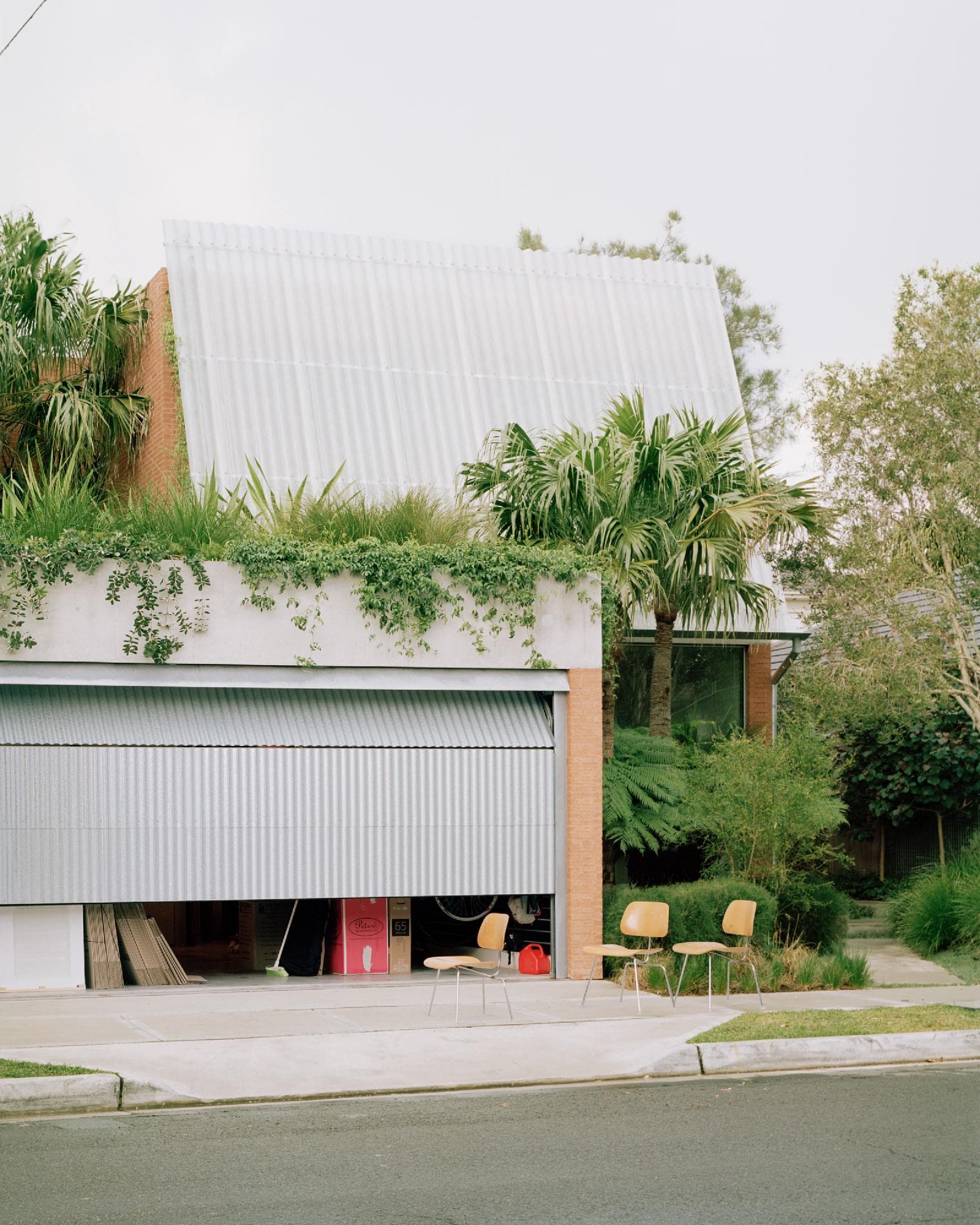
Clifton House
Anthony Gill designed this house for a builder and his young family, situated on the long sandy flat that extends from Bondi to the harbour at Rose Bay. Located on a 415sqm block in North Bondi, the property is notable for its size in the area. It sits one house back from a busy street corner featuring apartments and shopfronts, resulting in a mix of surrounding housing types and a site that is heavily overlooked. The original single-storey bungalow on the site was carefully deconstructed to enable the re-use of its building materials, including bricks and timber roof framing. A primary focus of the design was the potential for gardens to filter neighboring conditions and provide a sense of softness. Early collaboration with consultants shaped the design approach, ensuring a clear understanding of how the gardens could address privacy and protection. Each room’s exposure was carefully considered, with gardens integrated into the design to create a buffer and enhance the overall experience of the home. The plan of the house features staggered and stepped rooms, creating distinct garden spaces that bring light and ventilation deep into the interior. Each room is closely connected to its adjacent garden, offering privacy and unique conditions. In section, a four-step level change addresses the site’s slight slope from the backyard to the street. This design results in a tall lounge room, sunken into the site, with an expressed retaining wall that meets the slightly raised garden level. The entry path leads through an unfenced garden, down the side of the house, and into the center of the plan. This central entry divides the home into private areas and public living spaces, which are seamlessly connected to the outdoors. On the first floor, a compact plan is organized around a circulation spine linking four bedrooms and a bathroom. Each bedroom features full-width and height openings onto densely planted roof gardens, flourishing under sloping fiberglass privacy screens. The steepness of these screens varies according to setback controls that shape the underlying brick and concrete structure. Material selection was carefully considered to respond to the local context. Red brick, a common material in Bondi’s back streets, was chosen for its contextual relevance. The bricks from the original bungalow were repurposed to form much of the internal brickwork, finished in a natural render that was left unpainted and sealed with wax. The Oregon roof framing was reused for the kitchen island and internal doors, also finished with wax. The design also incorporates sustainable elements, including increased shade through native planting, a 9.3kW solar system with a battery, electric car charging, and a 7,200L water tank.
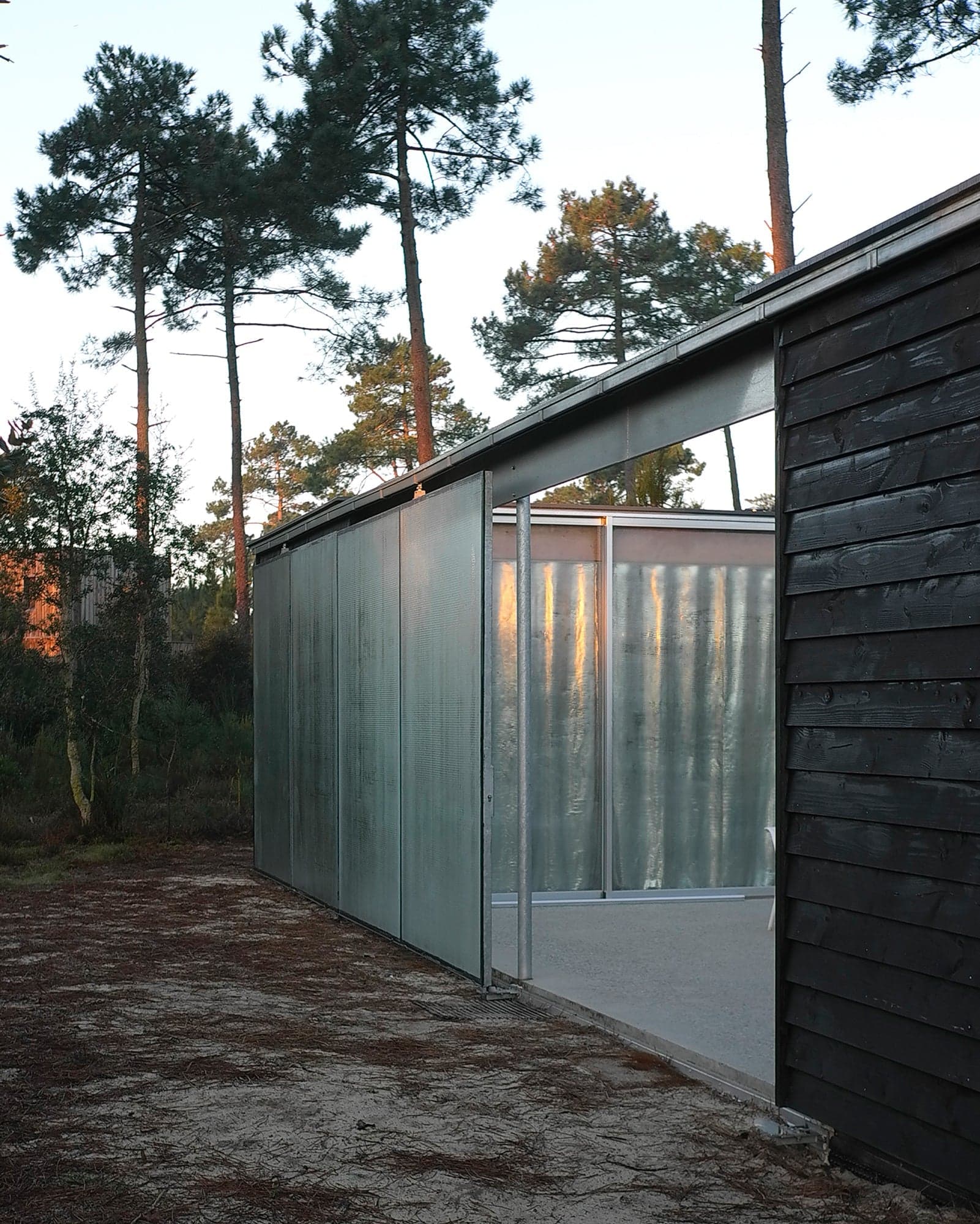
M37 House
M37 House by BAST + littoral is a compact retreat that preserves the wild character of the Landes forest while offering a secluded, nature-focused living space. Designed for a retired couple, the compact structure resists the conventional sprawl of private developments, instead preserving the natural landscape. A carefully arranged patio acts as a threshold between the main living quarters and a separate outbuilding for guests, fostering a sense of seclusion while remaining open to nature. The house’s wooden frame and polished concrete foundation anchor it in simplicity, while anodized aluminum windows, opening solely onto the courtyard, reinforce an inward-looking spatial logic. A strikingly minimalist intervention, M37 House avoids dominance over its surroundings, instead embedding itself within them. The flat membrane roof, a response to zoning constraints, is softened by skylights that infuse the interiors with natural light and ventilation. This architectural strategy ensures a seamless dialogue between built form and environment, reconnecting the occupants with the rhythms of the forest. More than a dwelling, the house becomes an act of resistance—eschewing suburban uniformity in favor of an architecture that is both introspective and profoundly connected to its landscape.
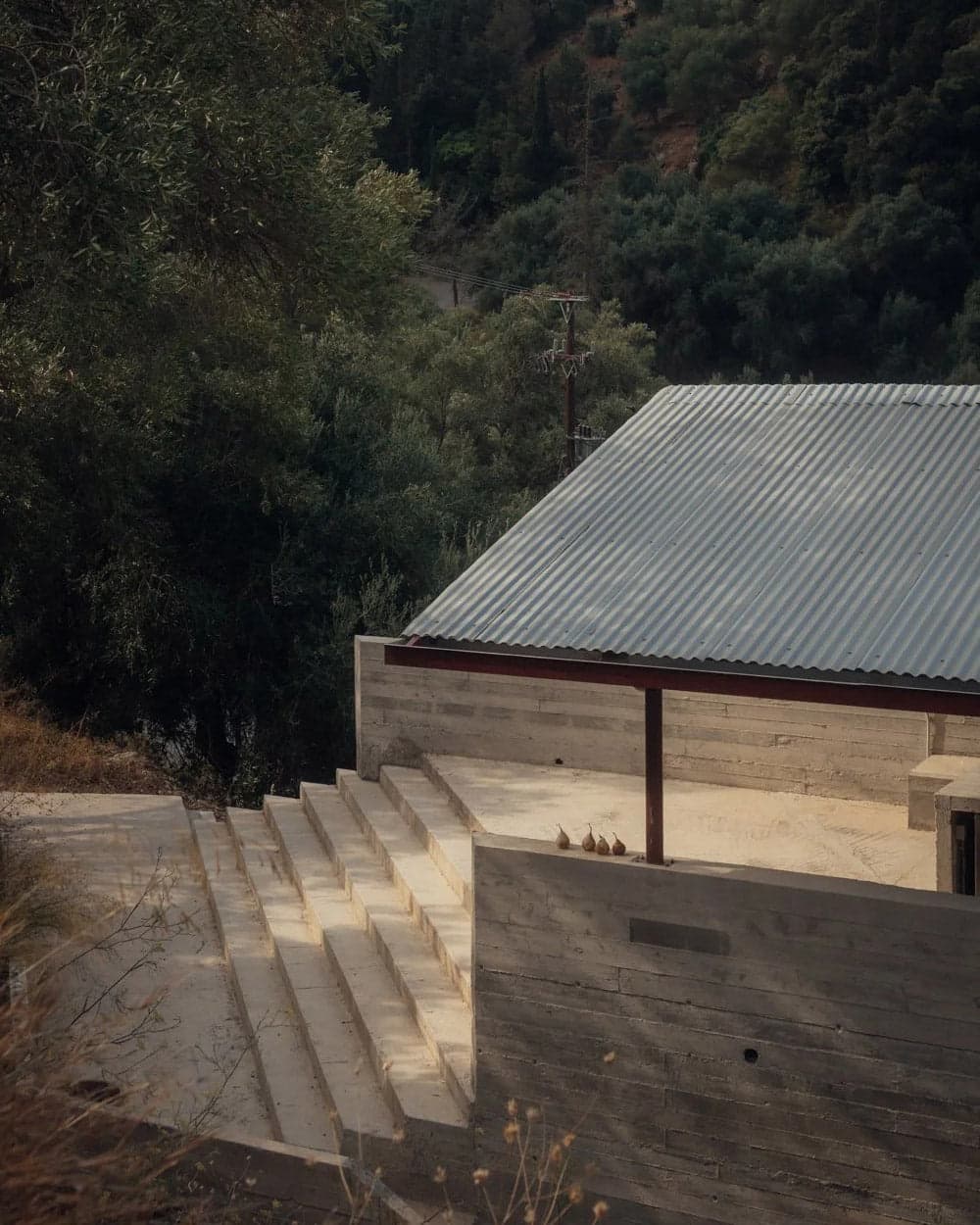
House in an Olive Grove
House in an Olive Grove by Invisible Studio is a deliberate act of resistance against the dominant language of Mediterranean domestic architecture. Designed by Piers Taylor, the project rejects the familiar vocabulary of cream render, marble floors, and terracotta tiles—hallmarks of a globalised aesthetic that has diluted regional specificity. In their place, Taylor proposes an alternative model: one grounded in local material intelligence, improvised building cultures, and a deep sensitivity to climate and terrain. Built within a Venetian-planted olive grove without the removal of a single tree, the house challenges the idea of the Mediterranean villa as an imported typology, instead positioning architecture as an act of cultural and ecological engagement. At first glance, the structure recalls the unfinished agricultural buildings scattered across southern Europe—concrete frames, exposed rebar, and makeshift shade structures. Yet these ad hoc forms are reinterpreted here with intent. The concrete was cast on site using irregular, reused formwork, its surfaces capturing the embedded traces of construction: seed pods, olive stones, and imprints of timber grain. These imperfections form a material record of labour and seasonality, turning the building into a physical archive of its making. Taylor’s decision to exclude glass further distances the project from conventional expectations of domestic comfort. Openings are defined by welded mesh, fly screens, and plastic curtains, producing a porous interface between inside and out. This approach reframes the notion of enclosure—not as a sealed boundary, but as a filter tuned to light, air, and sound. It aligns the house with the adaptive logics of vernacular structures while expanding the conceptual limits of what a “complete” building might be. All circulation occurs outside the insulated envelope, reinforcing the idea of the house as landscape infrastructure rather than isolated object. This configuration places House in an Olive Grove within a broader lineage of environmentally responsive design, drawing from the spirit of Richard Leplastrier and Glenn Murcutt—both known for linear plans, climatic sensitivity, and an architecture of light touch. Yet Taylor deliberately departs from their refined detailing, favouring a coarser, more open-ended approach that embraces imperfection as an expression of process. The project is the outcome of decades of observation and engagement with its setting. Taylor has visited this landscape since the 1970s, studying how vernacular construction adapts to scarcity, seismic risk, and fire. Built with local craftspeople, the house emerged through guided improvisation rather than strict documentation. The absence of detailed formwork drawings allowed material choices and sequencing to evolve organically on site, foregrounding collaboration and local knowledge over architectural authorship. Conceived within a context of limited means, House in an Olive Grove demonstrates how economy and constraint can yield architectural richness. Passive ventilation, shaded roof terraces, and minimal intervention into the terrain define a form of sustainability rooted not in technology but in attentive making. Through its modesty and resistance to polish, the house advances a critical discourse on how architecture might operate in relation to place. It redefines rigour as engagement, authorship as collaboration, and sustainability as cultural continuity. House in an Olive Grove is both an architectural proposal and a provocation—a quiet but radical argument for how to build meaningfully, locally, and with care.
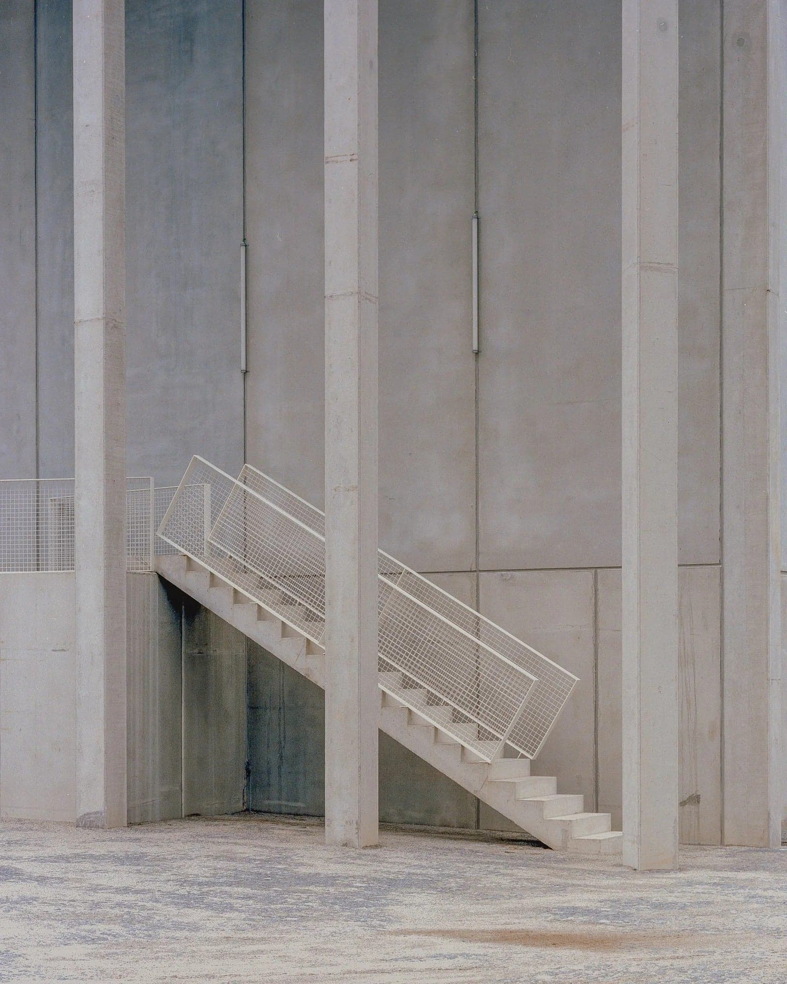
Corcet
Perched atop a small hill in Penafiel, Corcet is conceived like a local acropolis — a purposeful elevation for a headquarters building that brings together a surprising array of functions. Commissioned by a family-run business, the complex balances industrial performance with spatial richness, articulating a dense program within a singular concrete structure. The building hosts a wide range of uses: from a motorcycle sports and navigation hardware shop, to offices, software development labs, storage rooms, a cafeteria, showroom for heavy equipment, and a technical assistance area with loading docks. These varying functions are distributed across three cores, which are tied together by an open-air gallery that lends cadence and rhythm through a rigorous repetition of pillars — an architectural gesture that hints at monumentality before the user even enters. Internally, the strategy remains one of controlled contrasts. Twin patios carve light and green space into the grey bulk, while an axial entrance leads to a dramatic double-stair lobby defined by four vertical columns and a raised ceiling. Circulation is intuitively handled, with a central path and cross-routes weaving through the second level, supporting clear orientation amid the programmatic density. Materially, the building is grounded in its place: granite from the local topography is used for pavements and walls, forming a continuous surface that subtly detaches the heavy concrete structure above. The result is a building that feels both deeply rooted and formally precise — a “concrete mammoth” visually lifted by its granite base.
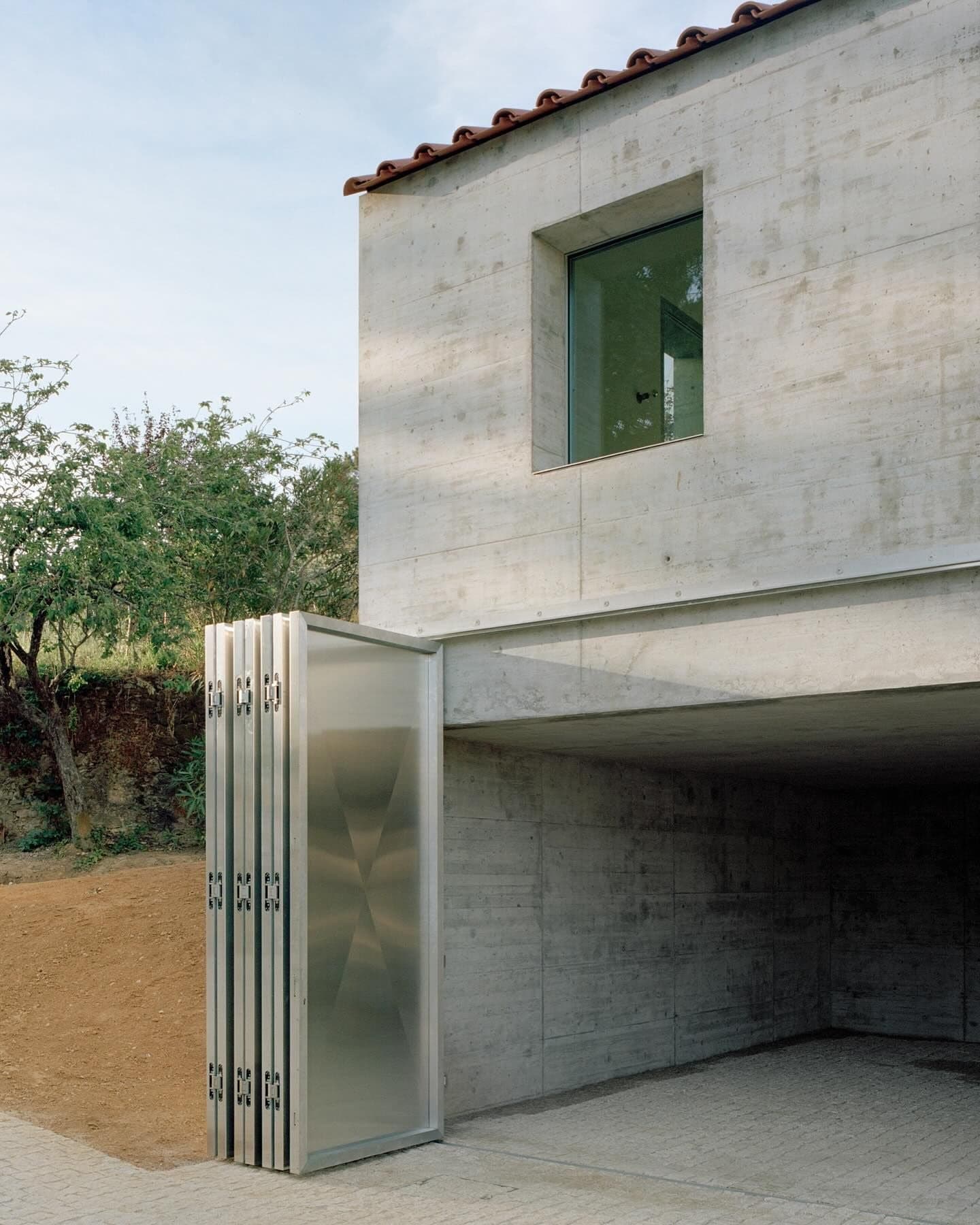
Guard's House
Arquitectura-G has designed a compact building at Quinta da Ponte to replace a collapsed auxiliary structure. Local regulations determined the footprint, overall volume, and ceramic-tiled roof, which closely follow the original construction. The new project also adopts characteristic elements found elsewhere on the site, including a chimney and window proportions that establish continuity with other nearby buildings. Positioned beside the main vehicular access to the property, the building combines two distinct functions: a garage on the lower level and a caretaker’s residence above. The sloping terrain enables each floor to open directly to the outside—vehicular access below, and a living space above oriented toward the south, with views over adjacent vineyards. There is no internal connection between the two levels; instead, they operate as separate entities under a shared roof. Previously attached to a neighboring structure no longer part of the estate, the new volume steps away to introduce a narrow pedestrian passage. This subtle shift reinforces the building’s independence within the broader architectural ensemble of Quinta da Ponte. Arquitectura-G is a Barcelona-based architecture studio known for its restrained approach to form and its thoughtful handling of residential typologies. Their work often explores the spatial and material possibilities of domestic architecture.
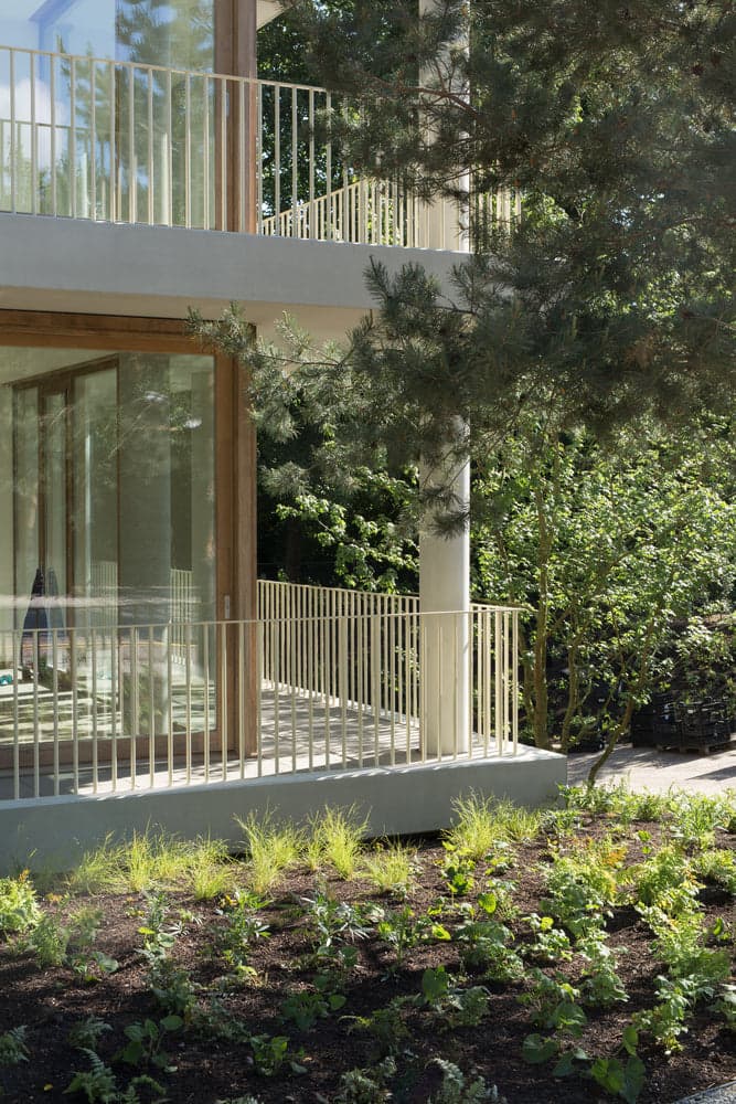
Klingelbeek Estate
The Klingelbeek Estate in Arnhem is a remarkable blend of history, community, and innovative architecture. Designed by Dyvik Kahlen for the Dutch developer Schipper Bosch, this project reimagines living within the beautiful green park along the Rhine. The estate comprises eight residential buildings, the first two are elaborated on in this article. The Building with 34 Columns and the House with four Patios. In addition to the architecture, we provide a broader historical context sourced from online research to enrich the narrative. The estate's history dates back centuries, when it formed part of the hamlet of Klingelbeek. By the 16th century, the estate was owned by Wijnand Hackfort, then mayor of Arnhem, and Aleyt Boshoff, who transformed the granary into a country estate. The Romantic English landscape style influenced the estate during Frederik Gerard Meijbaum's ownership in the 19th century. His contributions included intricate gardens and ornamental structures, such as a coach house and orangery. The late 19th century saw further enhancements by private owners, establishing an elegant driveway and lush parkland. Its villa transitioned into a monastery in the early 20th century, and remnants of this heritage, including a ruin, a natural pond, and an allotment garden, enrich the landscape today. These historical elements are carefully integrated into the new development, creating a harmonious dialogue between past and present. ^ 1845 - Former Klingelbeek Estate [Source: Gelders Archief, 1551 - 3046. By: Spin, C.A ] The Klingelbeek Estate as designed by Dyvik Kahlen introduces a diverse mixture of apartment buildings, townhouses, a villa, and a workshop, forming a vibrant community where living and working intertwine. The shared park serves as the estate's communal heart, fostering connections among residents while the design of each building ensures privacy through unique outdoor spaces. The Forest Apartments exemplify Dyvik Kahlen's architectural ethos, combining formal clarity with adaptability. A row of columns supports wraparound balconies on all four facades, offering panoramic connections to the surrounding landscape and direct outdoor access from every room. Another row of interior columns, coupled with four walls and five shafts, defines a flexible and open-plan layout. This resilient skeleton provides the framework for a structure that is both functional and aesthetically striking. Situated near the estate's central pond, the Pond House consists of three terraced homes designed with a sensitivity to the sloping landscape. The front façade engages with the square adjacent to the historic villa, marked by rectangular and circular windows that lend a playful yet grounded rhythm. Behind this façade, patios create private exterior spaces, providing a buffer between the homes and the shared park. Inside, an enfilade of rooms cascades downwards, mirroring the terrain and enhancing the connection to nature. Dyvik Kahlen's design reflects a commitment to clarity and formal logic. The architecture contrasts with the estate's organic landscape while remaining generous and adaptable. This thoughtful balance allows the buildings to evolve alongside their inhabitants, reinforcing the estate's identity as a vibrant and enduring community. Completed in 2020, the Klingelbeek Estate is a testament to collaboration, featuring contributions with landscape architects Buro Harro and the contractor Karbouw. The photography is done by Antoine Espinasseau.
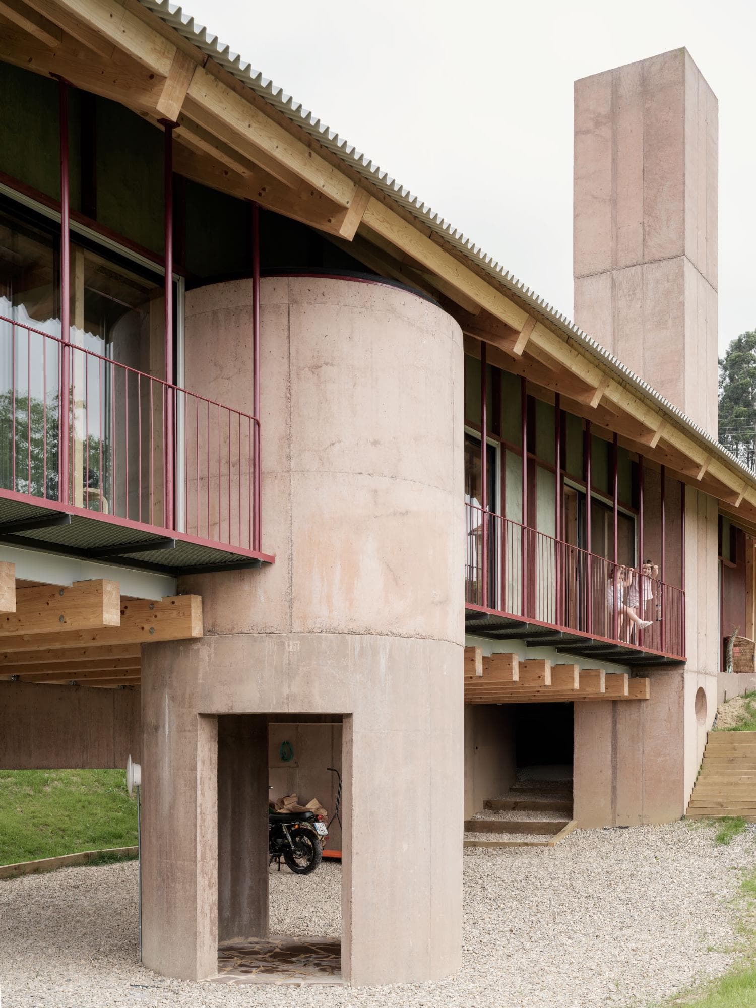
Nahinuena
In a quiet residential neighborhood of Gorliz in Bizkaia, Spain, where undeveloped, fenced plots shape the landscape, Nahinuena House emerges as a thoughtful response to the land’s natural inclines. Designed by Spanish practice BeAr Architects, the structure is long and narrow, dressed in soft pinkish tones and an interplay of raw materials, stepping away from traditional excavation and raised platforms. Instead, Nahinuena House appears to hover above the sloped terrain, with its foundations anchored directly to the bedrock below, preserving the natural topography. BeAr Architects approached this project with a vision that extends beyond visual appeal or conventional form, grounding it in a philosophy of authenticity and material integrity. The focus is on crafting a home that embodies an honest experience of space and structure, free from excessive stylization or the contrived atmosphere of plasterboard interiors. ‘Without falling into romanticized notions, it is about embracing the essence of building—free from overly stylized techniques or the enclosed, artificial worlds of plasterboard interiors. It is about creating something real, with minimal resources, and taking pride in simplicity. In conclusion, our hope is that Nahinuena House will not only exist, but will also enhance the lives of its inhabitants, helping them to become more fully themselves within its walls,’ conclude the architects. The BeAr Architects is an architecture office which runs a studio space next to their architectural practice, called Rabe. Rabe is a space that reflects the firm’s core principles of simplicity, material authenticity, and functionality. Located in an abandoned old construction warehouse merges a charm of its original structure combined with modern design sensibilities, Rabe embodies the same thoughtful restraint found in their architectural projects. The studio is characterized by a palette of raw, unadorned materials, creating a workspace that is as versatile as it is inspiring. This minimalist environment allows the team to focus on their craft in an atmosphere free from unnecessary distractions, reinforcing their dedication to honest, elemental architecture that connects seamlessly with its surroundings.
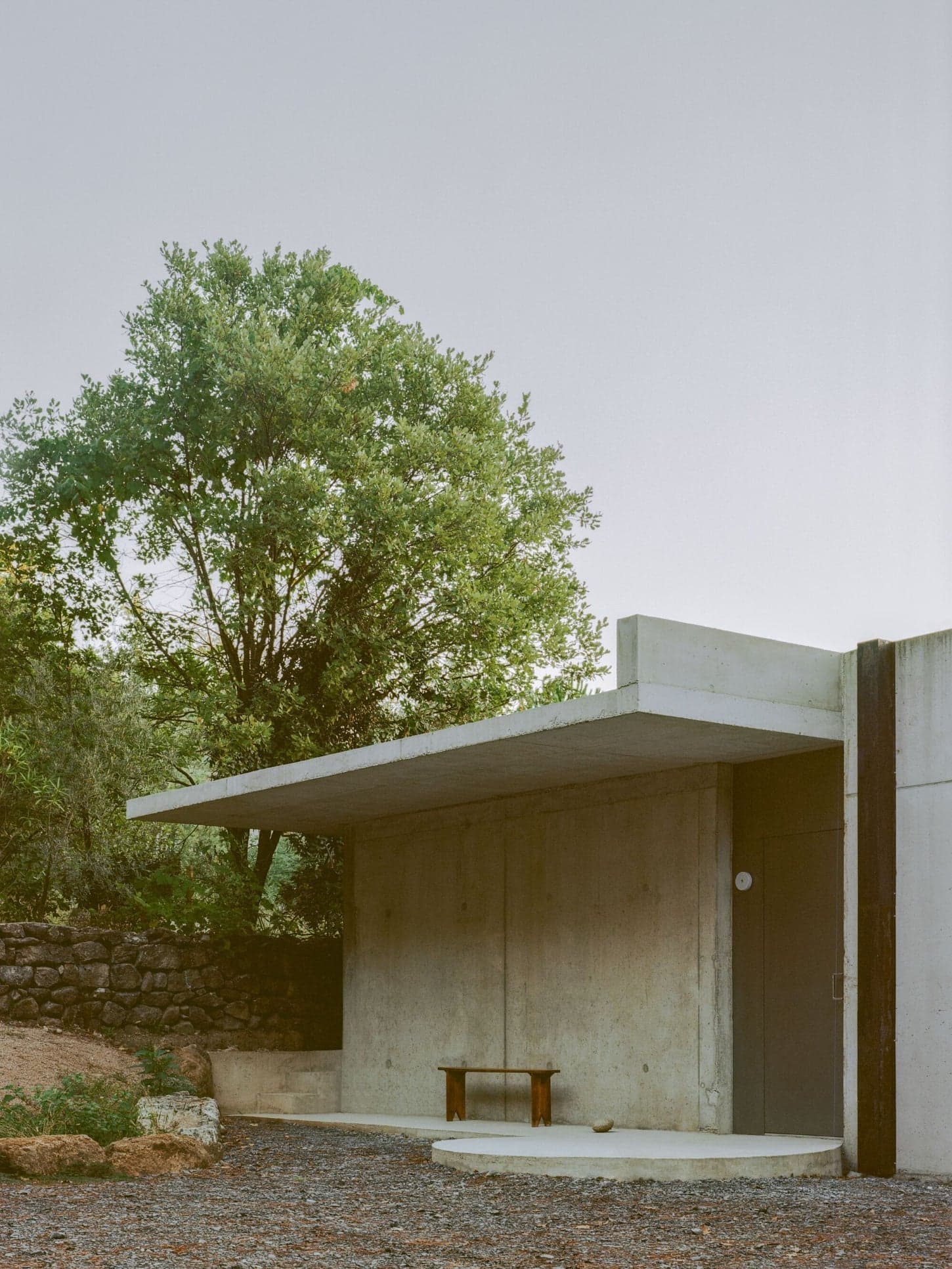
Payz House
Nestled within the rugged terrain of Ardèche, France, Payz House by Alors Studio redefines the relationship between architecture and its natural surroundings. Originally built in 2007 as a seasonal retreat, the residence was conceived as a series of three separate structures, connected only by exterior pathways. Its design responded to a transient lifestyle, allowing inhabitants to move between the units while immersed in the surrounding landscape of olive trees, aromatic plants, and dry stone walls. The recent expansion, however, shifts the home’s purpose from a temporary getaway to a more permanent dwelling. Alors Studio's intervention introduces a thoughtful reconfiguration that enhances both the house’s functionality and its engagement with the site. A new corridor now links two of the original structures, integrating additional living spaces, including two bedrooms, a bathroom, and a reading nook. This passageway transforms the house’s circulation, creating a seamless yet subtle connection between its distinct volumes. Materiality plays a defining role in the project's architectural language. The house’s original concrete facades, inspired by the region’s dry stone walls, establish a sense of permanence within the landscape. The extension continues this dialogue but shifts its focus inward. While the earlier structures embrace panoramic views of the terrain through expansive glass openings, the new addition fosters introspection, framing previously overlooked corners of the property, such as hidden terraces and aged stone walls. Inside, built-in wooden benches placed beneath windows offer serene spaces for contemplation. The interplay between raw concrete and warm wood textures fosters a tactile harmony, balancing industrial robustness with a welcoming atmosphere. Brown sheer curtains filter sunlight, adding subtle warmth to the otherwise neutral palette of concrete, stone, and wood. The new entrance serves as both a threshold and a statement. Marked by a bold steel door and a circular concrete element, it announces the home’s evolution while maintaining its understated presence within the landscape. A cantilevered concrete slab extends outward, providing shelter and reinforcing the house’s architectural rhythm. By bridging modernity with vernacular references, Payz House achieves a delicate equilibrium. It neither imposes itself on the landscape nor retreats into obscurity. Instead, Alors Studio has crafted a residence that simultaneously reflects and reinterprets its surroundings, offering a timeless meditation on habitation and place. Below, the architectural plans and sections illustrate the spatial organization and design details that define Payz House. These drawings reveal the interplay between volumes, the thoughtful transitions between spaces, and the material relationships that ground the house in its environment.
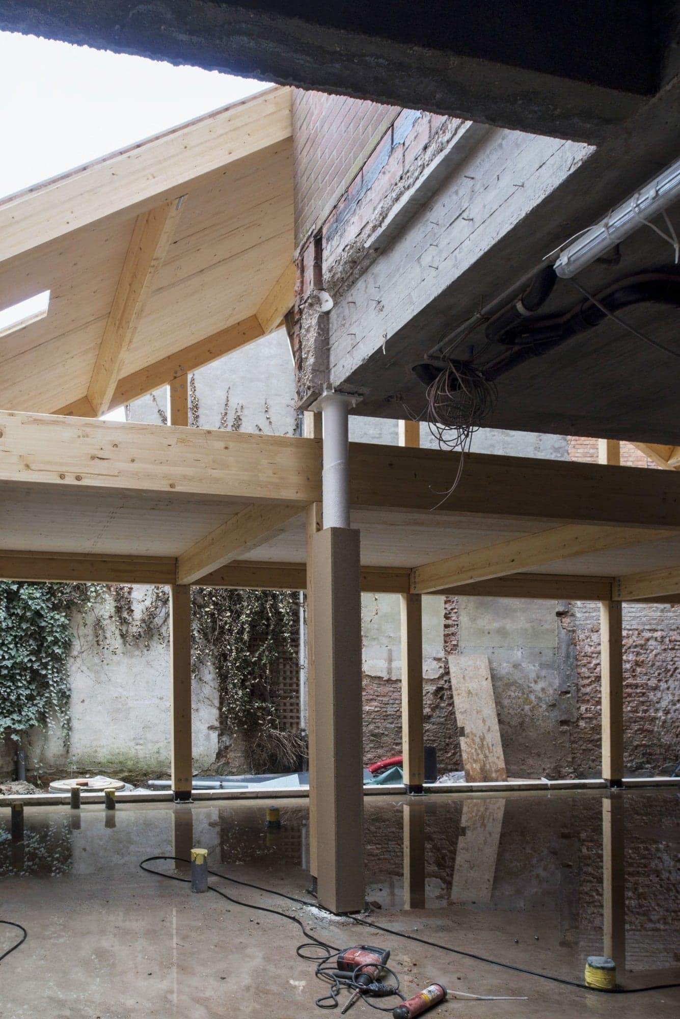
Extensions and renovations
Renovations and extensions offer a unique architectural challenge: preserving the past while introducing the new. Gafpa Architects embraces this challenge with a nuanced approach, transforming existing spaces into environments that reflect both historical context and contemporary needs. Their portfolio of adaptive reuse projects across Ghent exemplifies this philosophy through thoughtful spatial interventions, light manipulation, and carefully selected materials. By prioritizing the interaction between interior and exterior spaces, Gafpa creates dynamic extensions and renovations that honor original structures while redefining their purpose. This article delves into several projects that highlight their distinctive methodology. The G1401 project exemplifies this with its thoughtful renovation of two historic buildings in Ghent, opening up shared ground floor access while introducing a light-filled extension under a sloped roof, supported by delicate steel columns. By combining openness and tactile materials, Gafpa blends modern functionality with historical character. Similarly, the G2006 transformation of a warehouse into a home and studio showcases their emphasis on adaptable spaces. Hidden behind a typical facade with a garage, this former warehouse became a flowing mix of living, working, and outdoor areas. The concrete skeleton structure defines the ground floor, while two open sections divide the main house and rear space, bringing in natural light through large sliding windows. A zenithal light in the roof, with adjustable galvanised steel grids inspired by ship covers, filters light and offers a tactile, functional charm that blends practicality with style. In G1307, an old house extension transforms into an open, luminous living area, underpinned by a central beam that divides functional zones. The interplay of the gable roofline and a cutaway opening for daylight captures a fluid connection with its outdoor terrace. Elsewhere, projects such as G1411 and G1520 similarly explore spatial layering and transparency. For example, G1520's compact addition balances enclosed privacy with framed outdoor views, while G1411’s intervention incorporates open views of gardens into communal spaces, redefining interior limits. At last, the G2001 & G1203 projects exemplifies Gafpa's approach of embracing a building's layered past while introducing modern spatial solutions. The transformation of a former bank into a home in G2001 highlights their sensitivity to architectural history, as seen in the integration of the original concrete vault and the creation of a timber extension that echoes existing textures. Similarly, G1203 reimagines a former industrial stone-cutting factory into a family home, blending preserved concrete elements with sleek, modern wooden additions. Both projects maintain visible traces of the past, creating a dynamic narrative of continuity and change that resonates through light, structure, and materiality. Images by Gafpa©
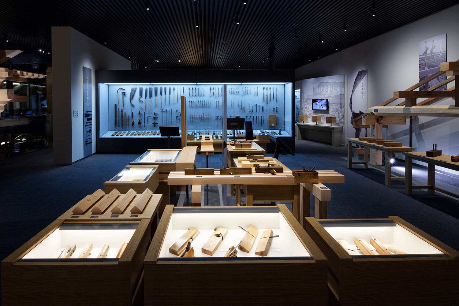
Carpentry Tools Museum
The Takenaka Carpentry Tools Museum, located in Kobe, Japan, is a unique museum dedicated to the craft, tools, and rich heritage of Japanese carpentry. Founded by Takenaka Corporation in 1984, this museum serves as a tribute to Japan’s millennia-old woodworking tradition, showcasing the skill and artistry of Japanese carpenters, known as daiku, whose sophisticated techniques are deeply embedded in Japan's culture and history. The museum not only displays the tools used in Japanese woodworking but also provides an immersive experience in the history, philosophy, and enduring craftsmanship of Japanese carpentry. The museum itself is a work of art. Its structure combines traditional Japanese aesthetics with modern design, embodying the principles of Japanese carpentry through clean lines, wooden accents, and a harmonious blend with nature. Visitors enter a minimalist space of carefully crafted wood interiors, designed to reflect traditional Japanese architecture that emphasizes natural materials, craftsmanship, and a deep respect for wood as a medium. The spaces are airy and well-lit, allowing the exhibits to stand out while maintaining an intimate atmosphere that complements the nature of carpentry. Carpentry has a sacred place in Japanese culture, especially in the construction of temples, shrines, and traditional homes. Japanese carpentry techniques, known for their precision, do not rely on nails or metal fastenings; instead, they use intricate joinery techniques that allow wood pieces to interlock seamlessly. The result is a form of architecture that is both structurally sound and aesthetically pleasing, capable of withstanding earthquakes and other natural elements. The Takenaka Museum dedicates itself to preserving and educating visitors about these traditional methods, highlighting the ingenuity of Japanese carpenters who developed sophisticated techniques centuries ago. Exhibition Highlights: Tool Collection: The museum holds an extensive collection of historical carpentry tools, including saws (nokogiri), chisels (nomi), and planes (kanna), each with a distinct shape and function. These tools showcase the evolution of Japanese carpentry, from simple hand tools to more advanced and specialized equipment used for various types of woodworking. The tools themselves are not only functional items but also works of craftsmanship, many adorned with engravings or crafted from special materials. Joinery Techniques: One of the most remarkable aspects of Japanese carpentry is its complex joinery methods. The museum exhibits scale models and life-sized examples of joinery techniques, demonstrating how Japanese carpenters create strong structures without nails. Techniques like kigumi, a traditional Japanese joinery method, allow for an in-depth look at how different wooden elements come together to form the backbone of Japanese buildings. Wood Selection and Preparation: Wood is treated as a living material in Japanese culture, and carpenters take great care in selecting and preparing it. The museum offers insights into this process, from tree selection and seasoning to the understanding of wood grain, color, and texture, all of which are essential for creating durable and beautiful structures. Hands-On Exhibits and Workshops: The museum also emphasizes experiential learning through hands-on exhibits and workshops. Visitors can try their hand at using traditional tools, and during special workshops, they learn basic techniques of joinery or planing. This interactive approach allows visitors to appreciate the precision and skill required for Japanese woodworking, giving them a deeper understanding of the trade and a newfound respect for its practitioners. Beyond exhibitions, the Takenaka Carpentry Tools Museum is dedicated to research and education. It offers seminars, lectures, and publications on Japanese woodworking, aimed at preserving and spreading knowledge about traditional carpentry techniques. The museum collaborates with experts and craftsmen, and it also produces a wealth of written material on woodworking, making it an invaluable resource for researchers, students, and woodworking enthusiasts. The museum frequently hosts special exhibitions that highlight particular aspects of Japanese architecture and carpentry. These exhibitions often feature collaborations with contemporary architects, artisans, and designers who incorporate traditional Japanese techniques into modern contexts. By linking the past with the present, the museum demonstrates the relevance and adaptability of Japanese woodworking in today’s world, showcasing how these time-honored techniques continue to inspire modern design. The Takenaka Carpentry Tools Museum is a rare and invaluable institution that preserves Japan's architectural heritage, offers an educational platform for traditional craftsmanship, and celebrates the beauty of Japanese woodworking. It serves as a bridge between the past and the present, drawing connections between ancient methods and contemporary design philosophies. In doing so, it not only helps keep these skills alive but also educates future generations about the importance of craftsmanship, artistry, and respect for nature, all of which are deeply ingrained in Japanese culture.In summary, the Takenaka Carpentry Tools Museum is more than a collection of tools; it’s a celebration of Japan’s woodworking tradition, an homage to the skilled artisans who have shaped it, and a source of inspiration for those who seek to understand the beauty and complexity of Japanese architecture. It offers a one-of-a-kind experience that reveals how even the simplest tools, when wielded with skill and respect, can create timeless structures that are both functional and poetic.
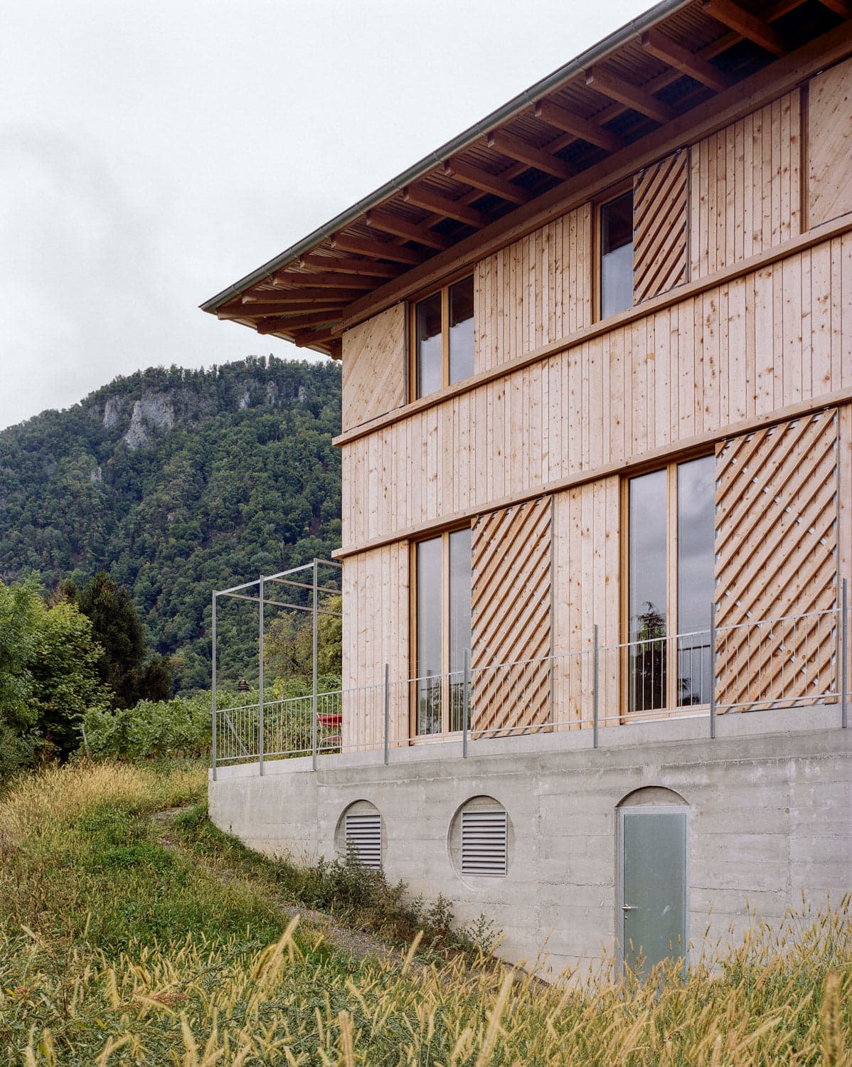
Logement, Vouvry
The building acts as a winegrower's gatehouse. The simple volumetry attests to the desire to be anchored in this rural heritage. The appearance of the mineral materiality of the base is borrowed from that of the retaining walls of the place, cased in irregular textured wooden formwork. The facade of the wooden volume expresses a piano nobile on the ground floor overlooked by the level including the “night” functions. Each level benefits from a type of opening responding to the desired relationship with the outside world. The thin metal roof covers the whole with a textured and technical element. Secondly, the excavation of the parking lot provides a space to occupy; a second housing unit is taking shape. Drilling openings in the wall in place requires large-scale core drilling. This second project follows a logic of hollowing out the full.
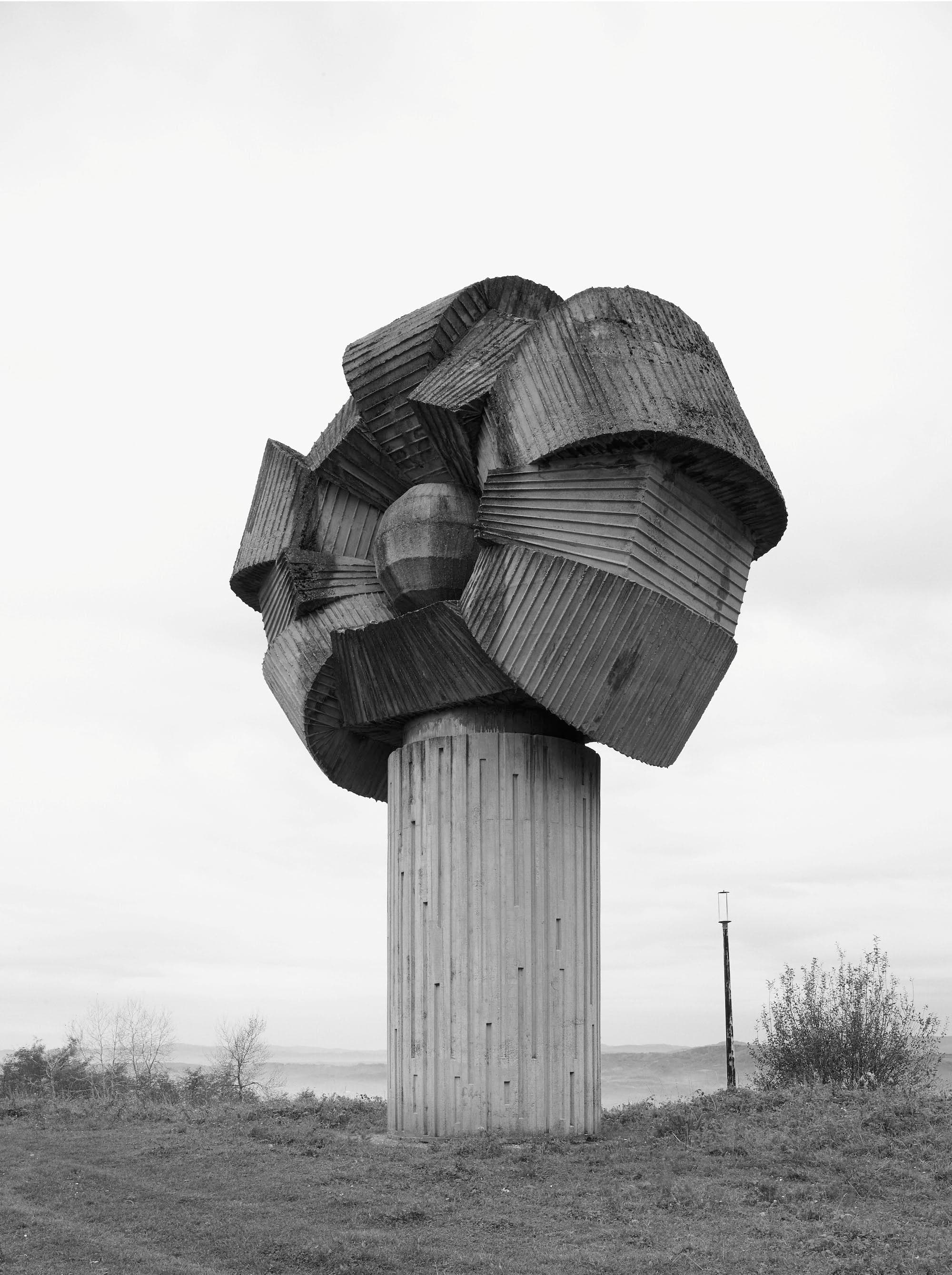
Spomenik
Jan Kempenaers (b.1968) lives in Antwerp and works in Ghent. He studied photography at the Royal Academy of Fine Arts in Ghent (BE) and the Jan Van Eyck Academy in Maastricht (NL). He has been affiliated with the School of Arts Ghent since 2006. Since the beginning of the 90s Kempenaers has been photographing urban and natural landscapes and in 2012 he completed a PhD in the visual arts. Jan Kempenaers’ third solo exhibition with Breese Little features the debut presentation of a new, unseen body of work. An essay by writer and curator Brian Dillon accompanies the exhibition: Again Elevate Your Eye'We erect monuments so that we shall always remember, and build memorials so that we shall never forget.’[1] So writes the philosopher and art critic Arthur Danto in an essay about the Vietnam Veterans Memorial in Washington, D.C. In classical Latin, monumentum denotes a commemorative statue or building, a tomb, a reminder, a written account or a literary work. The monument is meant to record, to preserve and to protect – it is supposed to keep the past with us, and the dead too. And yet it is surely the fate of all monuments to suffer almost immediately an evacuation of such meaning. The very gesture of erecting a monument puts a distance between us and the persons or events memorialized. And as soon as we begin to admire the monument – to pay attention to its heft, its contours, its rugged or polished surfaces – we must admit we have somehow traduced its subject by attention to the object before us.Of course, this is also where art begins, an art that is its own tribute to the past. Only the most literal-minded of civic or state authorities, the most crudely exacting of private patrons, could expect or wish for a precise correspondence between monument and memory. Degrees of artifice, indirection and abstraction are inevitable. The monument necessarily uncouples from its referent even when it recalls it, and detaches from its environs at the same time as it appears, in the form of a ruin, to degrade and meld with the landscape. As the American novelist William H. Gass has put it, ‘The monumental wrestles with the dialectic of endurance and denial.’[2] One can see this dialectic in action time and again in the photography of Jan Kempenaers, whose images of monuments and the territory that surrounds them are as much about distance and disavowal as they are the brute presence of his centred and frontal subjects.Consider Kempenaers’s photographs of the monuments known as Spomeniks that were built throughout what was then called Yugoslavia in the 1960s and 1970s. They were commissioned mostly as memorials to the dead of the Second World War; in a country with a complex relation to the Nazi invaders, the structures were deliberately neutral in terms of historical references, and thus frequently abstract. Here is a pallid concrete wedge situated among forested mountainsides, with steps apparently mounting to a doorway at one end, and a vast disc of the same concrete deposited atop the whole. And a thing like a wood-formed-concrete flower, at the summit of a concrete stalk, with its petals so many crudely lined or fluted segments. Or a collection of fat mirrored cylinders arranged on a plinth or platform of marble, whose panels are coming away in chunks. Like all monuments, these had their specific occasions for being built. But in Kempenaers’s pictures they appear anonymously, isolated like classical ruins whose decay and disarray may be dignified by distance, subtilized by an elevated viewpoint, refined by recourse to pale grey skies and no shadows.Does this mean that Kempenaers has merely exalted such structures, in uncritical accordance with the aesthetics of the picturesque that he avowedly invokes? Not at all. Because despite their austere clarity, their knowing citation of historical ways of looking at landscapes and ruins and monuments, in spite of their cool remove from their subjects, there is always something involved and involving about the texture of these images. The monuments positively bristle, they fracture and ramify like crystals, they shed their skins and reveal complex, enigmatic innards. And nowhere is this tendency more obvious than in Kempenaers’s recent ‘composite’ photographs, in which details from the monument studies are collaged and overlain. Horizons vanish, perspective becomes kaleidoscopic, the viewing eye is lost among multiple edges and competing surfaces. The even light that typically pervades Kempenaers’s landscapes gives way to a seething obscurity.It is the updated darkness, one might say, of the historical antipode to the picturesque – the darkness of the sublime. Kempenaers’s composites suggest nothing so much as the teeming architectural fantasias of Piranesi, recast in spalling concrete and rufous steel. In his Confessions of an English Opium-Eater of 1821, Thomas De Quincey described the drugged visions he suffers after viewing Piranesi’s engravings, in which he seemed to see the artist climbing the stairs towards a void: ‘But raise your eyes, and behold a second flight of stairs still higher: on which again Piranesi is perceived, by this time standing on the very brink of the abyss. Again elevate your eye, and a still more aerial flight of stairs is beheld: and again is poor Piranesi busy on his aspiring labours: and so on, until the unfinished stairs and Piranesi both are lost in the upper gloom of the hall.’[3] Kempenaers’s combination of sobered picturesque and confounding sublime is an apt embodiment of the contending impulses inside any monument. Brian Dillon, March 2017 Brian Dillon is UK editor of Cabinet magazine, and teaches critical writing at the Royal College of Art. His books include The Great Explosion (Penguin, 2015), Objects in This Mirror: Essays (Sternberg Press, 2014), Sanctuary (Sternberg Press, 2011) and Ruins (Whitechapel Gallery/MIT Press, 2011). [1] Arthur Danto, ‘The Vietnam Veterans Memorial’, The Nation (August 31, 1985): 152.[2] William H. Gass, ‘Monumentality/Mentality’, Oppositions 25 (Fall 1982): 144.[3] Thomas De Quincey, Confessions of an English Opium-Eater (Oxford: Oxford University Press, 1995), p. 71.
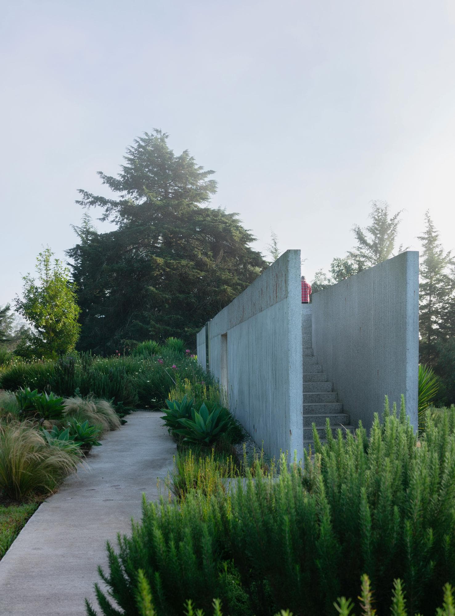
Ballen House
A house composed of two separate structures linked by a path and a large garden in a forest clearing. What could have been a single larger house, was developed as dispersed volumes positioned in the steep slope, each one situated in a unique way in relation to the topographic features of the beautiful site. Each structure is clearly different, yet they all share concrete formwork and custom made stainless steel details. Originally the site was a forest clearing used for cattle, presenting the opportunity to reconfigure the landscape by designing gardens that link both structures. The gardens in the slope are planted with species that on a first glimpse seem to be from a much higher climatic zone. Wild orchids, bromelias and other small plants were selected for their similarity to high altitude alpine plants. In a climate that is indeed cold and mountainous, this garden presents a different version of the tropics, intensifying the experience of a garden in the high altitude Andes. One house stands four meters over the terrain on a single column, while the long partially sunken house is defined by a long retention wall. The stainless steel details, windows and formwork are shared between both structures, all designed by the architects. The experience of the houses differ in the way that the structural solutions create two different climates and relationships with the slope, one closer to the ground, and the other elevated and more open. The gardens link both houses, and the same details and materials in outdoor areas are used indoors, which is part of the experiment in making the houses feel larger , as one of them is just 60 square meters and the other 75. The two structures behave a s single house; therefore, they are not an exercise in minimal living, but rather an experiment on how to satisfy the needs of a larger space by relying on the gardens as spaces that can complement the interiors. Both structures offer completely different atmospheres by employing opposite ways to relate to the slope and the carefully designed gardens.
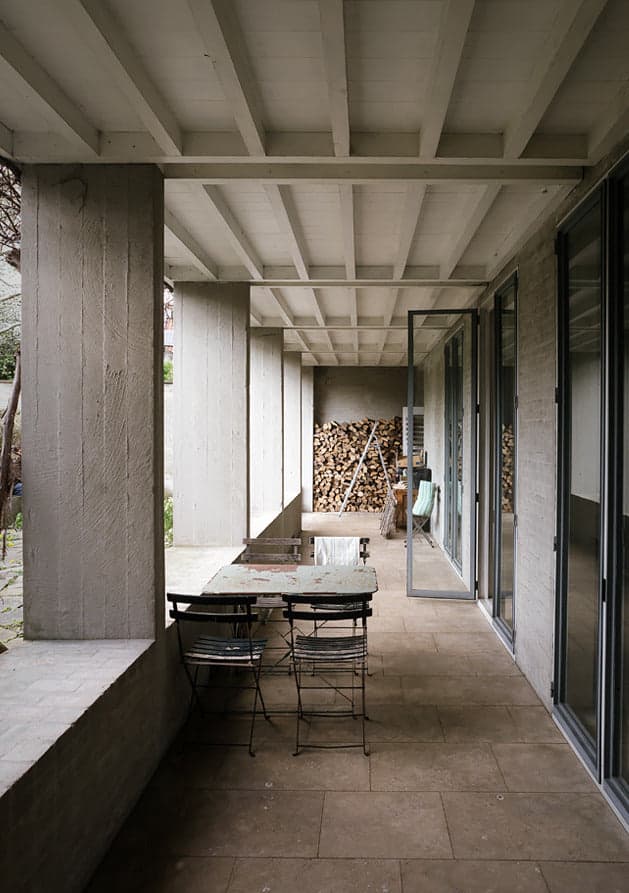
House Van Hee
Marie‑José Van Hee’s own home in Ghent, often referred to simply as “House Van Hee,” is a quietly assertive example of her distinctive architecture—a careful interweaving of interior and exterior, privacy and publicness, austerity and sensuality. Built between 1990 and 1997 on four narrow, merged row houses in the medieval Prinsenhof district, the project stands as an autobiographical testament to her architectural philosophy. Originally renting one of the narrow row homes (just 3.5 m wide), Van Hee gradually acquired four contiguous properties when the landlord withdrew. With these spaces she embarked on a long, incremental transformation. She cleaned out a derelict backyard, navigating years of planning in between other work and economic upheavals in Belgium. During this time-sanctified process, she engaged in hands‑on building—installing battened wood windows and constructing a new stair—while waiting until the entire vision coalesced. She described her approach as a dialogue with the site and her own imagination: strolling mentally through spaces with a glass of wine, seeking volume, light, orientation; planning facades only at the very end. Configured in an L‑shape around a courtyard and a gallery, the design choreographs a multi-layered transition between public street, intimate private space, and garden beyond. The compact street facade—with slim high windows—hints at interior volume while ensuring privacy. Bricks, given a light cement wash, harmonize with the context without drawing attention to their modernity. At the heart of the house lies a majestic double‑height living room—five meters high, with exposed wooden beams—evoking rural Tuscan rooms, suffused with daylight shifting beautifully from morning to evening. A stone staircase ascends to the library and bedroom, while an external covered staircase connects the bedroom to the garden—offering a fascinating secondary path through the architecture. In the shorter arm of the L sit the kitchen and bathroom. Van Hee intentionally downplays comfort to heighten physical awareness: for instance, even the toilet is located outdoors, emphasizing the boundary between inside and outside. House Van Hee is the product of “travail patient,” an architecture of patience and stripping away. Over seven years, layers of inessential detail were shed until only essentials remained—a lived essence . The result is tactile sobriety with a strong undercurrent of sensuality. Van Hee intentionally seeks a timeless aura through calm compositions, clearly articulated volumes, and calibrated light. She rejects computer‑aided design in favor of evening sketches—lines drawn freely in conversation with space, not style. House Van Hee is more than a dwelling—it is a mirror of life lived in slowness and attention. It sidesteps fashionable declarations in favor of quiet resilience and intimacy. It blurs thresholds, where one moves fluidly between street, courtyard, living volume, and garden. Shortlisted for the 1998 Mies van der Rohe Prize, it stands as one of Van Hee’s most personal and influential works—emblematic of Flemish “generation of 1974” architects who privileged tradition, craft, and human scale over spectacle.
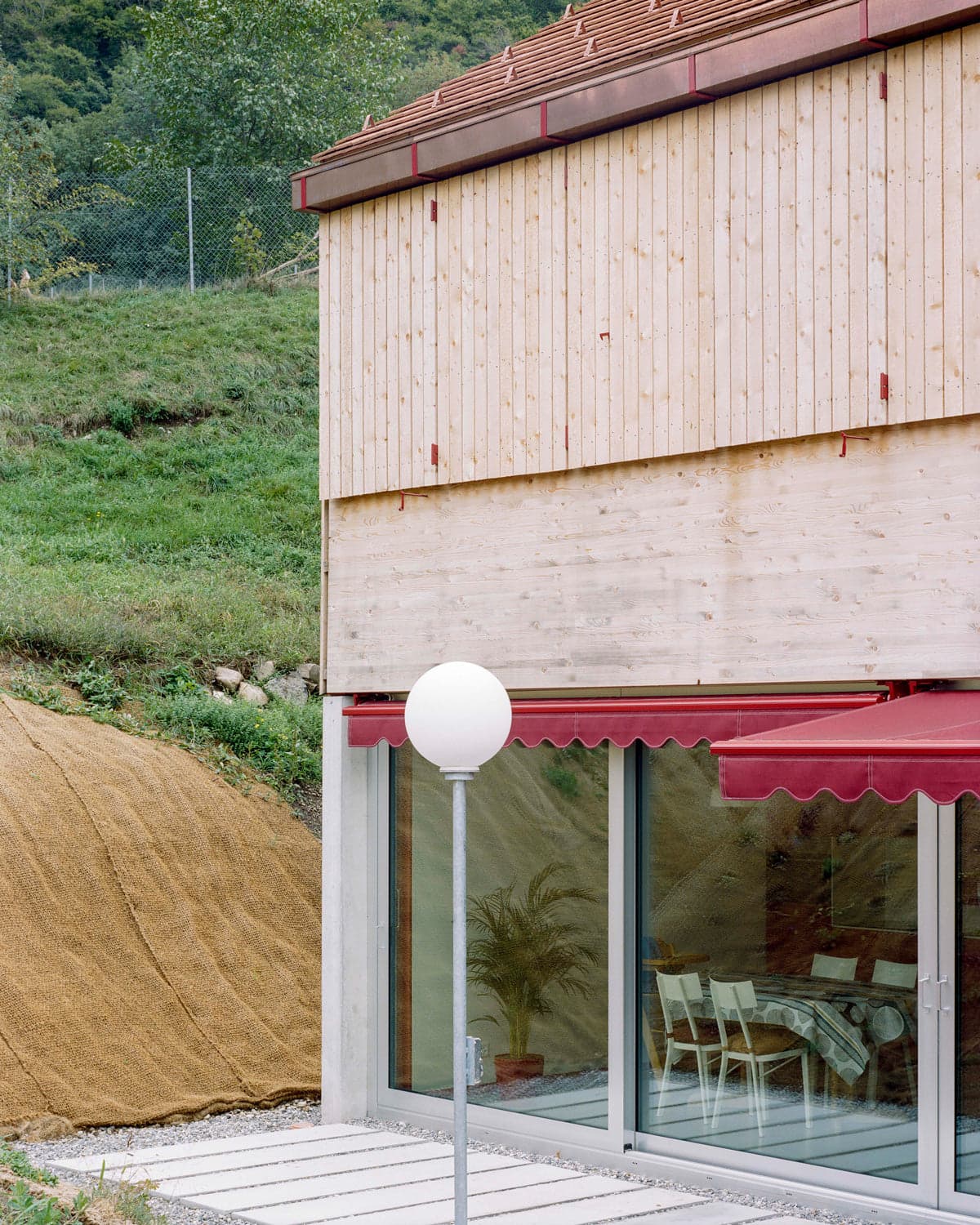
Villy
At the end of a dead end, an existing house built by the grandfather of three grandchildren punctuates the street due to its position in the center of the plot. The initial premise is simple, they inherit this particular land and all wish to inhabit it. In the manner of a participatory approach, the project management invites us to several meetings, discussions and sharing during which a relationship between principals and agents, between needs and responses, are questioned and merged. Three entities, initially independent, collaborate on a collective and cooperative intention. The existing house will be the heart of the project, the center of gravity around which the new living units orbit. Like a vital organ, it contains within it the techniques necessary for the functioning of the new body that surrounds it. The hollowed out floor, witness to its past, offers a new place that can be appropriated and multiple. The new construction breaks down its relationship with the ground into three distinct mineral entities, these containing the living rooms and their private terraces. Upstairs, the absence of clear boundaries allows rooms to be interchanged between units according to the desire of families to adapt and their development. This common belt connects the families with a single BLC structure and expresses the play of the spans and their resulting force. The existing and this new construction which surrounds it, like a parergon, act and determine each other. The interstice, interface between private and common worlds, presents a variation of devices necessary for understanding the boundaries of living together. Gateways and thresholds make up the treatment of this relationship through emptiness.
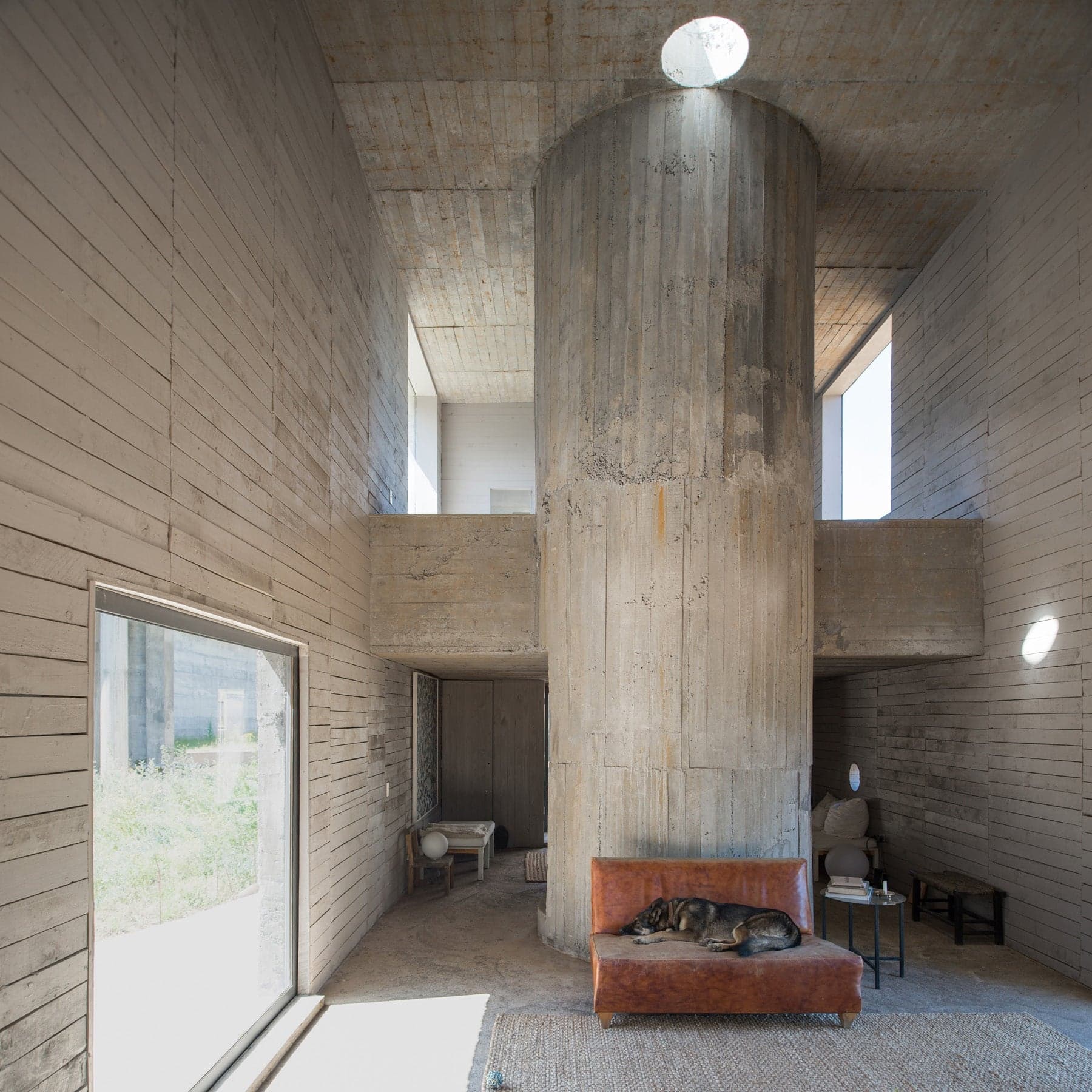
Casa Luna
Nestled within a dense forest at the foot of the Andes, in the Chilean village of Santa Lucía Alto, Casa Luna by Pezo von Ellrichshausen stands as an enigmatic and monumental work of architecture. More than a residence, more than a museum, it is an intricate compound of living, working, and exhibition spaces—an austere and poetic cloister cast entirely in exposed concrete. Spanning 2,400 square meters and occupying a 120-hectare site, Casa Luna is composed of twelve discrete volumes unified by a square footprint and bisected by an asymmetrical cross. This configuration yields four internal courtyards of distinct character: one elongated along the natural slope of the site and aligned with the movement of the sun; another perfectly flat, bordered by triangular ends and anchored by a solitary Chilean chestnut tree; a third defined by circular flowerbeds; and the largest, a pond-filled patio that recalls the scale of a medialuna—the bullring from which the house derives its name. The design defies simple classification. Its fortress-like profile—a long, horizontal stroke of grey nestled in the greenery—conceals a nuanced spatial landscape. Intimate and monumental, solemn and open, the interiors of Casa Luna unfold through a series of carefully orchestrated rooms. Some are lit by symmetrical skylights or punched windows; others are left ambiguous and opaque, their boundaries dissolved by the geometry of light and form. The material palette is raw and tactile. Rough concrete, recycled wood, and glass compose a building that feels ancient yet contemporary—crafted, not manufactured. Every wall bears the marks of manual labor: hand-cut rebar, uneven formwork, in-situ mixed concrete. These imperfections imbue the structure with a palpable humanity, echoing the surrounding natural environment more than any perfected artifact ever could. Casa Luna embodies the architectural philosophy of its creators. Mauricio Pezo and Sofia von Ellrichshausen eschew conceptual reduction, preferring instead to see their buildings as autonomous systems of spatial relationships. In this project, their intent was not to create a house, nor a museum, but a secular cloister—a continuum of domestic and creative life articulated through patios, volumes, and thresholds. Although legally and technically defined as twelve buildings—due to seismic joints separating the volumes—Casa Luna is experienced as a single, unified structure. It accommodates five dwellings, multiple workshops for painting, sculpture, and fabrication, along with exhibition spaces and a cylindrical library. The transitions between rooms are subtle, emphasizing continuity over compartmentalization. There is no single main axis or hierarchy of space; rather, the design fosters a fluid, almost labyrinthine navigation through functions and atmospheres. Seen from above, Casa Luna registers as a rational geometry. On the ground, it becomes something else entirely: a landscape of light and concrete, a home and a studio, a shrine to slowness and attention. It is architecture that neither explains nor simplifies—but invites. In addition to Casa Luna, two smaller concrete structures—Rosa and Lama—stand quietly elsewhere on the site. Like the main complex, these pavilions are monolithic and introspective, offering condensed architectural experiences within the vast natural surroundings. Together, they echo the language of Casa Luna while asserting their own spatial identities—solitary meditations in concrete scattered across the forested landscape. Rosa, the earlier of the two pavilions, is a 40-square-meter structure perched atop a rocky hill. Sunken slightly into the terrain, its floor lies 60 centimeters below the immediate ground level, emphasizing a sense of retreat and stillness. Its square footprint is defined not by mass but by absence—framed by a thin concrete roof slab supported by four off-corner columns. The load-bearing elements are subtly embedded, and the frameless glazing that runs between the roof and earth blurs any boundary between enclosure and landscape. The space becomes a suspended void—at once exposed and sheltered, elemental and refined. At the center of the room, a fireplace sits on the diagonal, casting a radial logic through the plan. A rectilinear chimney punctures the roof, doubling as a sundial, while a slender external staircase provides access to the rooftop, suggesting an alternate mode of inhabitation. Pezo and von Ellrichshausen describe Rosa as “a hut lacking interiority,” a space carved from the hill but touching the sky. Depending on one’s position—beneath or above the concrete slab—the pavilion oscillates between the cave and the cloud, the grounded and the ethereal. Its stillness is deceptive; structurally, Rosa is stabilized by cross beams embedded in the slab, designed to withstand both static and seismic stresses, allowing for an architecture of subtle equilibrium. Lama, by contrast, is a vertical figure drawn into the horizon—a lookout tower rooted in the earth yet oriented toward the distant Andes. Defined by a narrow and elongated plan, Lama functions as a concrete staircase rising through space, culminating in an elevated viewpoint that captures the vast landscape in all directions. While Rosa retreats, Lama projects—a solitary totem of observation in a field of silence. Its ascent is meditative, with each landing offering a new perspective, a moment of pause before reaching the final panoramic aperture at the top. The geometry of Lama is deceptively simple: a slender monolith with a singular path within. Yet its spatial experience is cinematic, calibrated to frame fragments of forest, sky, and mountain. The verticality of the form is balanced by its mass, anchoring it in the rolling terrain. Without ornament or distraction, Lama asserts its presence with clarity and poise. It is a structure that insists on slowness—on climbing, looking, and listening—and in doing so, offers a quiet counterpoint to the expansive horizontality of Casa Luna.
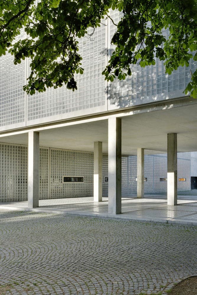
Academy of Art and Architecture
Wiel Arets designed this extension to an existing arts academy located at the northern edge of Maastricht’s city center. Designed to unify the programs of architecture, fashion, fine arts, industrial, and graphic design under one roof, the project comprises two interconnected buildings linked by an elevated footbridge. Suspended three stories above ground amidst mature trees, the footbridge seamlessly integrates the school’s components, fostering a unique connection with the surrounding natural environment. Nestled within a dense urban fabric, the school remains discreetly camouflaged from direct view, simultaneously exposed to the city while maintaining an element of seclusion. The school’s exterior is encased in a glass-brick façade that provides a delicate interplay between visibility and privacy. During the day, this semi-transparent veil shields the interior from external distractions, fostering a concentrated atmosphere for students. At night, the façade transforms, revealing silhouettes of its inhabitants as light from within illuminates its surface. This duality emphasizes the school’s role as both a sanctuary for focused study and a beacon of creative activity. Communal spaces such as the café, library, and large auditorium encourage informal interaction between professors and students, nurturing a vibrant academic community. A series of ramps connects the new structure to the existing arts academy, creating a fluid circulation path that accesses key areas such as the library and auditorium, the latter situated on the lower level. These ramps ascend to the uppermost level, culminating in the enclosed footbridge. Constructed with glass-block flooring and ceilings, the bridge offers a luminous journey through the treetops while its concrete walls bear its structural weight. Crossing this bridge leads to the working studios, distributed across three floors, where artistically inclined students engage in their craft.The interiors feature bespoke furnishings, including an oversized circular table in the café designed to seat twelve individuals, encouraging dialogue and collaboration. The design encapsulates the ethos of a modern atelier—a space where students and faculty are cocooned from the city’s bustle yet remain intrinsically connected to its cultural fabric. About Wiel Arets ArchitectenWiel Arets Architecten, the visionary firm behind this project, is renowned for its innovative approach to modern architecture. Founded by Wiel Arets in 1983, the firm operates internationally with a portfolio spanning academic, residential, and commercial projects. Known for their meticulous attention to materiality and light, their designs often explore the interplay between transparency and opacity, creating environments that are both functional and contemplative. The firm’s philosophy centers on fostering connections—whether between people, spaces, or the broader urban context. This school exemplifies their commitment to creating spaces that inspire creativity and collaboration while harmonizing with their surroundings.
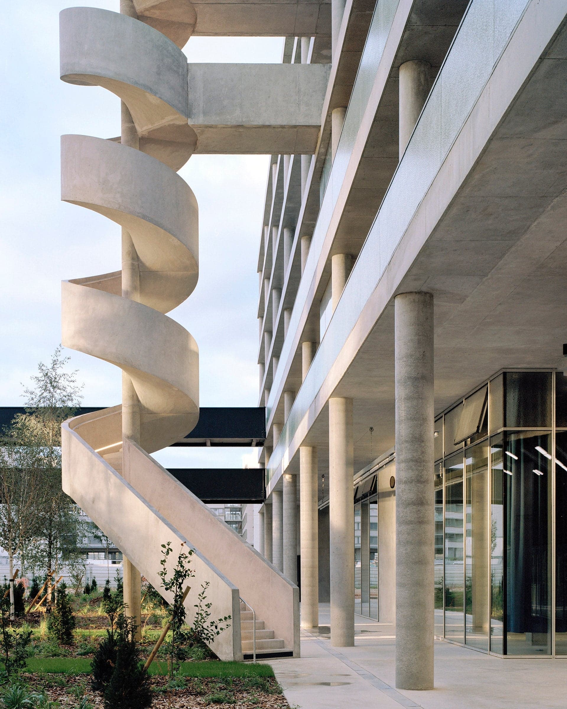
Palaiseau
At once rigorous and open-ended, this collaborative project by BRUTHER and Baukunst proposes a new urban model for hybrid programs in transitional territories. Located in Palaiseau, on the edge of the Paris-Saclay development zone, the building combines a student residence, public and private parking, commercial spaces, and communal areas—all within a single, continuous structural system. Framed by the logic of its site and the rectilinear plan of the campus grid, the U-shaped volume wraps around an open-air courtyard, treating the void as the project’s vital organ. From this central garden, the architecture reveals itself not just in plan or section, but in sequence—open, legible, and rhythmic. The structure unfolds in stratified layers: a porous ground floor for commercial and communal spaces; two massive, opaque levels for parking; and three more for student housing, culminating in a vaulted attic with duplex units. The contrast is intentional—between the transparent base, the dense infrastructural core, and the domestic volumes above. Access ramps are folded into the building’s mass, turning circulation into spatial drama. Rather than a patchwork of programs, the building is conceived as a single structural and spatial entity—thrifty in gesture, yet generous in effect. Its modular concrete frame governs a variety of uses without ever losing coherence. The architecture privileges flexibility and future reversibility: parking may someday become offices or workshops; housing could adapt to new formats. It is an inhabited framework rather than a fixed typology. There is no façade in the traditional sense—just a rhythmic articulation of concrete slabs and removable glass panels, alternating opacity and lightness. The building's monumental calm is not ornamental, but born from functional precision. Yet within this rigor, there is nuance: the attic’s roof vaults introduce domesticity; the garden evokes cloistered quiet; the daily cycles of light, shadow, and occupation animate the raw structure.
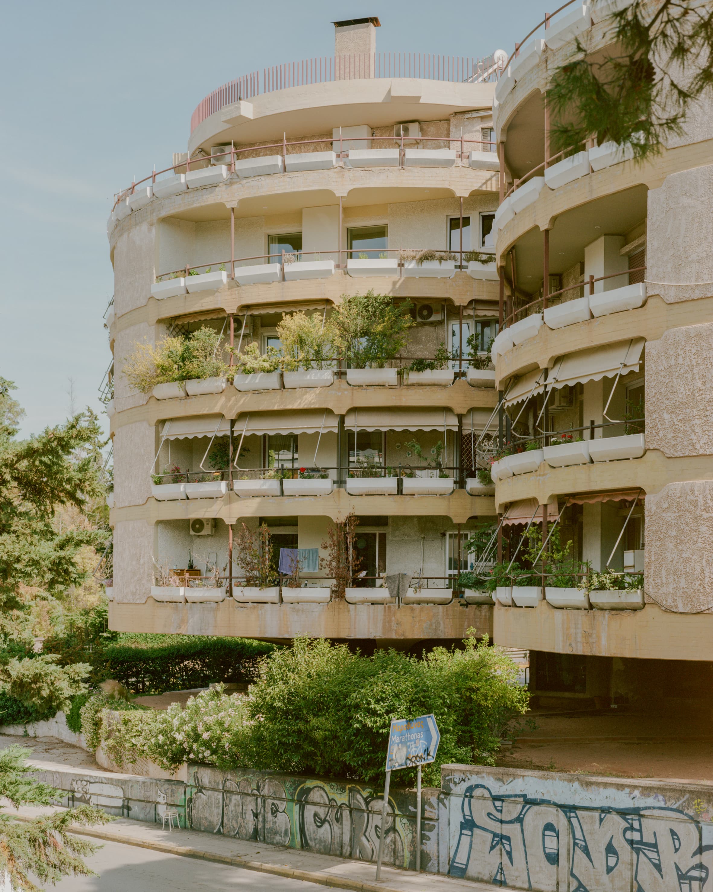
Kifisia Apartment
At the entrance to Kifisia, where the avenue comes in from Athens, a pair of round volumes stands clear of the ground on cylindrical supports. This is the Stroggyli Polykatoikia — the round apartment building — designed by Nikos Despotidis and built in 1973–1974. The concrete is left exposed and the balconies run continuously around the circumference, so the elevation reads as a stack of horizontal bands with neither a front nor a back. Contemporaries treated the structure as a technical accomplishment, and accounts from the period describe architects travelling from abroad to see how it had been done. It has been a fixed point in the northern suburbs ever since, known by its shape rather than by its address, though remarkably little about it has been written down: the building appears in no published survey of significant Athenian apartment buildings, and Despotidis himself leaves almost no published trace. The geometry sets the terms for everything inside it. The perimeter curves away continuously, so partitions meet the façade at an angle that changes along its length, and the corners a rectangular plan would rely on are not available. The 80 m² apartment that Georgios Apostolopoulos Architects has now reworked was organised as a sequence of enclosed rooms: two narrow corridors, the bathroom occupying the centre, and the principal living areas compressed into a narrow zone with limited access to daylight. The renovation began by taking things away. Every internal partition was removed, leaving the existing structure exposed and the floor plate readable in one view. What followed did not put the walls back. Georgios Apostolopoulos Architects treats the apartment as a continuous interior and hands the work of division to a set of joinery elements, which define how each part of the plan is used without closing it off. The question the project puts is whether a home needs rooms at all, or only the things that rooms were supposed to provide. The kitchen answers first. Placed at the centre of the plan, it is built as a solid volume and handled less as a room than as an object to be inhabited — cooking, working and meeting all collect around it. The island can be approached and used from every side, which is what makes it the social instrument of the apartment rather than a service counter: it supports the routines of a day without setting an order for them. Living and dining open out from it through gentle transitions rather than doorways. That continuity carries into the main bedroom, which reads as an extension of the living area instead of a sealed room. The vanity runs past the bathroom enclosure, and the wardrobes work as layered filters rather than partitions. Privacy here is not fixed in the plan but adjusted in use — a matter of where someone stands and what is drawn across, negotiated through occupation. At the far end of the apartment the second bedroom is not built. In its place sits a flexible joinery system: a fold-down bed, an integrated desk and sliding panels that let the same square metres move between sleeping, working and storage. It behaves less like a room than like a piece of domestic equipment, and it is the clearest statement of the project's argument — that use can be held by furniture as competently as by walls. The material handling keeps out of the way of all this. A monochromatic palette holds the interior quiet and lets the original structure stay present in the room, while slim-frame windows admit as much light as the openings allow, so the continuity between one part of the plan and the next is carried by daylight as much as by geometry. What results is a domestic interior organised as a system of spatial relationships rather than a collection of rooms: boundaries that stay fluid, privacy that can be dialled up or down, and a plan whose order emerges from how it is lived in.
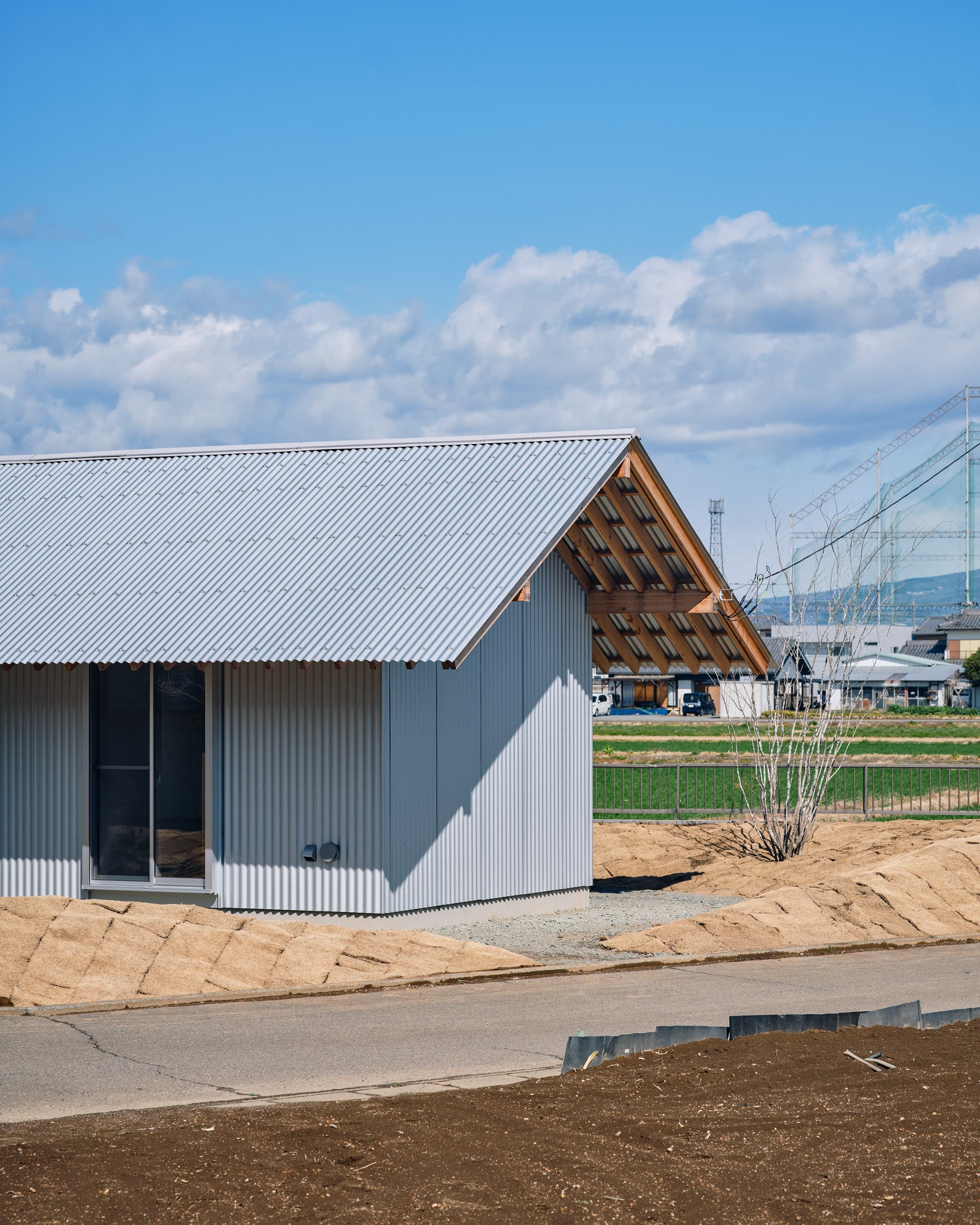
An Unfinished House
An Unfinished House — Reorganising the Residue of the Suburbs Located in the suburban outskirts of Isesaki City, Gunma Prefecture, this single-storey wooden house stands on a parcel of land that had been left behind in the process of suburban development. After surrounding plots were subdivided and sold, the site became landlocked and excluded from formal market circulation. Rather than treating these conditions as obstacles, the project embraces them as contemporary potential. The surrounding context is layered but unresolved: residential neighbourhoods, agricultural fields and distant views towards Mount Akagi overlap without clear hierarchy. To engage this condition, the house is placed along the site’s elongated east–west axis, allowing the north–south landscape to be drawn into everyday life. Openings are arranged in a repetitive and evenly distributed manner. They are not conceived as framed panoramic views, but as fragments of landscape embedded within the interior. Through subtle variations in scale — from distant mountains to nearby vegetation — the scenery continuously shifts, creating an evolving relationship between daily life and its surroundings. Inside, the house avoids a composition of clearly defined rooms. Instead, loosely articulated spaces extend gradually along the east–west direction. Boundaries remain ambiguous; circulation and stillness, interior and exterior, light and shadow overlap. The behaviour of the inhabitants becomes what defines the space. This spatial organisation reflects a contemporary family structure — independent yet not entirely separated. At the intersection of the north–south and east–west axes, a single structural column stands as a symbolic element. Rather than acting as a centralising core, it operates as a temporary anchor that holds multiple centres of gravity in balance. The client, who is also a carpenter, played a fundamental role in shaping the house. The project was developed using only minimal drawings that outlined essential principles. Through continuous on-site dialogue, the boundaries between design and construction were intentionally blurred. Differences between intention and execution were not eliminated, but absorbed as opportunities to generate new forms of rationality. As the project pursued rational simplicity, the space gradually became abstract. This abstraction does not assert authorship or fixed meaning; instead, it creates a neutral field capable of receiving the inhabitants’ actions and memories over time. The house proposes not a finished object, but an open condition — one that remains capable of adaptation and renewal as life unfolds.
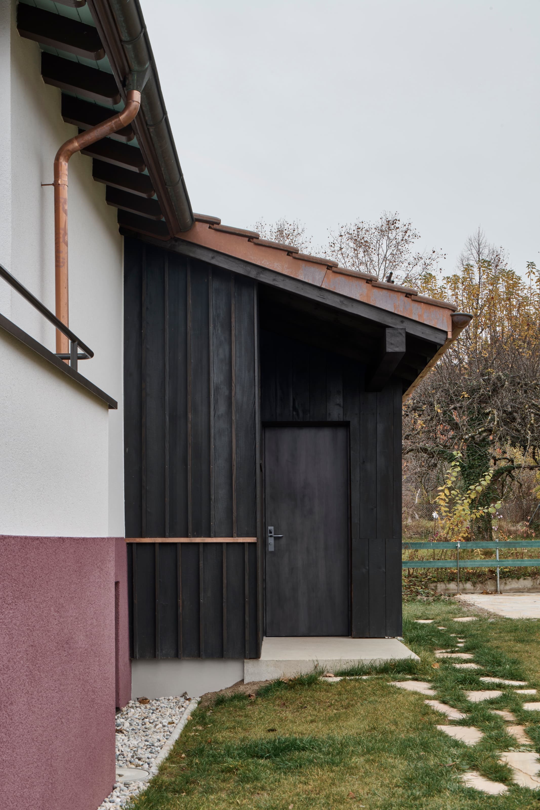
Conversion of a 1940s Workers’ Villa
The house belongs to a protected complex of identical villas built in the 1940s for workers of the national railway — a repeated type whose form cannot be freely altered. It originally held a single inhabitable floor above a lower level of cellar and garage, each reached independently from the outside. The conversion treats that lower level not as ancillary space but as a second full register of the house: a bedroom and a studio are inserted there, and a new entrance is built to reorganise the vertical circulation and unify access to both floors. To make the lower level habitable, its floor had to be excavated to reach the ceiling height the new rooms required, and existing windows were enlarged or supplemented with new openings to bring in light. The resulting change in level is not concealed: a finish of sand-washed concrete marks the height gained in both the bedroom and the studio, keeping the trace of the original floor visible within the finished rooms. The same sand-washed concrete runs across the new floor spaces throughout the lower level, including the entrance. But the entrance itself is enclosed in wood frames rather than concrete — a shift from the solidity of the concrete that lines the floor and lower walls of the bedroom and studio, marking the entrance as a distinct, lighter threshold between the two levels it now joins. The change in level is registered on the exterior as well. On the original façade, a coloured socle already marks the separation between the existing ground floor and the new lower level; the extension continues that logic through a symmetrical offset of the lower timber fins. The extension is finished in burnt timber, setting a blackened, contemporary volume against the original one. The conversion does not resolve the difference between old and new so much as stage it in material: concrete that keeps the memory of a former floor level, timber that marks where the house has been added to. What results is a protected, decades-old typology given a legible, contemporary layer without erasing the datum it was built from.